Created new design concepts for a member-facing behavioral health (BH) experience.
Project Overview 📝
Elevance Health, Inc. is an American health insurance provider, formerly known as Anthem, Inc. In the summer of 2023, I worked as an Experience Design Intern in the Chief Experience Office (CXO) at Elevance Health.
Under Suzanne Currie, Experience Strategist, I was part of the Behavioral Health Consumer Experience (BH CX) initiative. I developed new design concepts for a member-facing behavioral health (BH) experience. This involved synthesizing input from four sources, including a consumer-research report, to create lists of member needs, user tasks, and BH situations. These lists informed the design of a future "Find BH Care" member experience, which included a landing page and interaction flows. The design process involved walkthroughs with 10 internal employees and 5 participants from a dscout study, incorporating their feedback and evidence-based findings to refine the designs.
Role
Intern, User Research, User Interface
Tools
Figma, Dscout, Mural
Project Duration
10 Weeks (June - August 2023)
Confidentiality Considerations
This case study adheres to confidentiality agreements (e.g., NDAs, PHI, and PII) at Elevance Health. While specific details are omitted, the focus remains on methodologies, processes, and outcomes.
Introduction: How it All Started 👋
During my summer internship at Elevance Health, I worked as an Experience Design Intern in the Chief Experience Office (CXO). I was part of the Behavioral Health Consumer Experience (BH CX) Initiative, creating new design concepts for a member-facing behavioral health (BH) experience. This involved understanding members' needs when accessing BH care and designing app concepts to meet those needs.
Problem Statement
Elevance Health members face barriers in accessing digital resources for Behavioral Health (BH) care. This includes understanding care options, identifying providers, and managing ongoing care, especially for complex cases. To address this, we propose a comprehensive digital app experience to meet the diverse needs of members seeking BH care.
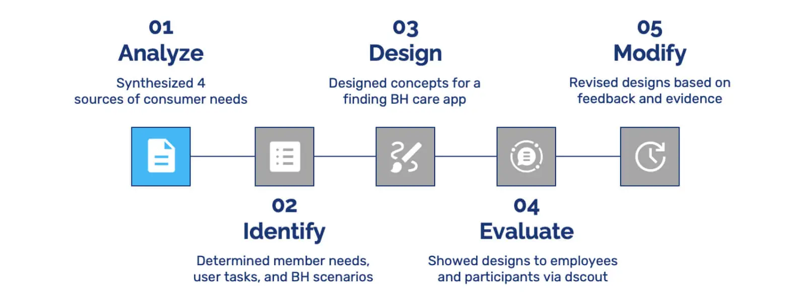
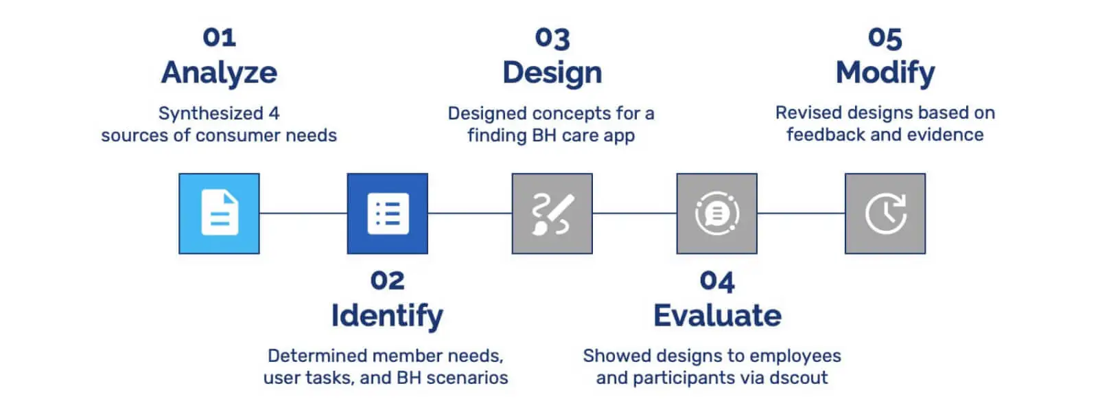
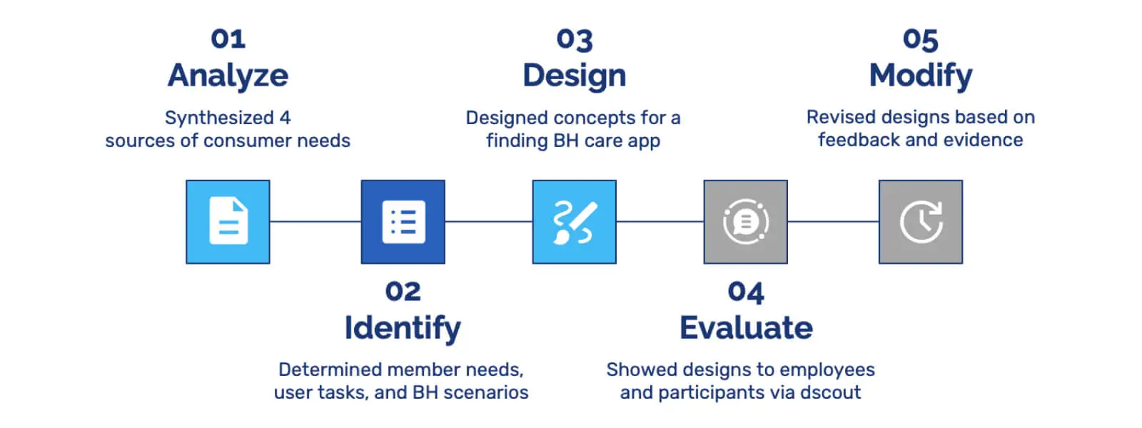
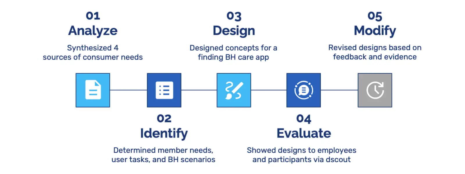
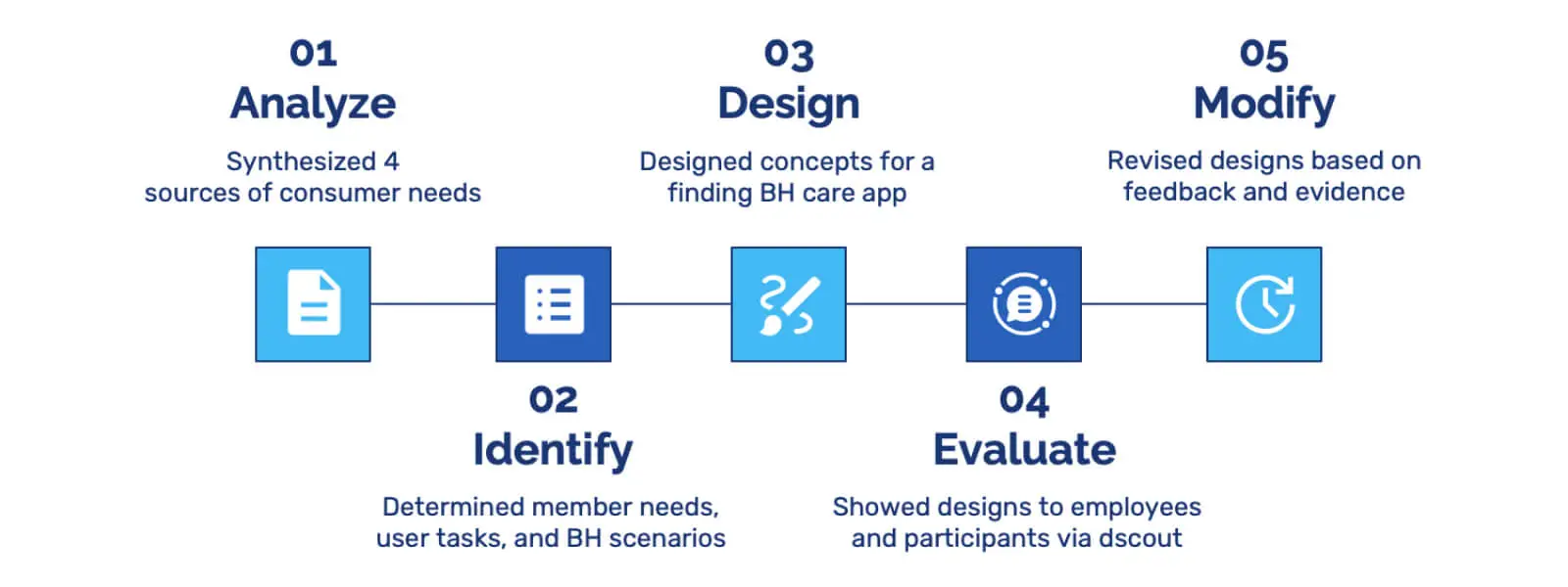
The project was divided into five stages: Analyze, Identify, Design, Evaluate, and Modify. In the Analyze stage, I synthesized four sources of consumer needs. During Identify, I determined member needs, user tasks, and BH scenarios. In the Design stage, I created concepts for finding BH care. In the Evaluate stage, I presented these designs to employees and participants via a dscout study. Finally, in the Modify stage, I revised the designs based on feedback and evidence from the previous stage.
Scope of the Project
Analyze 🤔
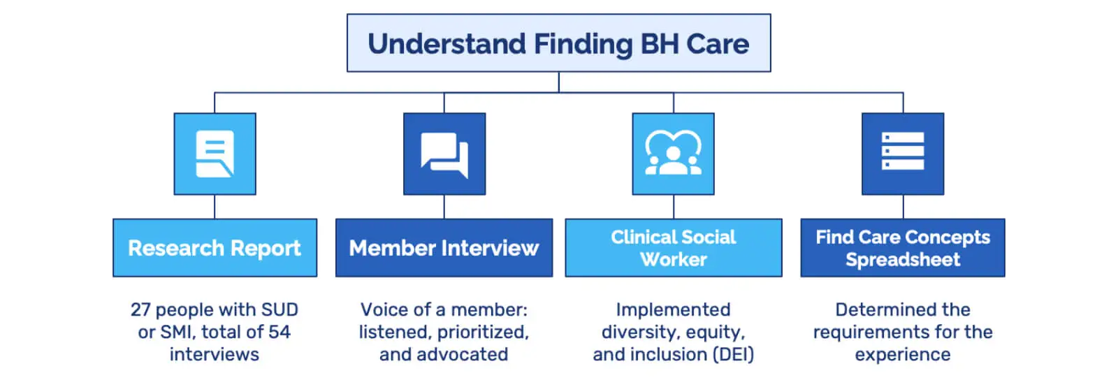
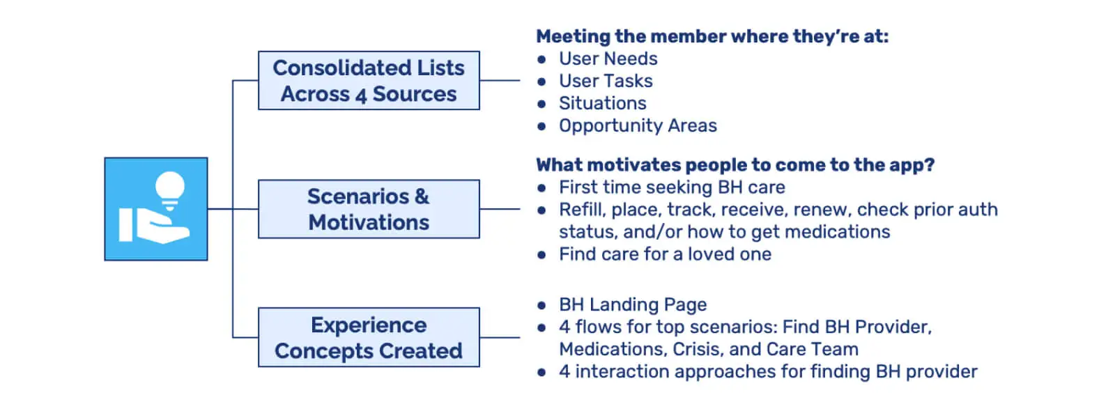
During the Analyze stage, my goal was to gain insights into the process of finding and accessing BH care. To achieve this, I drew from four key sources: Research Report, Member Interviews, Clinical Social Worker Informational Interview, and a Find Care Concepts & Use Cases Spreadsheet.
Analyze Stage
Research Report
I reviewed an in-depth research report that encompassed interviews with 27 individuals living with Severe Mental Illness (SMI), Substance Use Disorder (SUD), or both. This report revealed valuable BH insights, consumer pain points, and pivotal moments, enhancing my understanding of their experiences.
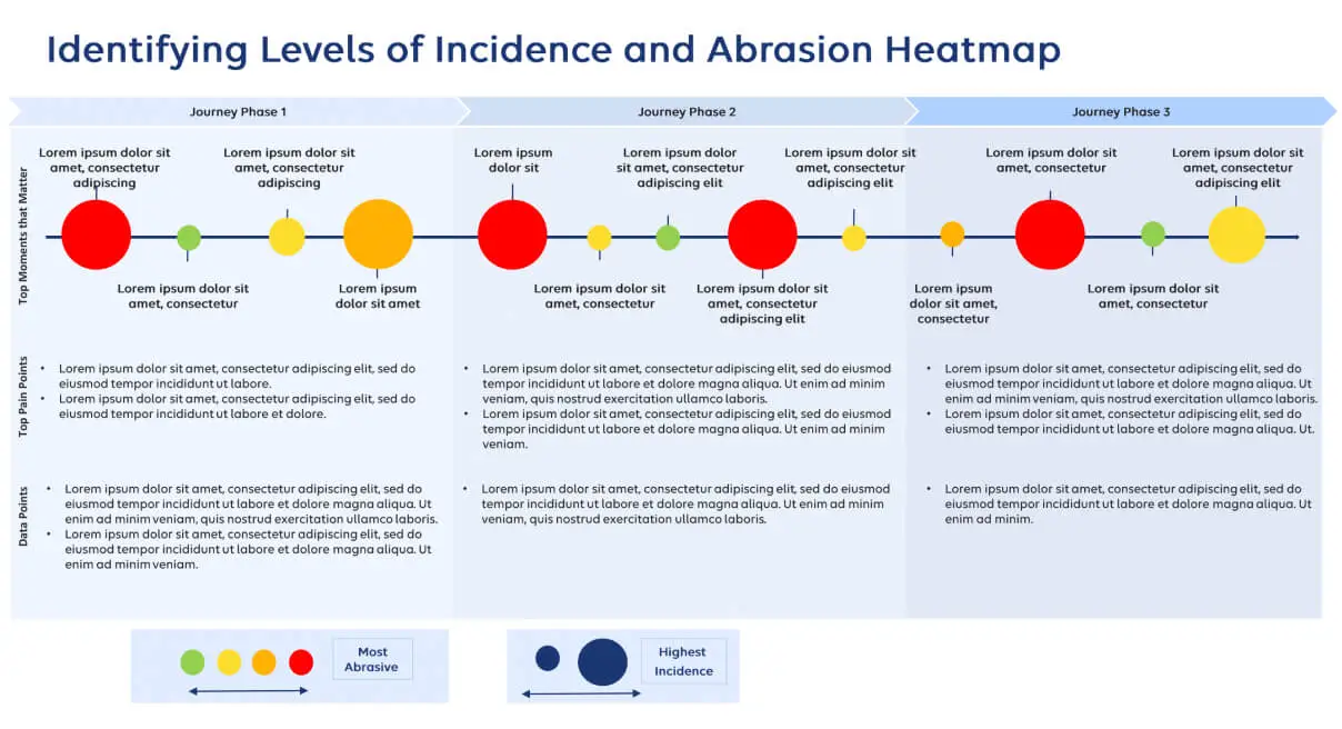
Heatmap of Incidence and Abrasion
Additionally, contained within this research report, the BH CX team created a range of artifacts, including a heatmap that played a pivotal role during the Analyze phase. This heatmap emerged as a crucial resource, outlining the varying degrees of incidence and pinpointing areas where our members encounter friction. While the specific data from this heatmap remains confidential, I can offer a visual representation to illustrate its structure and how it aided in highlighting pain points within a member's journey.
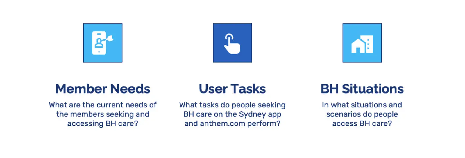
Four Key Sources for Finding BH Care
Member Interviews
Through confidential discussions with a member—whose identity I can't disclose due to privacy reasons—I grasped firsthand the challenges families and individuals face when health insurance falls short in providing necessary support. This experience consisted of 3 cross-functional informational interviews that underscored priorities and informed my advocacy efforts.
Clinical Social Worker Informational Interview
An informational interview with a clinical social worker at Elevance Health emphasized the significance of diversity, equity, and inclusion (DEI) in the search for a suitable provider. This dialogue highlighted the pivotal role these factors play in the BH consumer experience.
Find Care Concepts & Use Cases Spreadsheet
I leveraged a spreadsheet containing Find Care concepts and use cases. This resource aided in discerning requirements, exploring various concepts and solutions, and assessing the potential value they could bring to the consumer journey.
Identify 🔎
In the Identify stage, I concentrated on generating three pivotal categories of information: member needs, user tasks, and BH scenarios.
Identify Stage
For member needs, I aimed to understand the current requirements of those seeking and utilizing BH care, focusing on their specific needs and concerns. For user tasks, I outlined the tasks individuals perform when engaging with BH care via the Sydney app and anthem.com, capturing the user experience from start to finish. Additionally, I detailed diverse scenarios where individuals find and access BH care, identifying contexts where our design solutions would be most impactful. Synthesizing these lists and insights revealed opportunities that formed a solid foundation for our design concepts.
Lists of Identified Information
Design 🎨
During the Design stage, I synthesized the research and information collected in preceding stages to craft the design concepts.
Design Stage
Core Experience Principle
With this objective in mind, the design concepts were centered around a core experience principle: "Meeting the Member Where They’re At." While the specific meaning of this principle is bound by non-disclosure agreements (NDA), it served as a guiding beacon for the design concepts. My task was to translate the identified consumer needs into tangible experience concepts that aligned seamlessly with this experience principle.
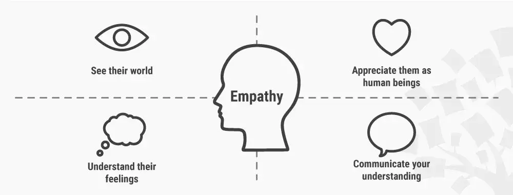
Empathy Map to Understand Members
Translating Consumer Needs into Experience Concepts
In short, my earlier work involved pinpointing needs, tasks, situations, and opportunities within the project's scope. Building on this groundwork, I delved into these concepts to uncover the underlying motivations that drive individuals to engage with the app. Examples included instances where users sought BH care for the first time, needed prescription refills, or sought care for a loved one.
Translating Consumer Needs into Experience Concepts
By establishing this solid foundation, these experience design concepts were tailored to cater to diverse situations and motivations. The result was a pathway that resonated with each user's current needs, facilitating an authentic and intuitive experience.
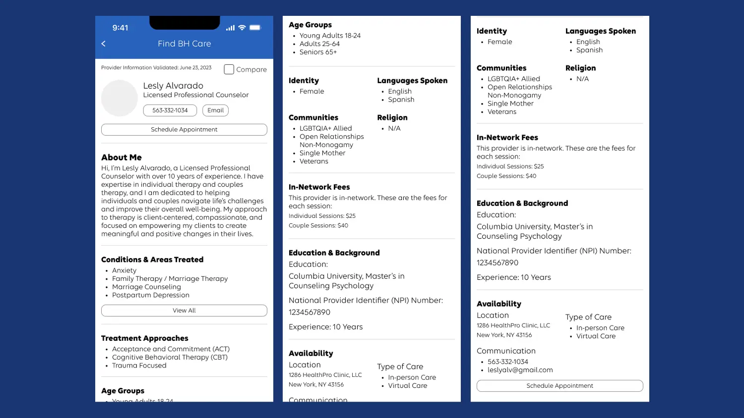
Low-Fidelity Design Concepts
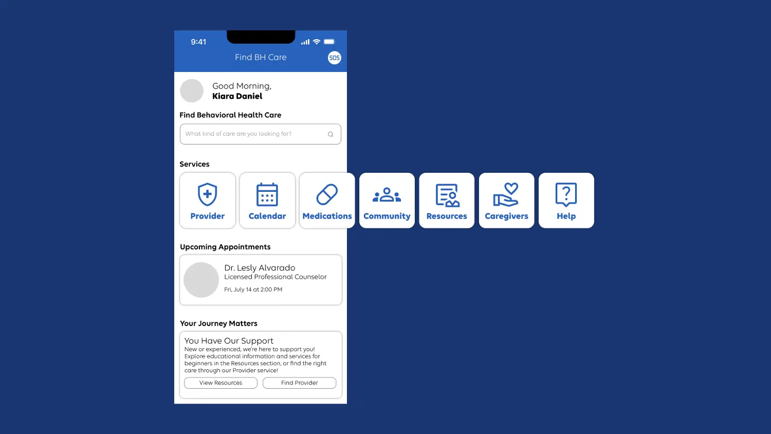
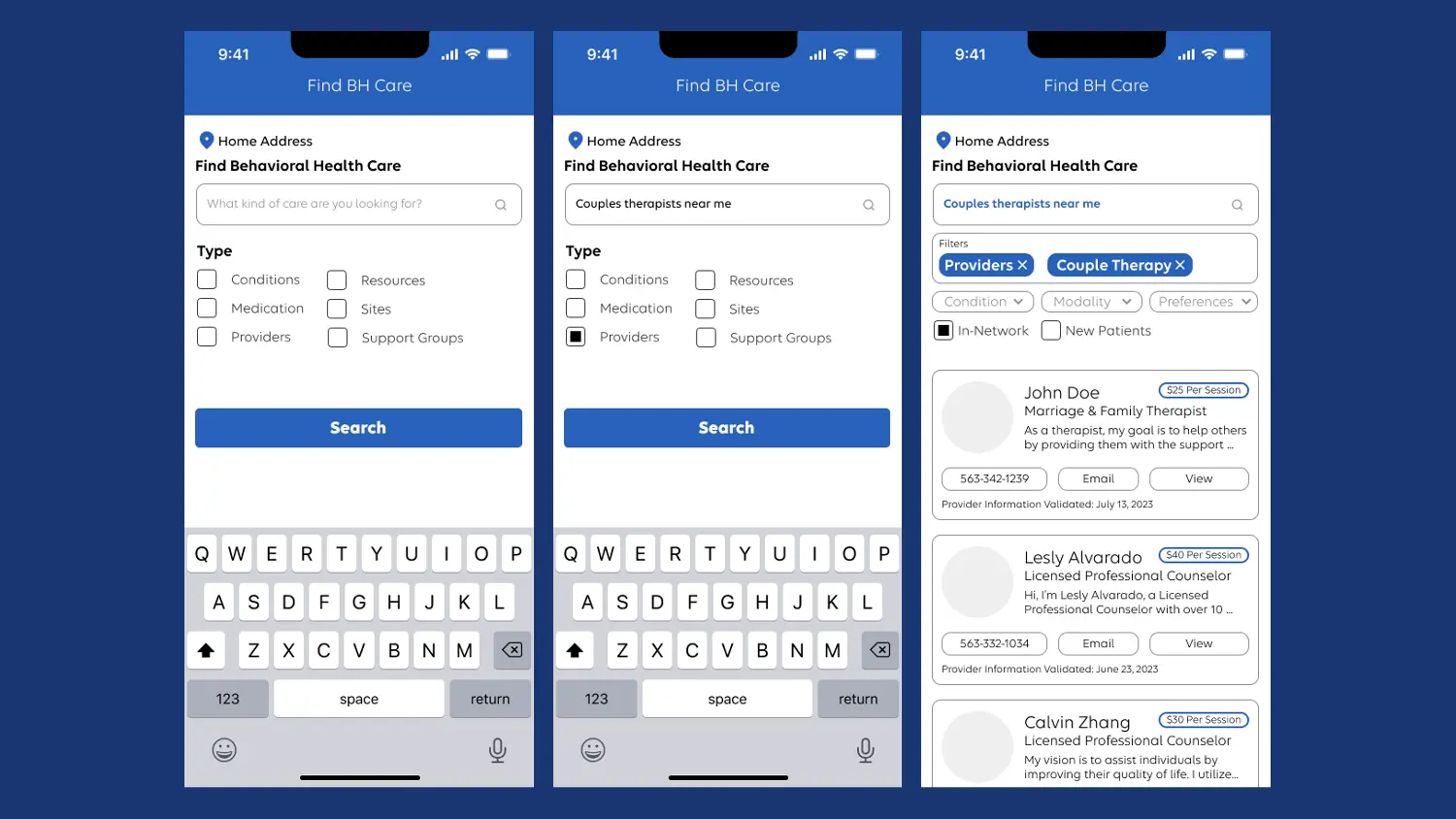
The following is the initial iteration of the BH landing page concept I've created. In this version, the interaction approach centers on a carousel or slider format to present various services.
Initial Iteration of the BH Landing Page
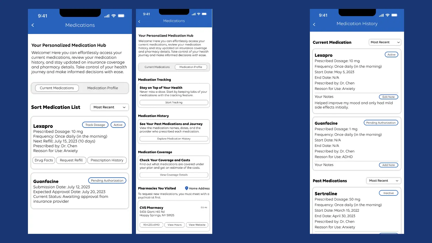
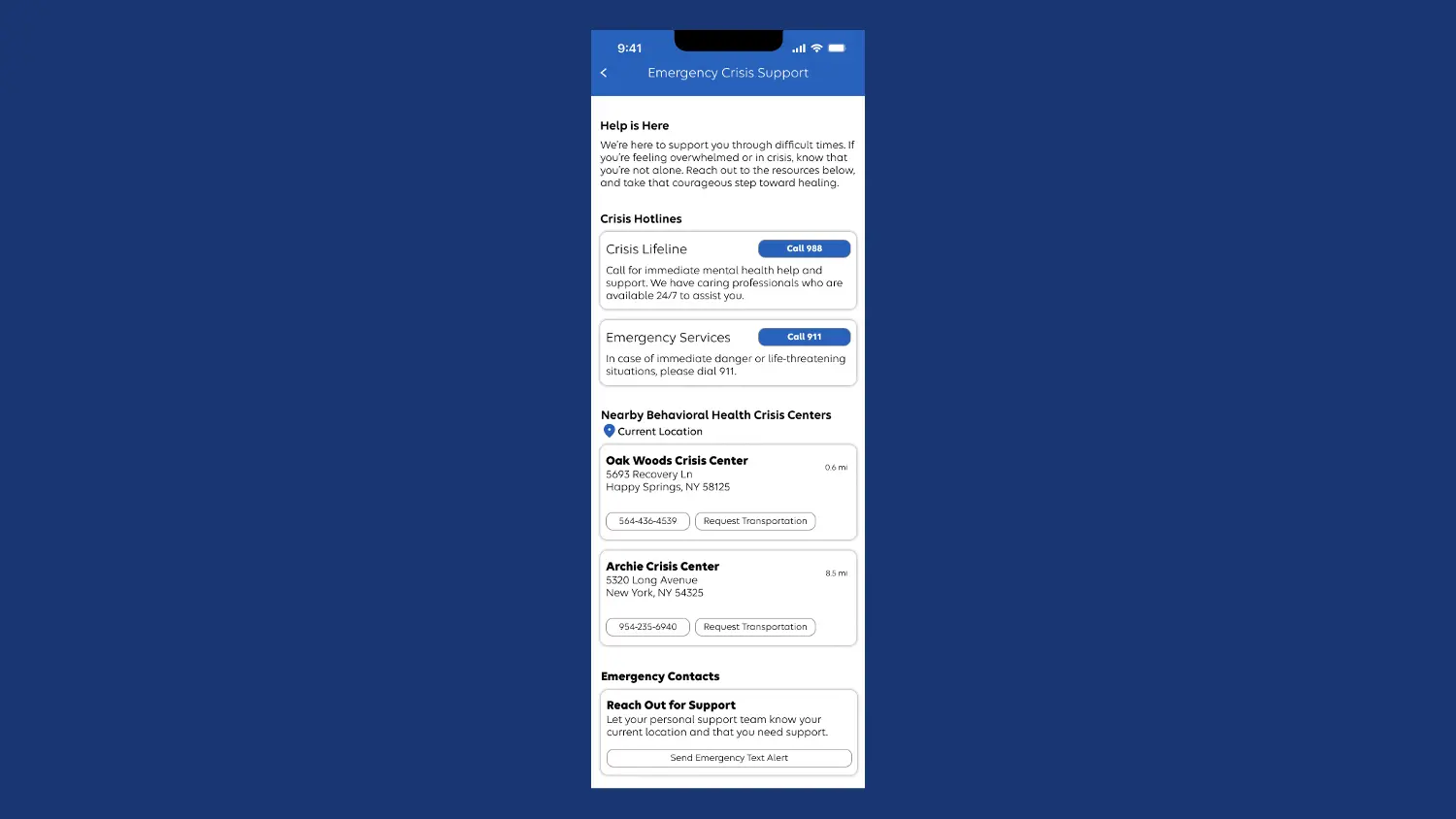
Furthermore, connected to the landing page, I've designed four distinct user flows: finding a BH provider, managing medications, connecting with a care team, and addressing crises—these are the key scenarios we pinpointed to be top scenarios to focus on.
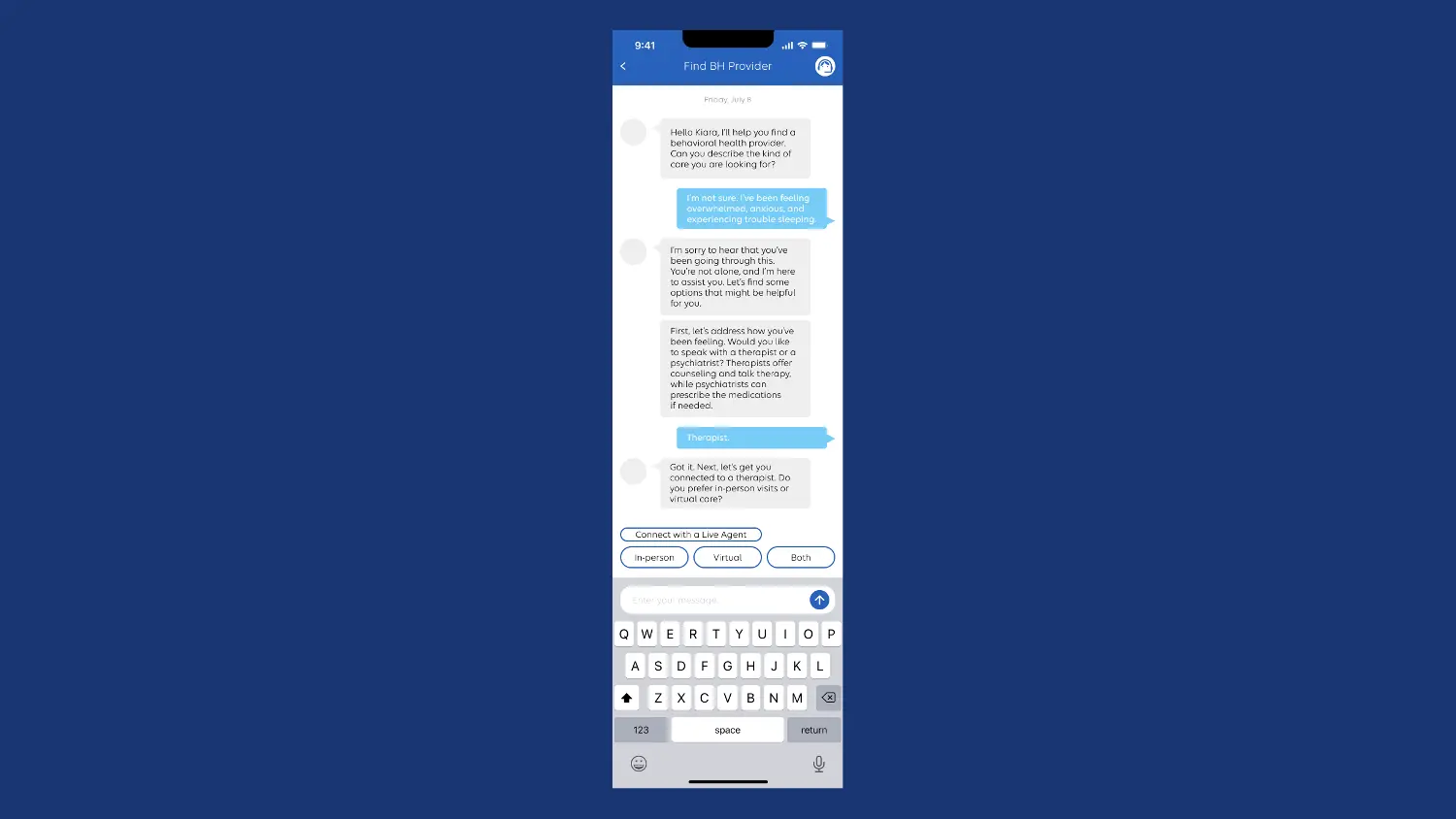
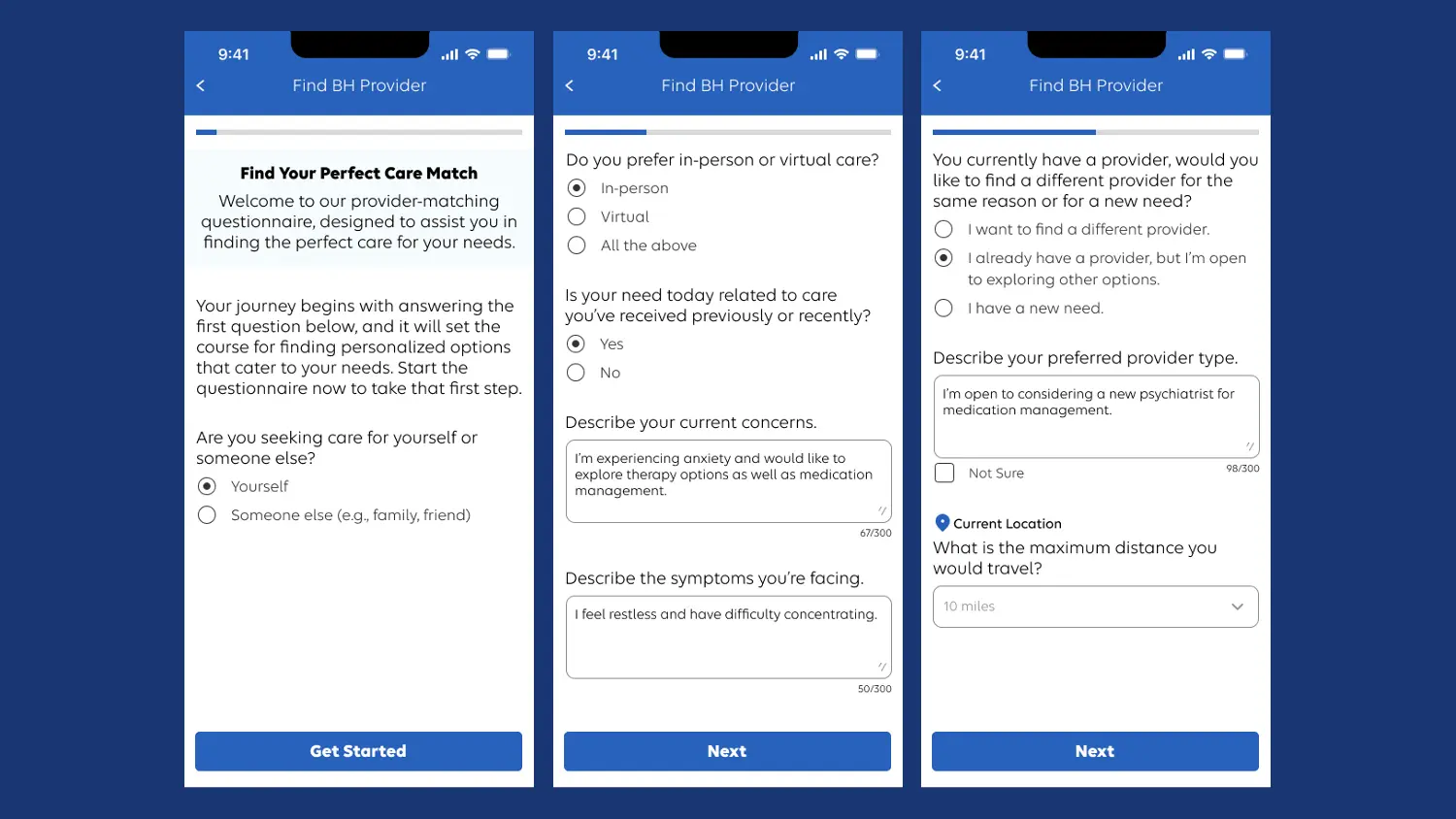
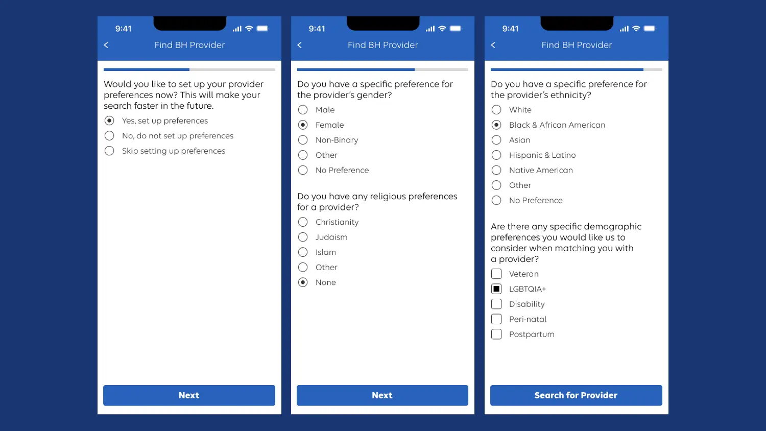
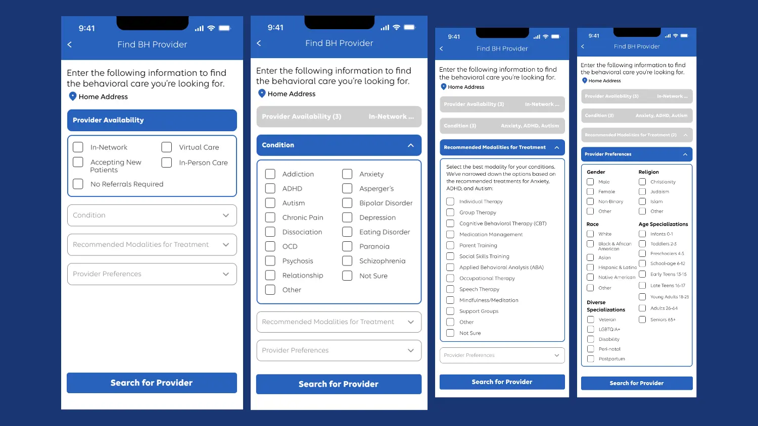
Additionally, I've designed four interaction approaches tailored to the process of locating a BH provider: a chatbot, an open-search, a questionnaire, and a dropdown and search feature, as well as an open search. To add a supplementary touch, I've also designed a provider bio screen.
Evaluate 💬
With the completion of the BH landing page, diverse user flows, and an array of approaches for locating a BH provider, we transition to the Evaluate stage. Here, the focus is on gathering feedback that will facilitate the refinement of the designs.
This pivotal phase allows for insights from stakeholders, experienced employees within the company, and participants with BH needs, fostering an iterative process of improvement. By incorporating valuable feedback, I am positioned to make informed revisions that elevate the overall user experience.
Evaluate Stage
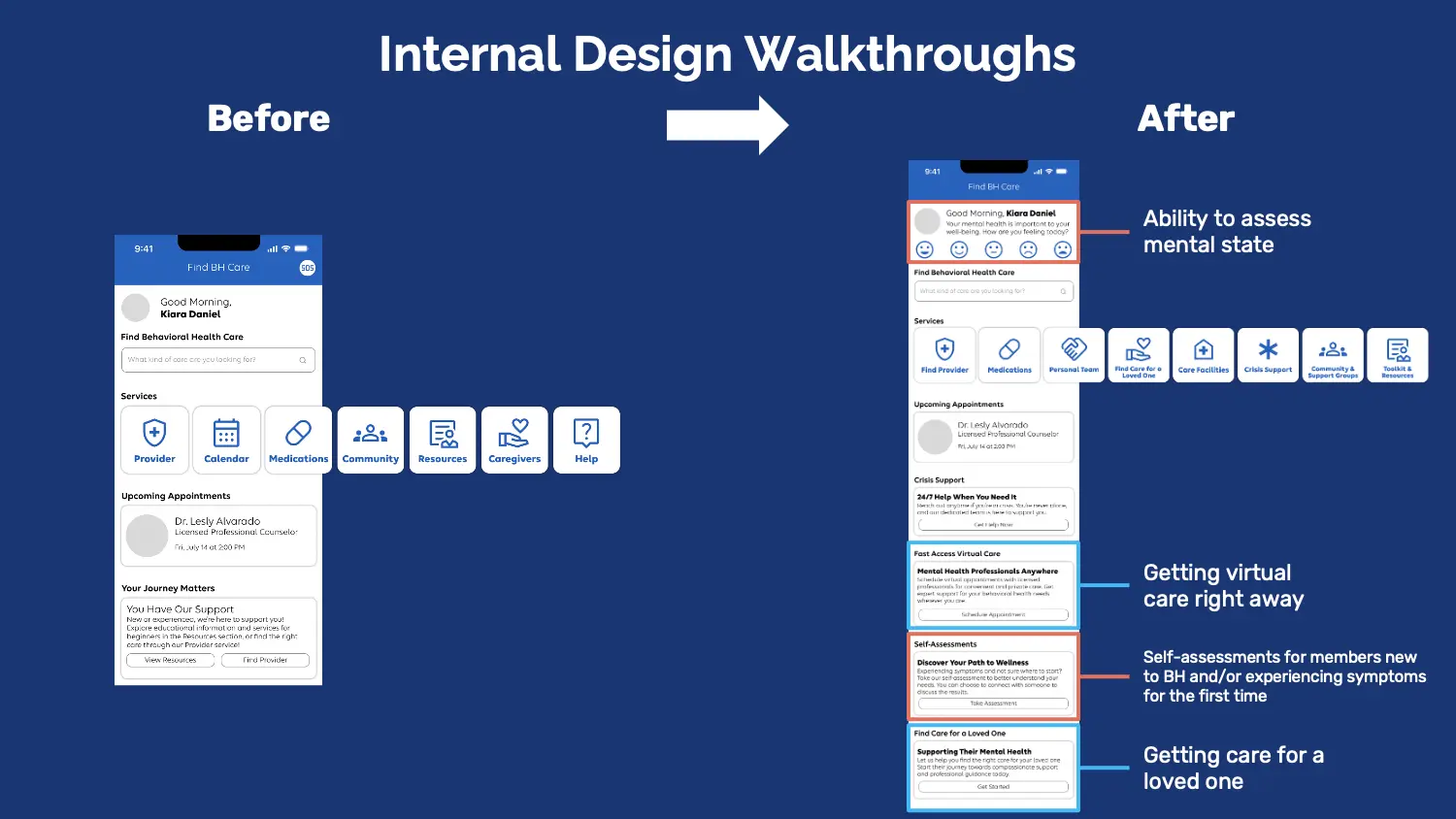
Four Sessions of Internal Design Walkthroughs
To initiate the feedback collection, I conducted four rounds of design walkthroughs involving a total of 10 company employees. In line with privacy considerations, the names of participating employees won't be disclosed; however, I can outline their roles and backgrounds.
The initial session engaged members of the CXO behavioral health team, initiating a comprehensive review. Subsequently, I had a session with individuals who could offer valuable personal behavioral health insights. This included a member whose family was currently facing a BH situation, their case manager, the administrator of peer support programs, and a clinical social worker. For the third session, I engaged two Subject Matter Experts (SMEs) well-versed in Substance Use Disorder (SUD) and Severe Mental Illness (SMI). Lastly, I connected with an individual experienced in the pharmacy sector.
The culmination of these four diverse sessions, encompassing a range of roles and expertise, yielded invaluable feedback. This feedback stands to enhance the designs in alignment with the experience principle of meeting the member where they are.
After the Internal Design Walkthroughs
To demonstrate the impact of our internal design walkthroughs, let's examine the before-and-after comparison of the landing page, highlighting the implemented changes.
Internal Design Walkthroughs - Before Versus After of BH Landing Page
On the right screen, we've included a feature for members to evaluate their mental state. This promotes self-reflection and mental health awareness. We've also integrated direct access to Live Health Online, enabling quick engagement with care services. The incorporation of self-assessments provides guidance for those new to behavioral health or experiencing symptoms for the first time. The page now also supports those seeking care for loved ones, reflecting diverse user needs.
Dscout Study
Building on the internal design walkthroughs, I partnered with my project manager, Suzanne Currie, to run the Find & Access BH Care Study. This encompassed comprehensive tasks, including study planning, plan review, the creation of a recruiting screener, and ultimately launching and conducting the study.
Dscout Screener
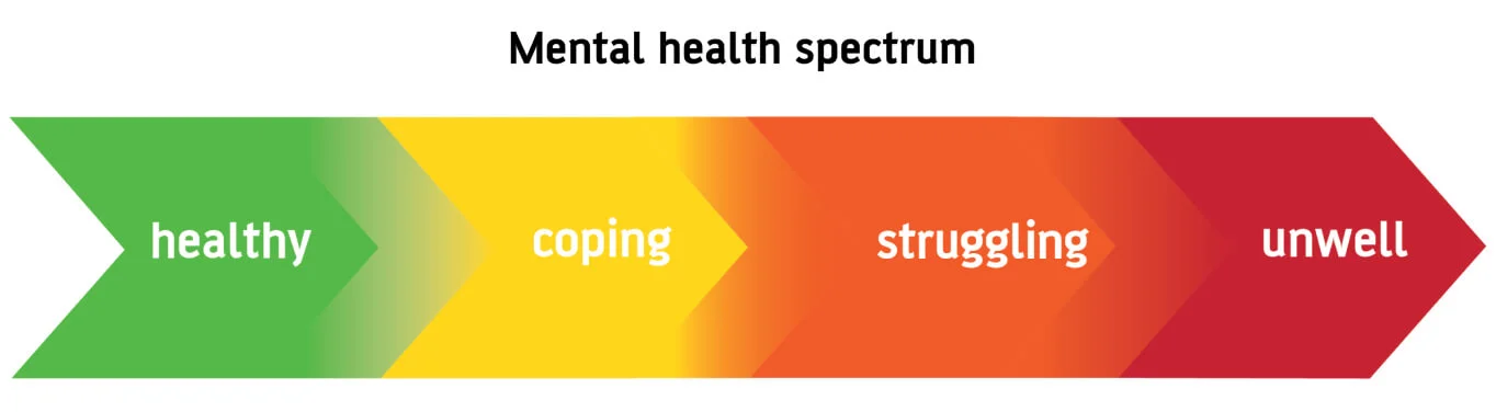
In designing our participant screener, we formulated twenty-three questions to determine the suitability of participants for our study. Additionally, participants were requested to contribute a concise 30-second video detailing their experience with accessing BH care. Furthermore, our recruitment strategy targeted the engagement of five participants spanning diverse acuity levels within the mental health spectrum.
Varying Acuity Levels of Behavioral Health
Running the Study
During this process of running the study, I had the opportunity of moderating four out of five one-hour sessions with participants via dscout.
Across these sessions, participants actively engaged in sharing feedback encompassing various facets. They provided insights on the BH landing page, offered perspectives on the array of user flows via various scenarios, and contributed opinions on the four interaction approaches tailored for finding a BH provider. Beyond this, participants shared valuable information about their individual behavioral health journeys and their mental model of what a behavioral health app consists of.
Subsequently, I utilized the insights garnered from these sessions to construct affinity maps, which involved grouping similar information together. This method helped distill the collective feedback and identify recurring themes. It's important to note that, due to the constraints of non-disclosure agreements (NDA), the affinity maps and certain specific findings cannot be disclosed. These affinity maps also served as a foundational tool for guiding the revisions of the experience design concepts. They provided a structured understanding of participant preferences, enabling me to pinpoint key areas for improvement.
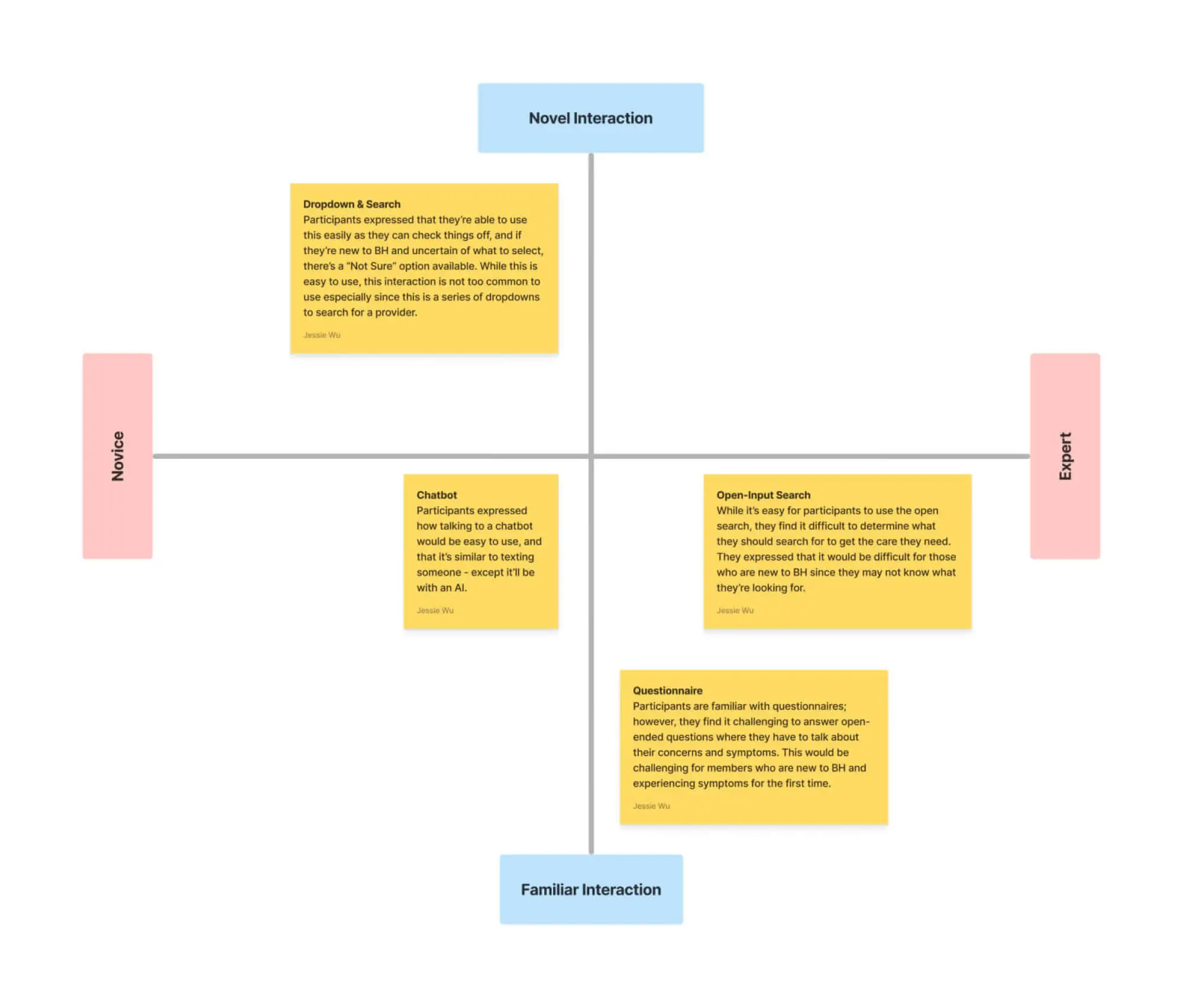
Notably, the sessions unveiled the participants' preferred interaction approaches for locating a BH provider, aiding in refining the concepts moving forward.
Preferred Concept to Finding BH Provider
From the evaluation, it became evident that among the four interaction approaches, the dropdown and search method garnered the preference of four out of five participants. This preference stemmed from its comprehensive and personalized nature. The approach's adaptability to individual needs, coupled with its intuitive checklist-like functionality, contributed to its perceived ease of use.
Winning Concept of Finding BH Provider
Conversely, the other interaction concepts didn't align with preferences. This stemmed from their lack of suitability for individuals new to BH care and their potential challenges when seeking swift assistance during a crisis or under certain BH conditions/situations.
To better visualize the comparative effectiveness of these interaction approaches, a 2x2 matrix was devised. This matrix serves to visually map participants' experiences based on contrasting attributes. The matrix values encompass "novice to expert" and "novel interaction to familiar interaction."
2x2 Matrix
"Novice to expert" indicates the level of familiarity or expertise a participant requires in BH to effectively employ a particular interaction approach. On the other hand, "novel to familiar interaction" gauges how common a user's past interaction with a similar approach impacts its ease of use.
Modify 🔨
In the Modify stage, I utilized feedback and insights gathered from the Evaluate stage to refine and enhance the design concepts for optimal user experiences.
Modify Stage
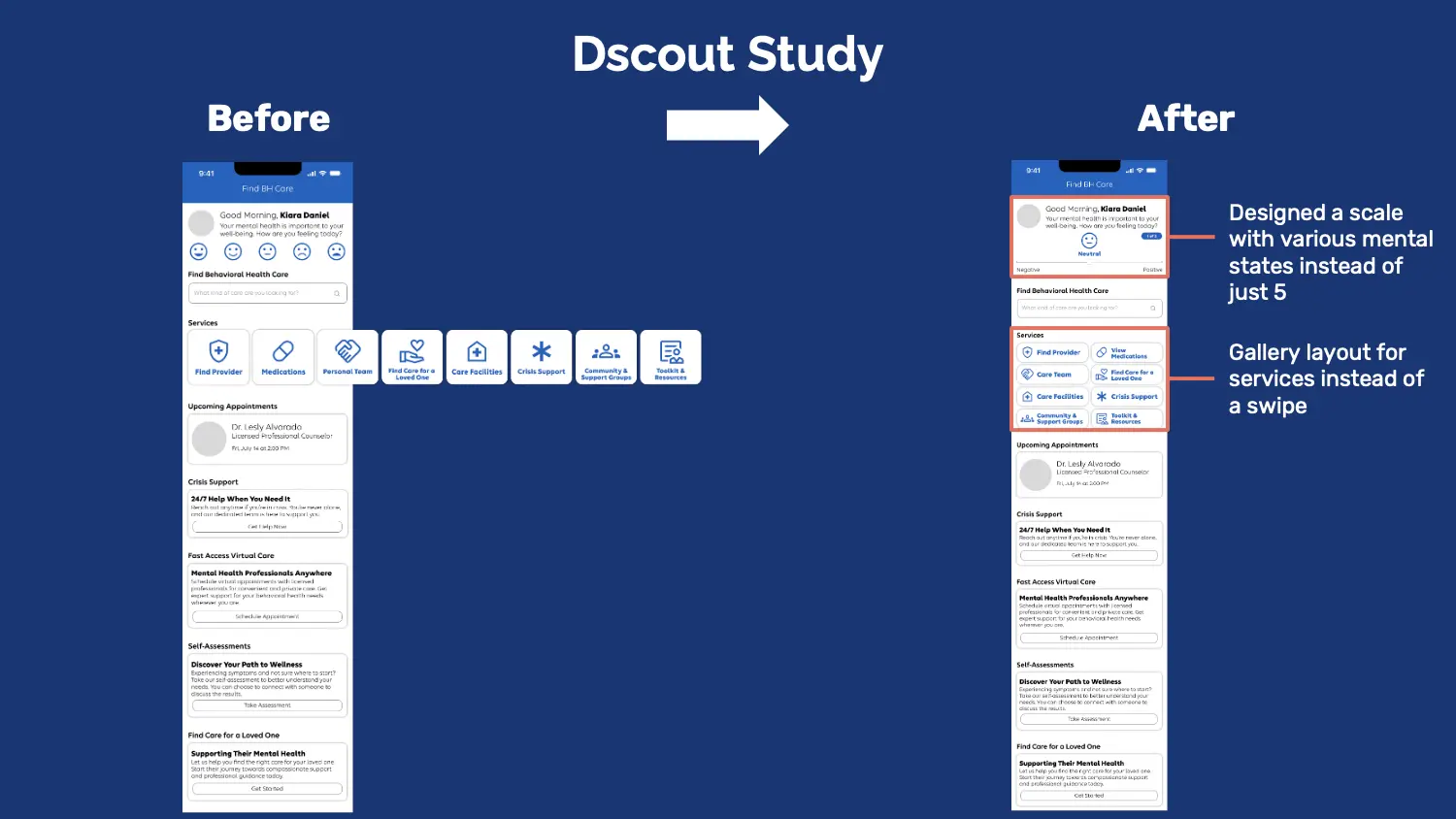
To illustrate the effectiveness of the dscout study and design walkthroughs, let's delve into a before-and-after comparison of the landing page, spotlighting the incorporated enhancements.
Dscout Study - Before Versus After of BH Landing Page
Now, the screen on the right represents the current finalized iteration of the BH landing page. With the dscout walkthroughs, two significant modifications were implemented on the landing page. Let's delve into these changes.
The first involves the introduction of a spectrum featuring a broader range of mental health states, replacing the previous limited scale. Furthermore, the layout for services has been transformed into a gallery format, moving away from the swipe-based design.
I'll now delve into the underlying reasoning behind these adjustments and provide an in-depth explanation for each change. It's important to note that, in accordance with the non-disclosure agreement, I'm unable to include direct quotes from the participants to substantiate these changes. Nonetheless, these alterations were rooted in the evidence from the study.
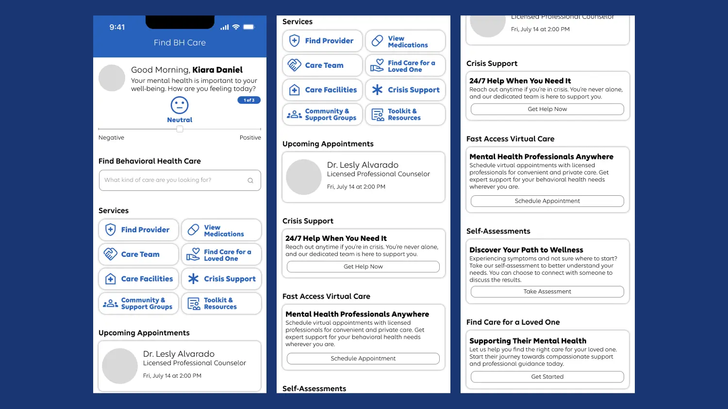
Final BH Landing Page Iteration
Dscout Study Finding - Services
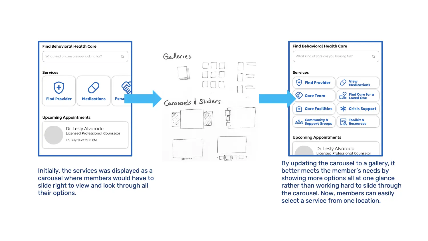
Originally, the services were presented in a carousel/slider format, requiring members to slide right to explore all available options. However, through conversations with participants, it became evident that this sliding action demanded extra effort and time to access desired options. Consequently, I updated the carousel/slider to a gallery layout that aligns more closely with member preferences. This adjustment efficiently caters to member needs by displaying a wider array of options in a single location, eliminating the need for extensive sliding. Now, members can effortlessly select desired services from a consolidated display.
Dscout Study Finding - Services
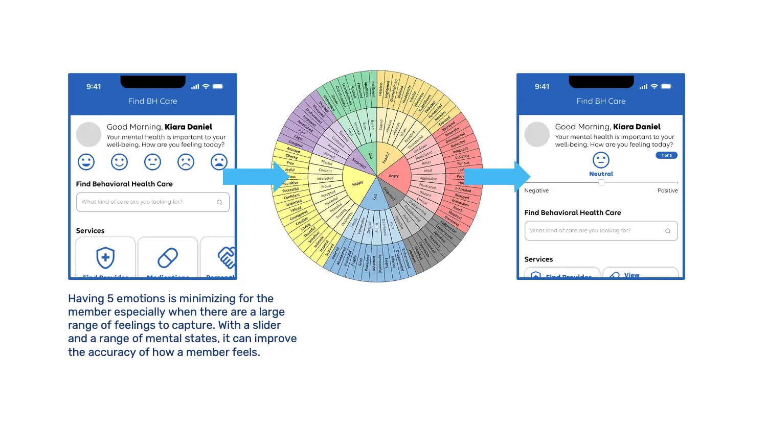
Dscout Study Finding - Mental States
Moving on to the next substantial alteration, we've focused on the aspect where members can engage in check-ins and designate their mental states. Originally, offering a choice of merely five emotions proved to be limiting. This led to me discovering a comprehensive wheel encompassing numerous words to accurately capture the diverse range of emotions individuals experience.
Acknowledging this intricate spectrum of feelings, the design transitioned to a slider format. This change, in contrast to the initial five options, better aligns with the intricate emotional landscape. It empowers members to indicate a wider span of mental states, consequently enhancing the precision with which they can express how they feel.
Dscout Study Finding - Mental States
Dscout Study Finding - Personalization
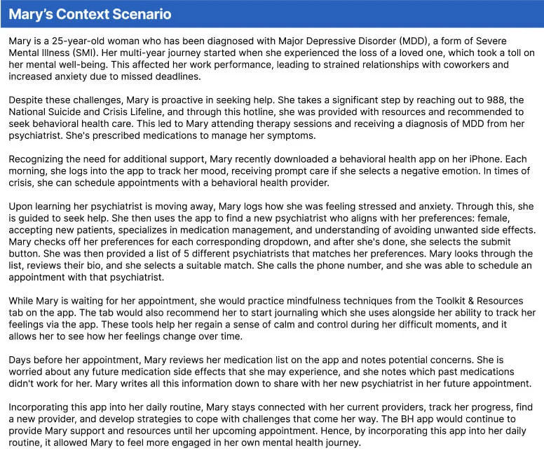
As the design concepts reached their culmination, I took a step further to provide a tangible depiction of the BH app's utilization. Through the creation of a context scenario featuring Mary, a fictional character, I aimed to offer a clear illustration of how individuals like her would navigate the app. This narrative became one of my final contributions during this internship, and its focus on Mary's journey underscores the need for the BH app to offer a personalized experience.
Mary's Context Scenario
The insights gained through the dscout study emphasized a key finding: personalization is paramount. The scenario not only highlights how the app can be tailored to Mary's unique needs but also accentuates the broader importance of personalization in enhancing users' overall experiences.
Conclusion 🏁
As the internship concludes, I take pride in the impact I've achieved through my contributions. While the specifics remain confidential, I'm gratified to have provided valuable CX recommendations that guide Elevance Health in enhancing the existing BH member experiences. This marks the culmination of my internship journey.
Key Takeaways 🔑
Looking back, this summer has been a tremendous learning journey and opportunity, filled with valuable insights. Here are some of the key takeaways:
I came to appreciate the significance of low-fidelity designs. These designs taught me the value of embracing imperfection and being open to sharing work in progress, which in turn facilitated swift adjustments when needed.
I learned how important teamwork and collaboration truly is, particularly in achieving alignment across different parts of the project. Working collectively, I was able to gain diverse perspectives and insights to ensure a cohesive and effective approach.
I gained a profound understanding of the interdependence between research and design. A strong design foundation relies on thorough research, and intriguingly, designs can even serve as research tools—an aspect that truly fascinated me.
The most effective researchers are the ones who have empathy. The ability to connect with participants on a human level allowed me to gain insights but also enriched the depth of our understanding, ultimately shaping more impactful solutions.
Equally important, I discovered the joy of networking. Connecting with others not only broadened my horizons but also contributed to my personal growth. While honing research and design skills is vital, I found that forging connections and fostering relationships holds its own unique power.