Good Sh*t is a gut health tracker that informs users about their bowel movements.
Project Overview 📝
Good Sh*t is an iOS mobile prototype geared toward providing a way to log bowel movements, point out patterns to the user, as well as giving the user unbiased/reliable information and tips about their gut health. In collaboration with three other team members, this project was created using a design process called Lean UX, and we were able to create a gut health tracking application. In order to assist us in identifying and meeting the goals of our users and addressing business needs, Good Sh*t is guided by the following objectives:
Create and design an effective gut health tracker
Integrate health tracking with informational resources
Incorporate doctor consultations for users to learn and assess their gut health
Inform and educate users about their gut health as they log their bowel movements
Role
Research, User Interface, Interaction
Approach
Lean UX
Tools
Figma, FigJam, Canva, Photoshop
Project Duration
8 Weeks (October - December 2022)
Introduction: How it All Started 👋
For my class project in the fall of 2022, I worked alongside 3 other team members to design Good Sh*t. We were assigned a project where we had to create an app prototype utilizing the Lean UX approach. However, in order to do so, we needed to pick a topic for this app. My team and I felt that having bowel movements is a topic that is not commonly discussed, and due to that, we do not know a lot of information on our gut health. Consequently, we wanted to create an app that tracks and informs a users’ gut health, and with all of us expressing interest in this idea, we decided to create this project over the course of 8 weeks. Hence, this process page will be structured based on the sprints, and how with it, we created a gut tracking app utilizing the Lean UX methodology.
Janice Kim
Researcher/Designer
Jordan Scavo
Researcher/Designer
Jenny Trejo
Researcher/Designer
Jessie Wu
Researcher/Designer
Our Approach: Lean UX 💡
For this project, we utilized the Lean UX approach, which is a framework that combines UX, Lean, and Scrum methodologies. UX is focusing on the user and how they interact with a product. With Lean, it is a start-up methodology where its primary goal is to reduce waste and improve efficiency. Then, Scrum is a subset of Agile, which is an iterative approach that divides the work into phases. With Scrum, it ensures the team stays aligned through a series of meetings to complete the project. While Lean UX does combine these principles, it is a design methodology based on assumptions. This means making assumptions, testing those assumptions, and measuring it.
The Lean UX process takes a project and divides it into sprints. Due to the duration of our class, we completed this project over two 3-week sprints, and throughout it, we made assumptions, validated and measured them, conducted research, and tested our prototype for usability.
Lean UX Combines UX, Lean, and Scrum Methodologies
Starting Our Sprints 🎬
A sprint is a timed approach that is laid out for a team to accomplish set goals, deadlines, and ending with a reflection based on previous iterations to improve in the next sprint. Due to how our project was divided into two 3-week sprints, each design week set us on track to complete specific tasks that were unique to each week. By the end of each sprint, our goal was to have a Minimum Viable Product (MVP), that we could show to users to get feedback from. In otherwords, this allowed us to create low-fidelity prototypes for user research and usability testing, and we would be able to test out our assumptions. Furthermore, it would save us time and effort by testing out bold decisions early before refining our product. Throughout these sprints, our team would meet every two days where stand-ups were completed. This allowed each team member to discuss their progress, challenges, successes, and plans of their work until the next stand-up meeting.
Sprint 1: Design Week 0 🤔
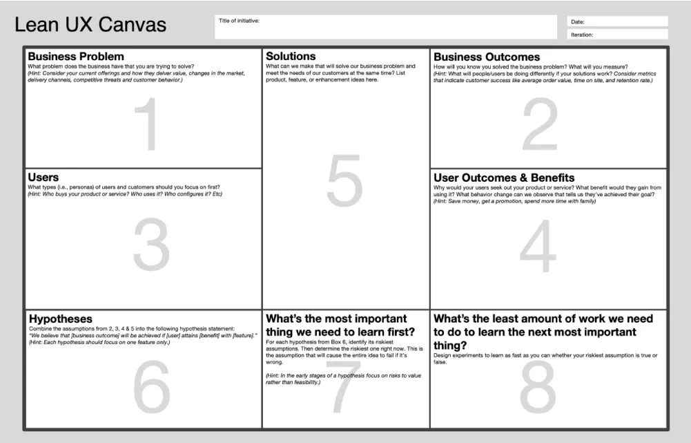
For Design Week 0, we started our project with the Lean UX Canvas. While this step doesn't always occur, it provides designers a week to create a layout before sprints begin. This allows them to get into the process of building, testing, and measuring our assumptions.
According to Gothelf and Seiden, the writers of Lean UX: Designing Great Products with Agile Teams, the Lean UX canvas is a set of exercises which enables a team to declare what their assumptions are about a product, and it allows them to determine the current state of the product to its desired future (33-35). Using this canvas, it helped our team build a foundation of assumptions for our product, and it will give us a sense of direction that will soon be validated in the future.
The Lean UX Canvas
Lean UX Canvas 1: Business Problem
The first step in the canvas is to determine our product problem statement. To do so this, we had to make assumptions as to how the company, Good Sh*t, would work. This allowed us to determine a vision for the product, pinpoint the domain we are working in, identify the current state of health tracking apps, how these current apps have failed, how we can address this gap with our product, and who our target audience might be.
Product Problem Statement
The current state of lifestyle and productivity in health has focused primarily on achieving and improving the user’s personal goals. What existing products/services fail to address is informing the user why their health is in its current state and possible health risks. Our product/service will address this gap by providing the standard gut health through informing instead of problem solving. Our initial focus will be health conscious people. We'll know we are successful when we see user activity remaining consistent or increasing.
Lean UX Canvas 2: Business Outcomes
Next, we identified our success metrics. We did this by determining what our impact metrics and outcomes would be. This meant making assumptions to how the product would work. As a team, we completed an “outcome-to-impact mapping” exercise where we made assumptions about how we will know if our designs are “successful”. To be specific, this means first determining what business-oriented impact metrics we might have (e.g., profitability, growth, customer satisfaction, customer acquisition and/or retention). Next, our goal was to figure out the kind of behaviors that we can observe/measure which will indicate if we were going to achieve our impact goal.
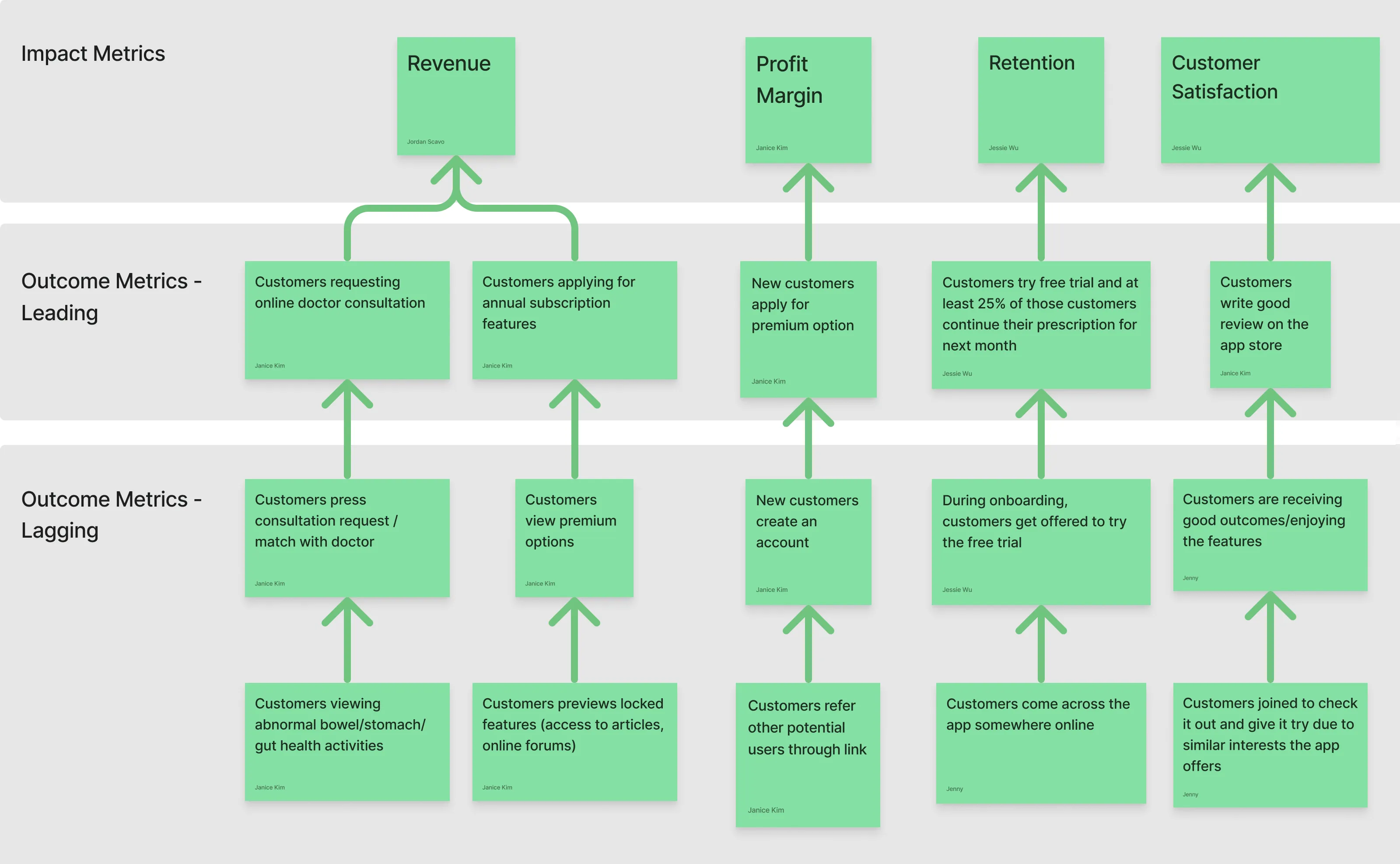
Our Metrics 📏
During this step, we determined the first (lagging) and second (leading) order metrics to determine how it may lead to those business-oriented impact metrics that we would hope to achieve with our product. For instance, we determined that to gain Revenue from the app, customers would apply for our annual subscription features and/or request online doctor consultations.
Lean UX Canvas 3: Users
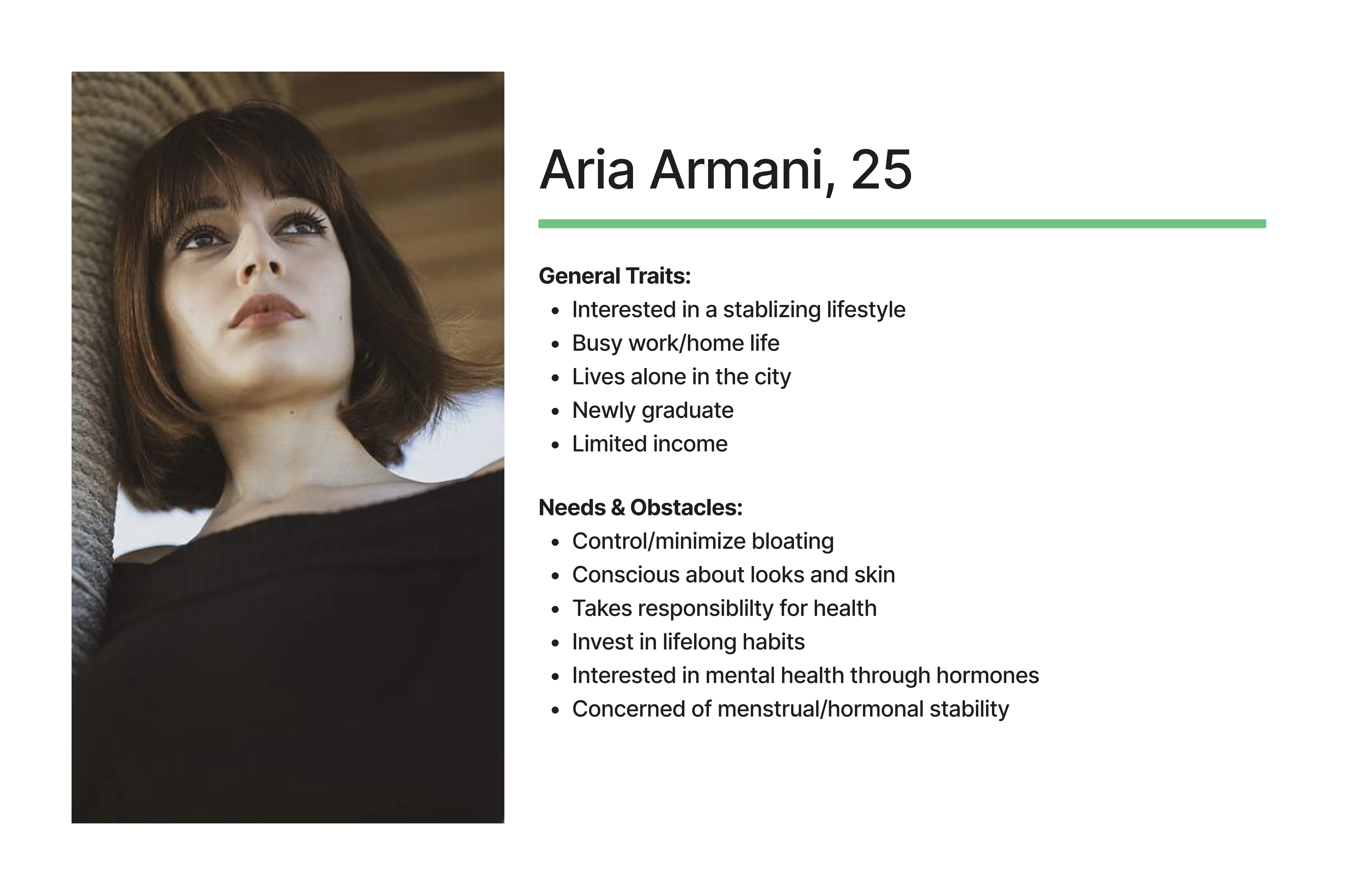
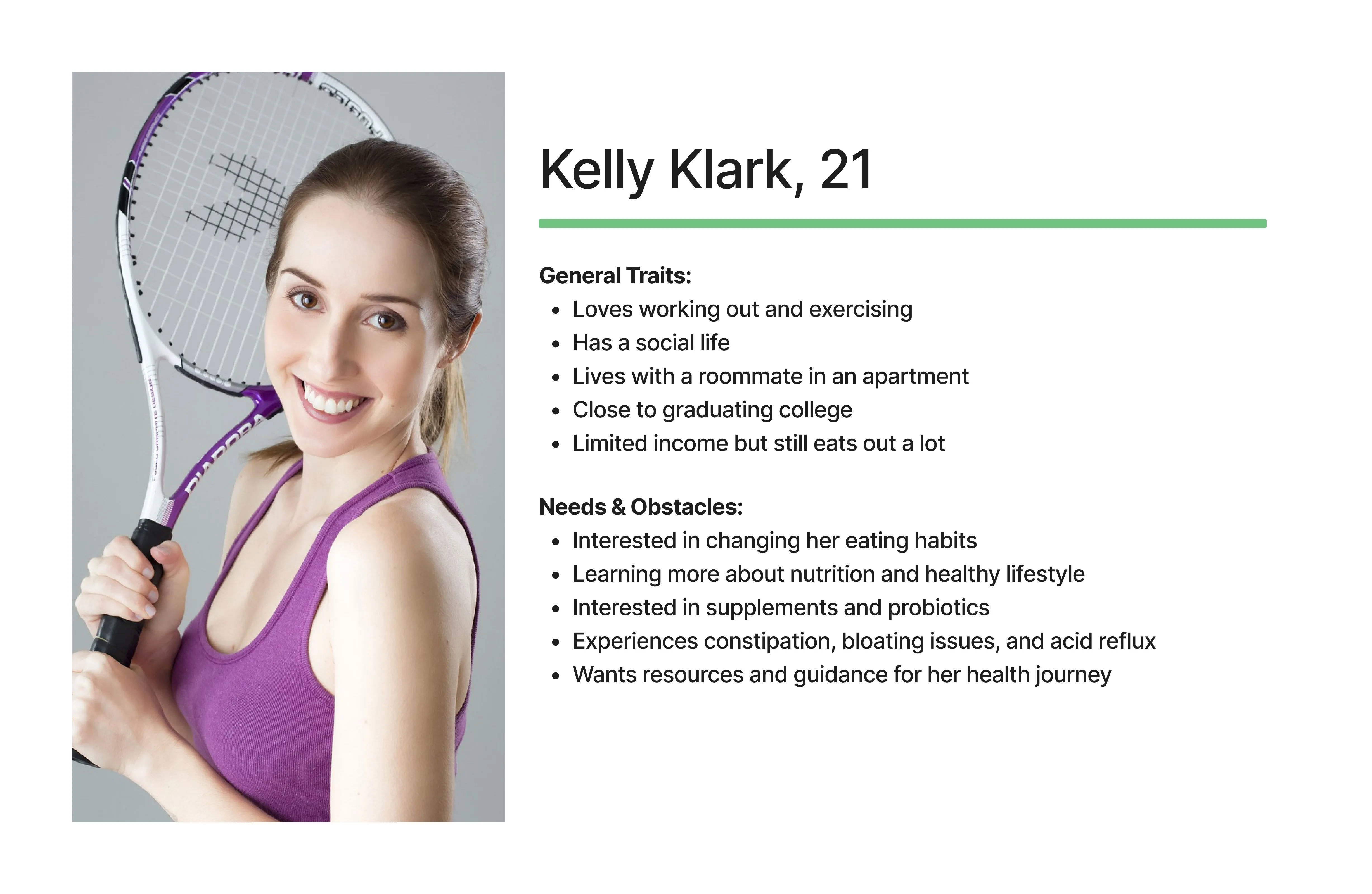
Afterwards, we needed to determine the types of users and customers we should focus on. During this stage, we created 2 proto-persona, which is a persona that is based on the team’s collective assumptions, of who will use our product. However, these proto-personas were created without much research/evidence, and they are subject to change as we gain more knowledge. Essentially, they are living documents that lists the user’s goals and needs, and they will continue to change throughout the course of our research.
Our Initial Proto-Personas
Lean UX Canvas 4: User Outcomes & Benefits
Once we established who our users will be, we determined why they would want to seek out this app. This will give us an idea of what our users will hope to gain from our product, and we identified behaviors that would help indicate whether or not they achieved their goal. The following are some examples of how we did this:
What is the user trying to accomplish?
Users want to understand their gut health and how to care for it. They want to feel knowledgeable and comfortable with their body.
Why would your user seek out your product?
Users will seek out our product to learn more and observe their gut health. They will be able to access information and input their bowel movements.
Lean UX Canvas 5: Solutions
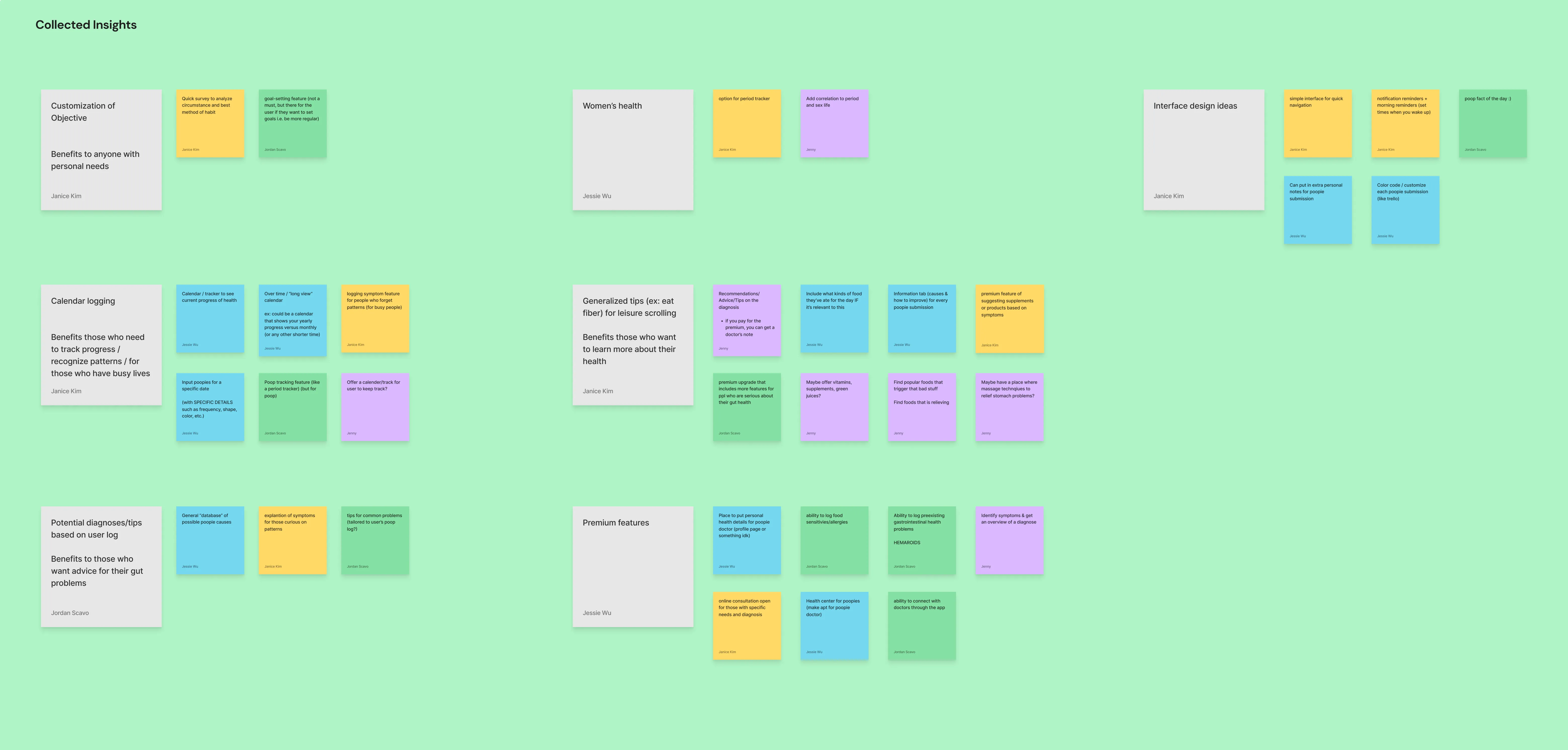
Now that we identified the problem statement, determined our users, and what our users hope to gain out of this product, we are seeking solutions for them. To do this, each of us wrote solutions on sticky notes in FigJam, and we looked for patterns between them. Ideas that were similar would soon be grouped together. While these are all assumptions, we brainstormed solutions that could potentially serve our proto-persona and create the desired outcome for our app.
Thinking of Solutions 🧠
While looking at the information we had, we thought of some solutions and saw patterns amongst our sticky notes. For example, some of our clusters consist of: calendar logging, potential diagnoses/tips for users, customization features, and more.
Lean UX Canvas 6: Hypotheses
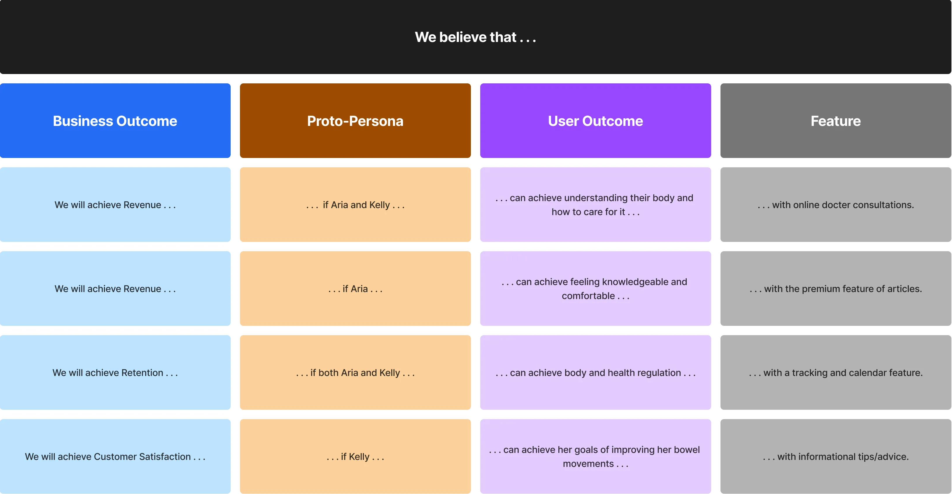
We would now take all of our assumptions from the previous steps to create hypotheses that make sense. While these will not be accurate, we can make them accurate over time. This is to help us test assumptions. We can turn these hypotheses statements into a product backlog, which is a list of features we would add to our project, that will help us determine what we need to do.
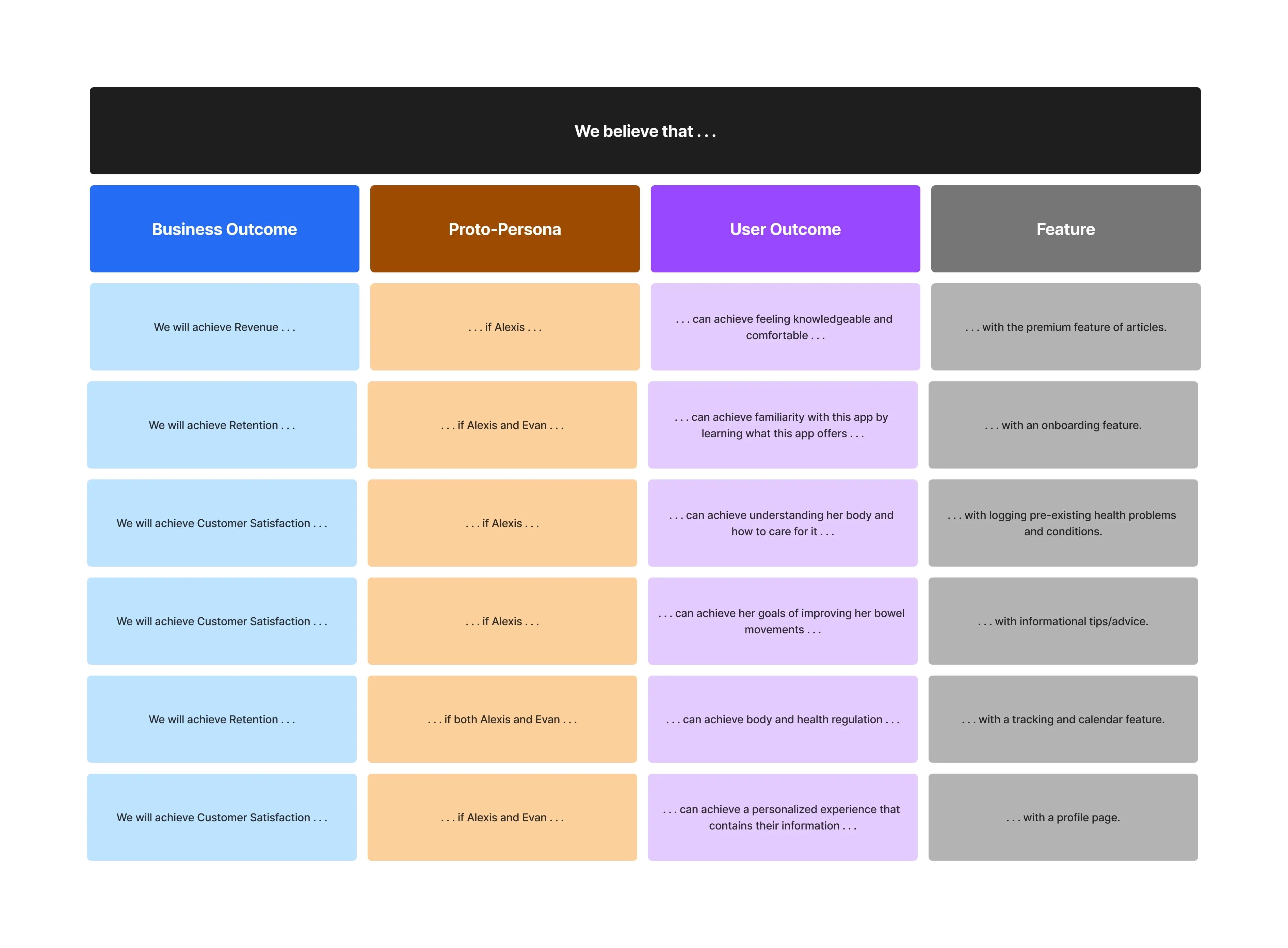
Creating Hypotheses Statements 🔨
For instance, we essentially used the following structure: We believe that [business outcome] will be achieved if [proto-persona] can achieve [a desired user outcome] with [this feature].
To help visualize this, I included an image of what some of our statements look like.
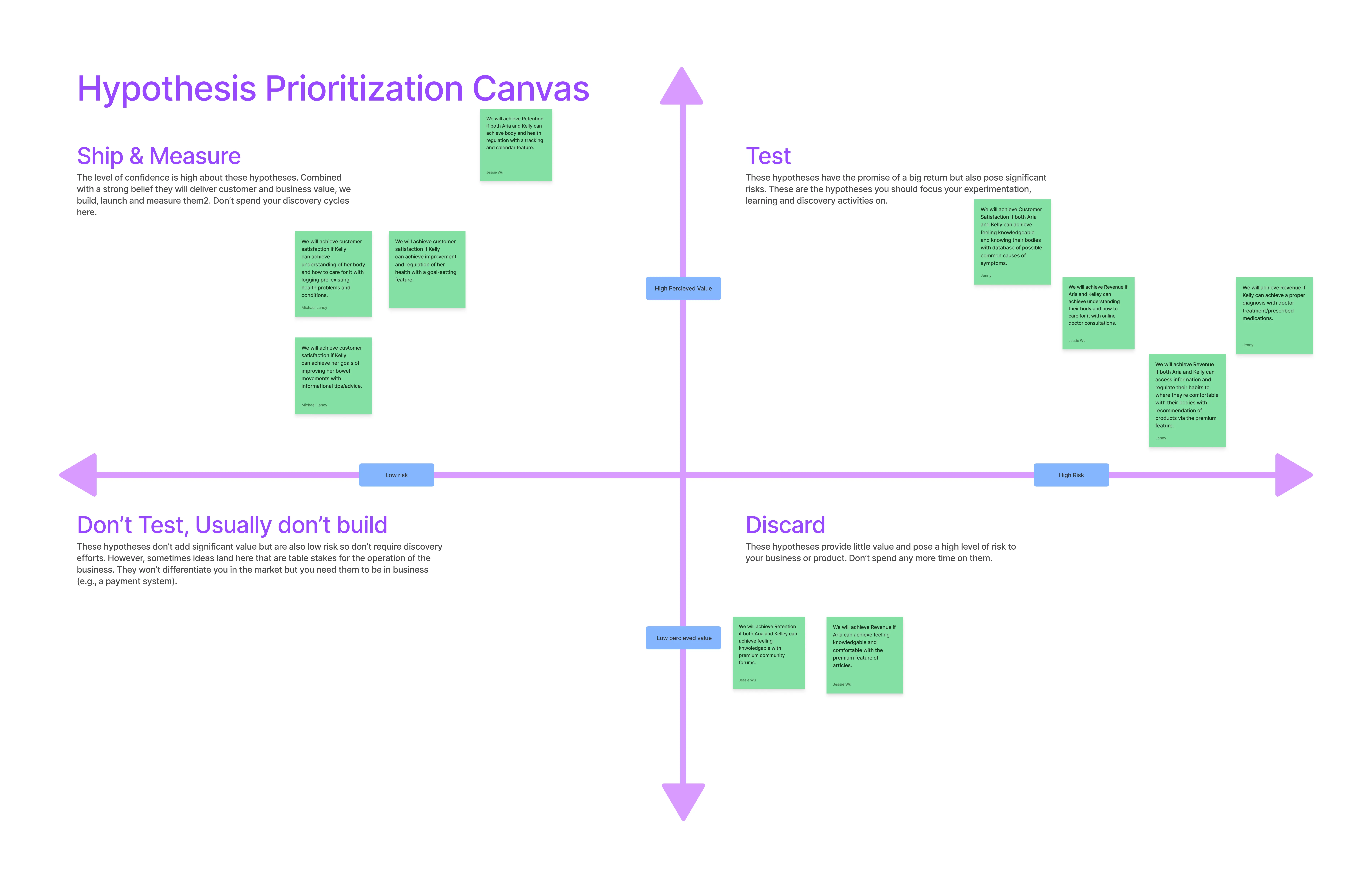
After we created our hypotheses table, we mapped each hypothesis based on how risky they are with a hypothesis prioritization canvas. This allowed us to assess which features we felt like should be prioritized with its associated risk.
Our Hypothesis Prioritization Canvas
Lean UX Canvas 7: What do we need to learn first?
Afterwards, we took our hypothesis statements, and we prioritized them based on most to least amount of risk and value. This was important to identify the riskiest hypothesis statements because it would determine which ones we needed to work and learn about first.
Prioritizing Our Hypotheses 💭
An example of prioritizing our hypotheses was how we felt that the riskiest feature to implement into the app was our users receiving doctor treatment and prescribed medications.
We felt that it might be risky because it will be difficult to get involvement/permission from doctors as well as complications with insurance. There is also a greater liability with treatments and prescriptions involved.
Lean UX Canvas 8: MVPs and Experiments
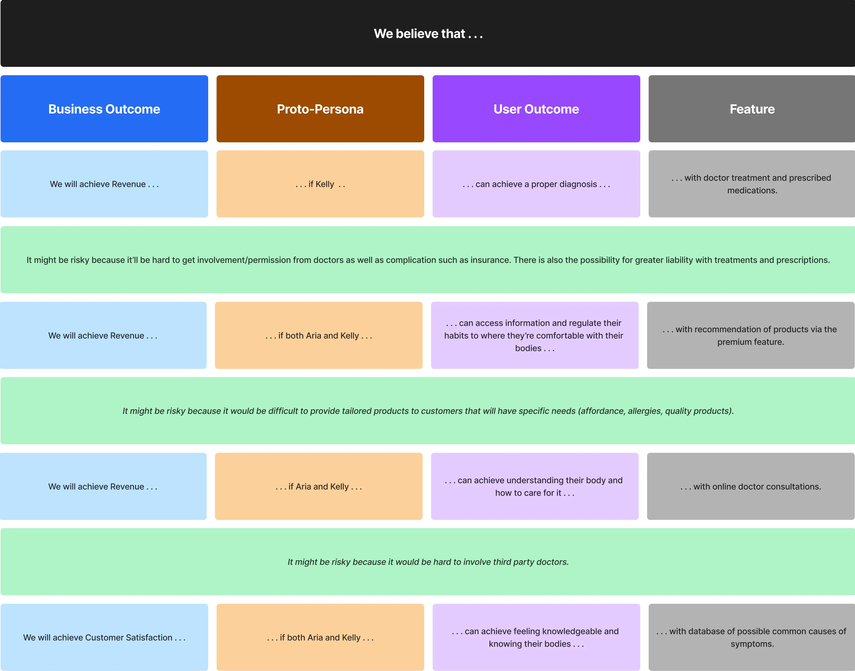
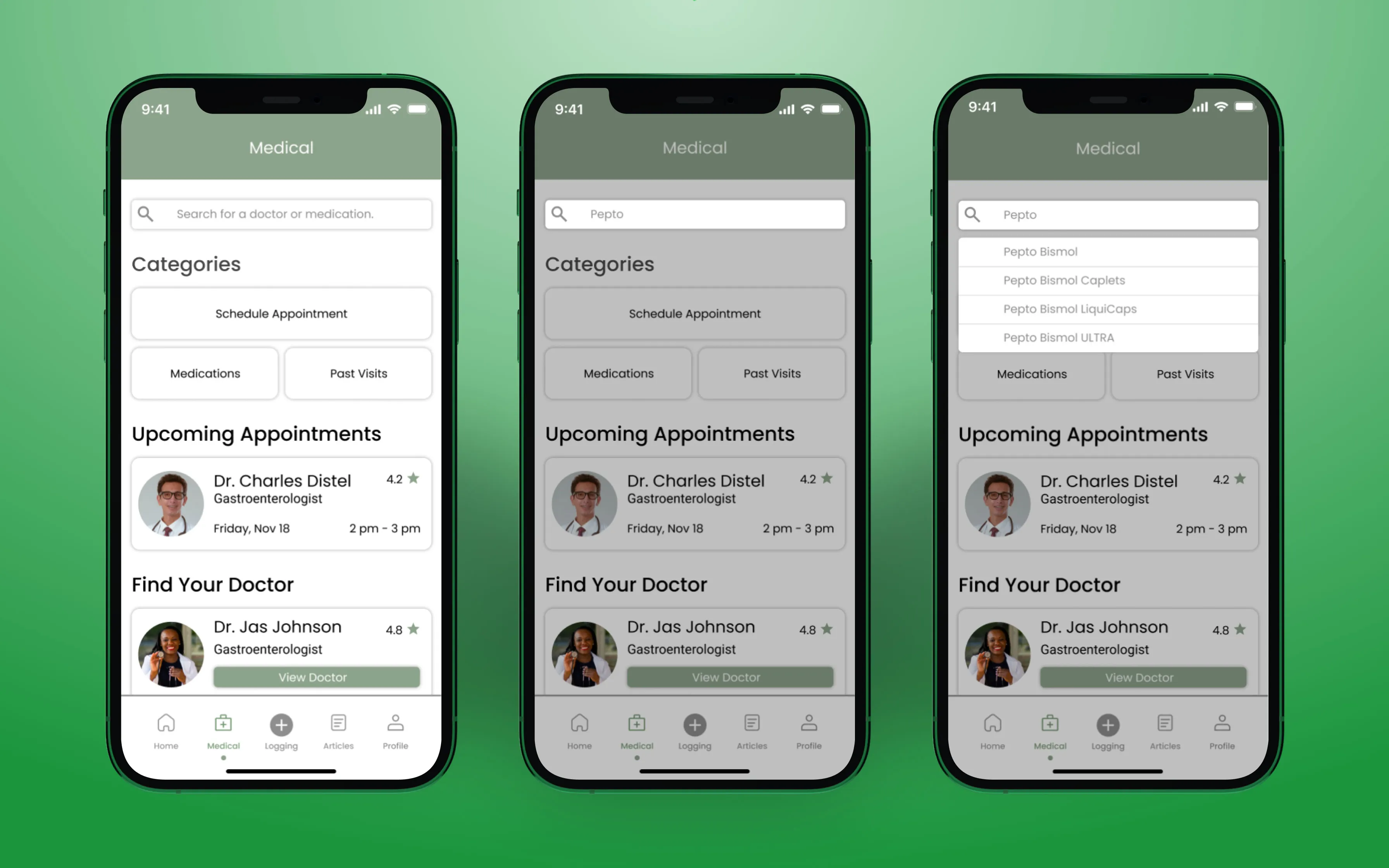
Now, with our hypotheses, we need to create Minimum Viable Products (MVPs). MVPs are experiments to learn a particular thing, and it’s the least amount of work that we need to do to learn that thing and move forward. During this step, we had to figure out some potential design experiments that we can use to learn fast whether or not our riskiest assumptions would work. Thus, for each hypothesis, we would state what we would design and how we will test it. For instance, with allowing our users to receive doctor treatment and prescribed medications, we determined that we should create a doctor consultation tab that contains: schedule an appointment, view past prescriptions/treatments, and past visits (including documentation from the appointment). We would measure the success of this feature by the users’ activity on these sets of screens.
Sprint 1 Backlog
With the completion of our product backlog, we narrowed down our focus and selected several hypothesis statements from it. We selected these based on the risk, value, and whether or not it was feasible to create within our timeline. These statements would then form our sprint backlog, which will determine what we will be working on for our first sprint.
Our Sprint 1 Backlog
After the Sprint 1 backlog was set, my team and I delegated each other various tasks to complete from it. I took on the doctor consultation feature which includes the medical screen, scheduling, and editing an appointment with a doctor. However, we also had doctor treatment and prescribed medication, so my team member decided to work on that feature. We took into consideration that our two features are likely to overlap, so we built our screens to accommodate it.
Sprint 1: Design Week 1 🏃♀️
For Week 1 of our first sprint, we started off our 2-day stand-ups—which are done every second day in a week. Stand-ups are 15-minute meetings in which each team member updates the status of their work and any obstacles they encounter. By having these meetings, they kept our team aligned and set expectations for the next meeting. For instance, in our first meeting, we started by creating low-fidelity wireframes of our app in Figma. The wireframing was divided amongst the team for each feature from the sprint backlog, and I designed the doctor consultation and appointment schedule screens. Another team member, however, would take the view medications and past visits screen, as our screens overlapped.
Conducting User Interviews
For each design week, we conducted 3 interviews. This is to help us understand our users’ needs, and it enable us to test out our assumptions with our MVPs, which for this week, was our low-fidelity wireframes. To do this, I prepared the interview script which included questions aimed at gaining insight into our users’ gut health and interest in this topic. Once we gained a better understanding of them, we had our users test out our MVPs.
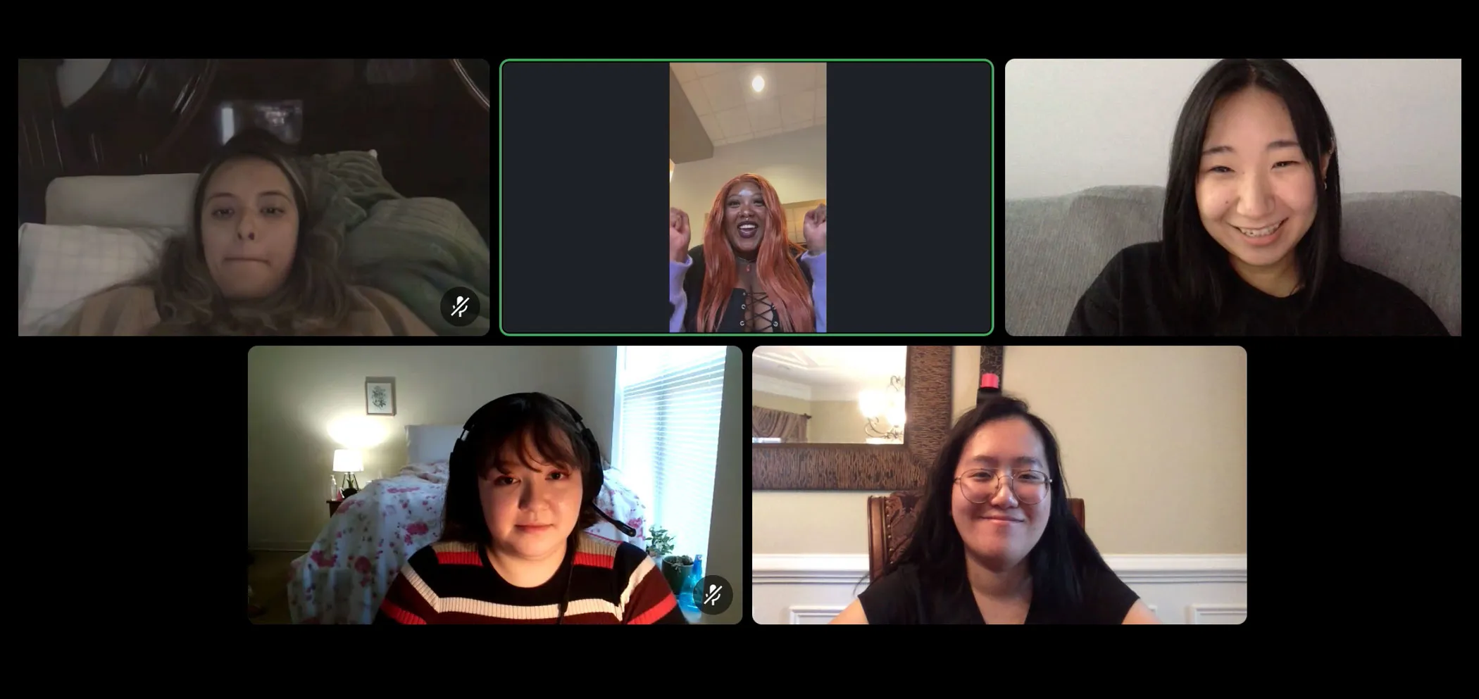
User Interviews via Discord
Affinity Maps
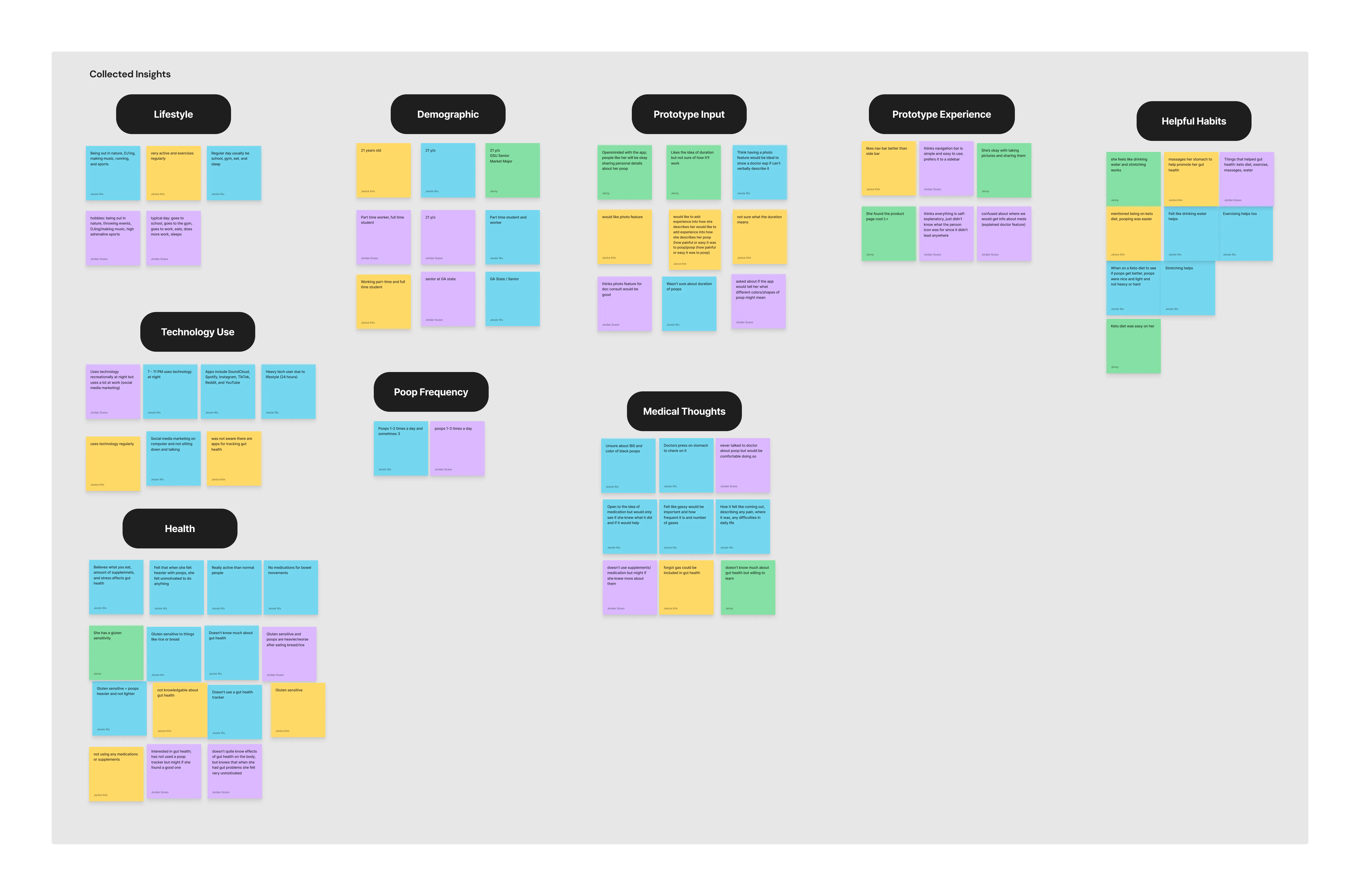
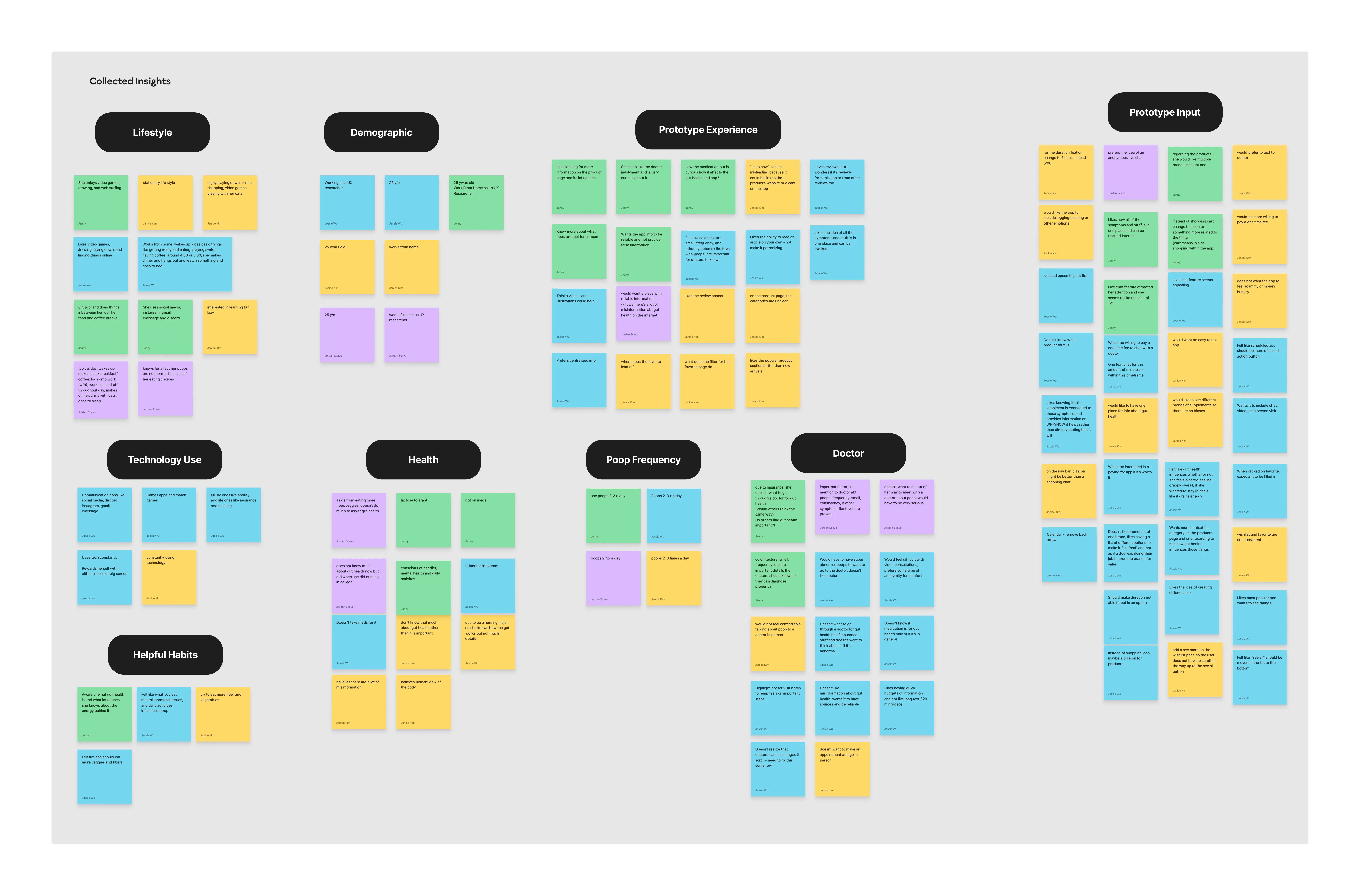
Following each interview, we would conduct affinity map sessions in FigJam. We would write down key characteristics, thoughts, observations, and or behaviors that we took away from that specific interview. When all of our team members are done, we viewed all of our sticky notes and made pairings of ones that were similar to each other. Eventually, we would have groups of sticky notes that all reflect the main points that we got from each participant. We then utilized these pairings to help guide us to make changes on our prototype. We learned that our users find it important for doctors to check their stool, information from the app needs to be from credible sources, and they would like to know why their stool looks the way it does.
Affinity Map from Participant #1
Affinity Map from Participant #3
Sprint 1: Design Week 2 🔎
As we modified and updated our wireframes, we wanted to primarily focus on usability testing. This is to ensure that before we move onto the next sprint, that the elements on our prototype for Sprint 1 are functional and if it aligns with our users’ mental model for the app. We reached out to one participant that we had from the previous week and two new participants. During these testing sessions, we gave our users the ability to roam around the app, and they would tell us their initial impressions and thoughts. We would base our questions based on their impressions, how they interacted with it, and what they liked/disliked. This information allowed us to test out our assumptions and if needed, it determined whether or not we should pivot from the direction we were heading.
Some Valuable Insights
Users would like to take photographs of their stool.
Illustrations and visuals help users describe their poop.
Users want to choose how they communicate with a doctor.
Important information from doctor notes should be highlighted.
Sprint 1: Retrospective Meeting 🤝
After the sprint and week, we held a retrospective meeting to discuss what went well, what issues we encountered, and how we can improve for our next sprint. During this meeting, we were able to be transparent with one another, and determine how to work even more effectively going forward (Gothelf & Seiden 133).
Areas of Improvement
Providing users with task-based scenarios helps guide them through the prototype.
Creating a consistent and standardized style guide early will save us time later on.
During stand-ups, determine and elaborate what each set of screens should include of.
Collaboration is key, continue to keep each other updated.
Starting Sprint 2 🎬
With Sprint 2, we followed a similar structure and approach to the previous sprint. However, with this sprint, we focused on designing a high-fidelity prototype that could be presented to our hypothetical stakeholders.
Sprint 2: Design Week 0 🤔
Design Week 0 focused on revalidating our product problem statement, proto-personas, product backlog, and creating a sprint backlog based on the research we conducted. Essentially, revalidation is reexamining the research done in Sprint 1 to determine if it is still valid.
Product Problem Statement
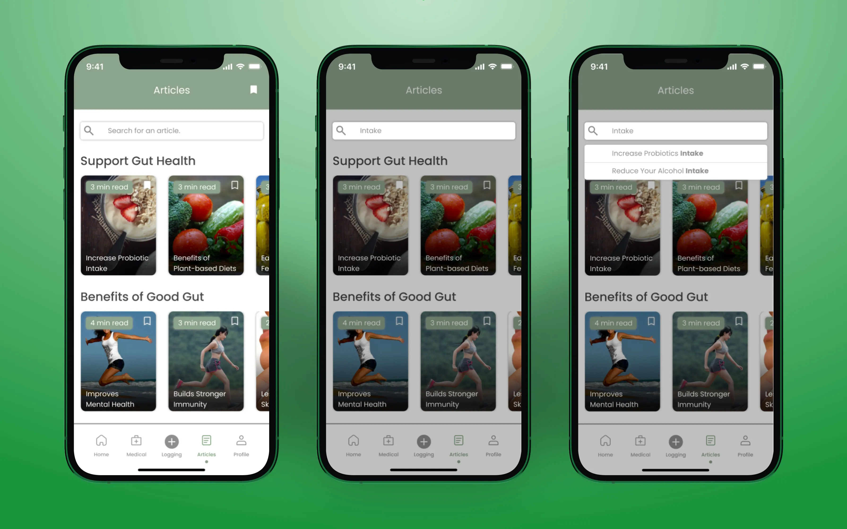
For our product problem statement, it changed drastically. We learned that while our users would like to track their stool, they also wanted to know why their stool is the way it is. This changed the course of our app to become more of an informational resource. Thus, we decided to focus on features such as including articles with credible sources.
Updated Product Problem Statement
The current state of the health and lifestyle domain has focused primarily on goal making and improving habits for people who are worried about their health. What existing products/services fail to address is explain why their gut health is the way it is. Our product/service will address this gap by providing a way to log bowel movements to point out patterns to the user, as well as giving the user unbiased/reliable information and tips about their gut health. Our initial focus will be people who are curious about their health and why it’s important even if they’re not necessarily health conscious. We'll know we are successful when we see people are engaged with the app and are willing to recommend it to others.
Updated Proto-Personas
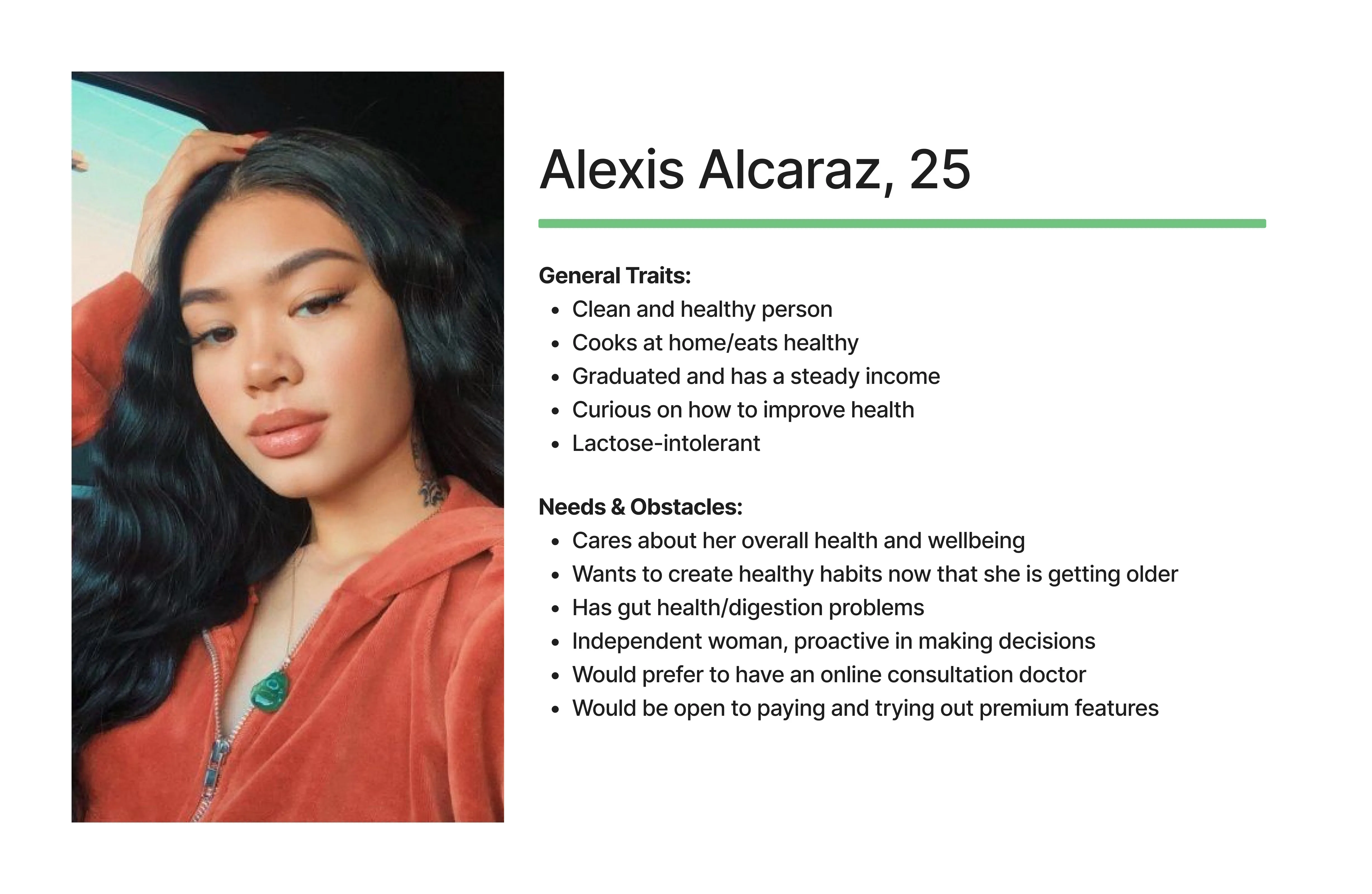
When revisiting our proto-personas, we changed and updated both of them. We realized that both Aria and Kelly, our previous proto-personas, did not fit the individuals we interviewed. Both of them focused on the idea of actively looking to find ways to improve their health and being hyper-fixated on changing their habits. However, we learned that this is not the case. Due to that, we created Alexis and Evan which was a better representation.
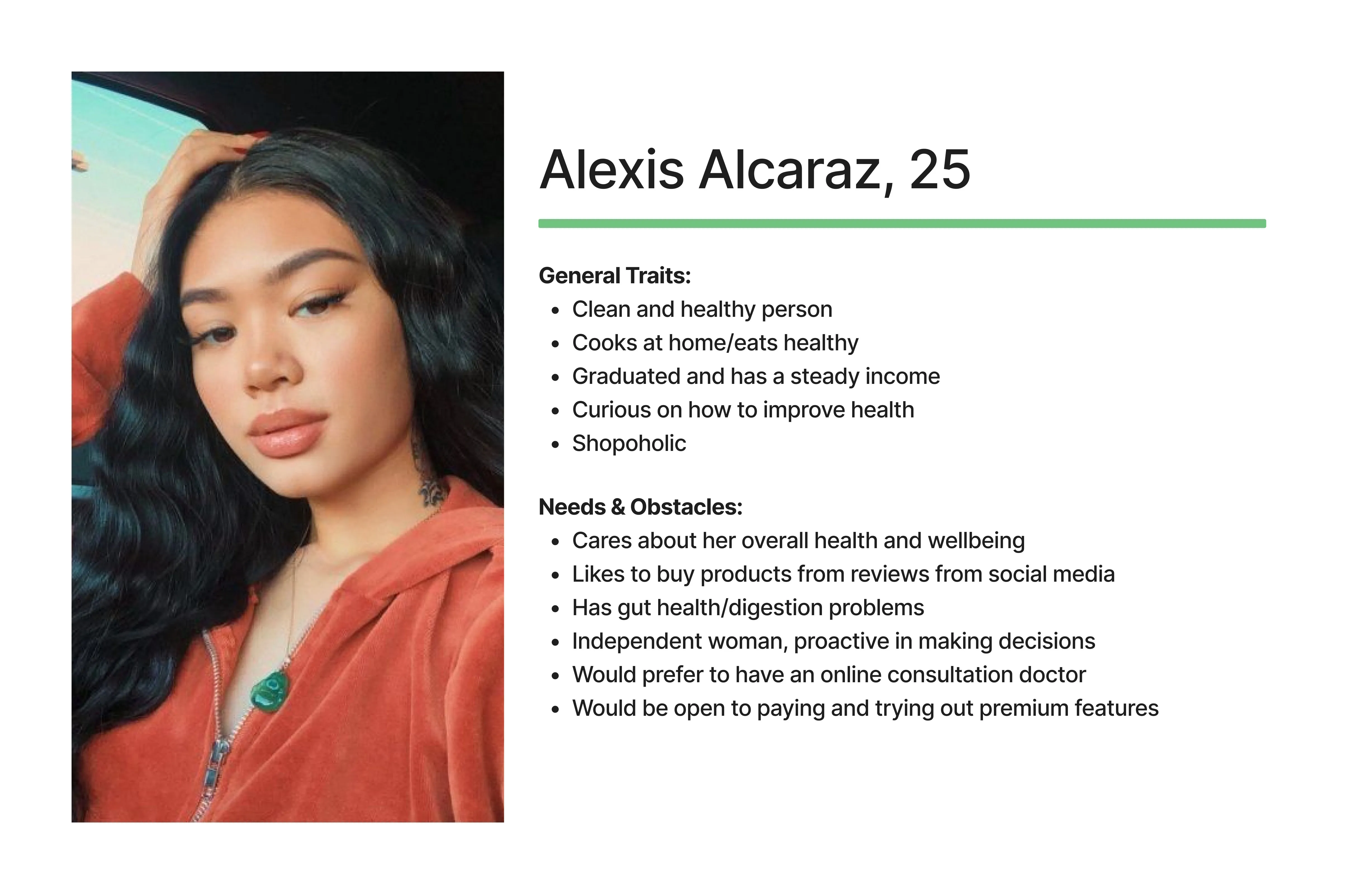
Proto-Persona #1
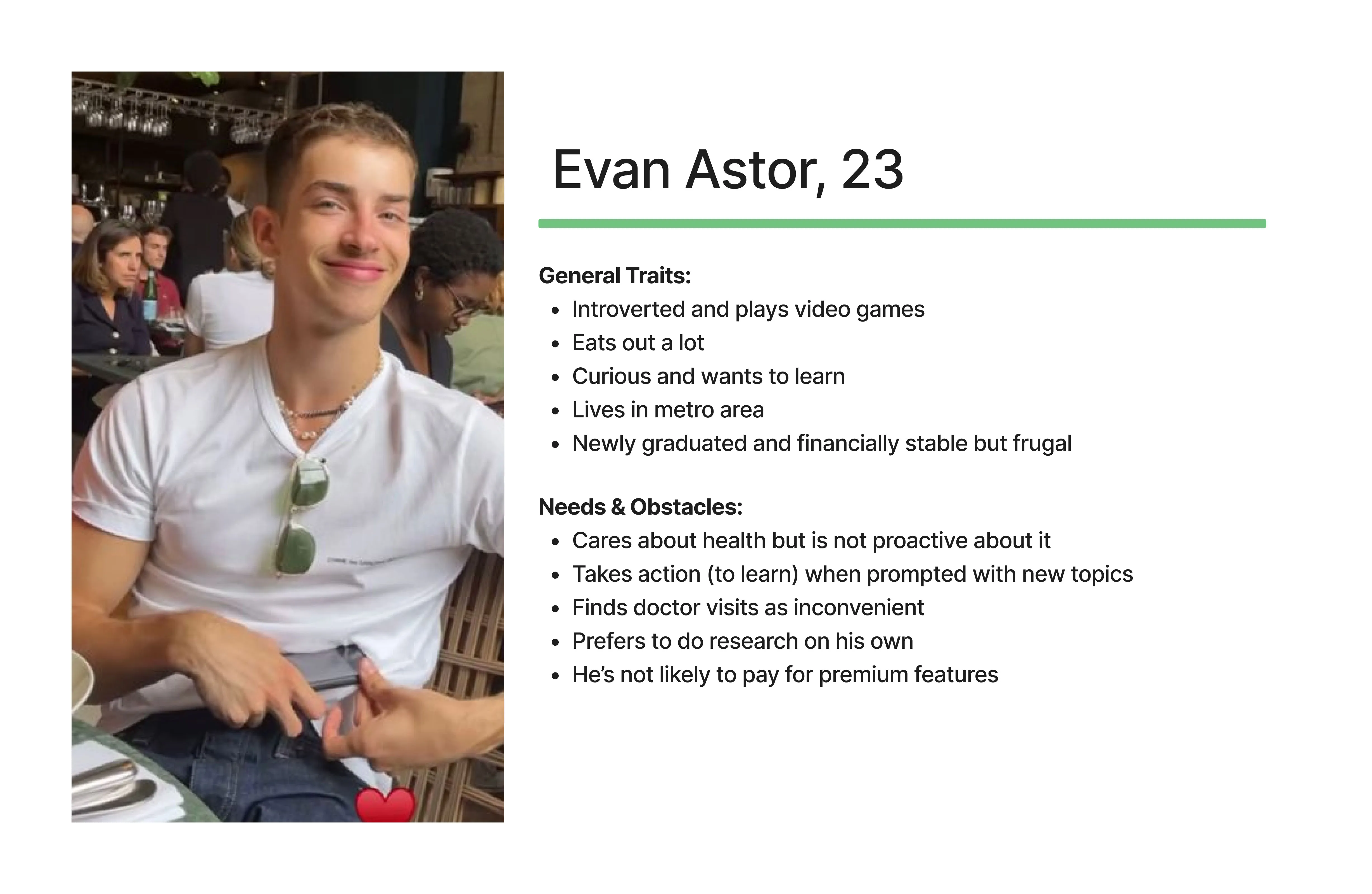
Proto-Persona #2
Our proto-persona, Alexis, does care about her health and well-being, and she is willing to occasionally look for effective products (backed with evidence) to improve her gut. She is an independent woman, and she is open to the idea of consulting with a doctor for her health. On the other hand, the male interviewees we spoke to were the opposite, and Evan was reflective of that. Evan cares about his health, but he is not proactive about it. He is, however, willing to learn about his health, and he prefers to do his own research on it. Lastly, he finds doctor visits to be inconvenient, so he is not likely to meet with one.
Sprint 2 Backlog
Due to how our product problem statement updated drastically, we revalidated and expanded our product backlog. We wanted to take into account for how we needed to include more sources of information for our users. As a result, we added articles, provided info/advice for our users, included an area to log preexisting health conditions, and more.
Our Sprint 2 Backlog
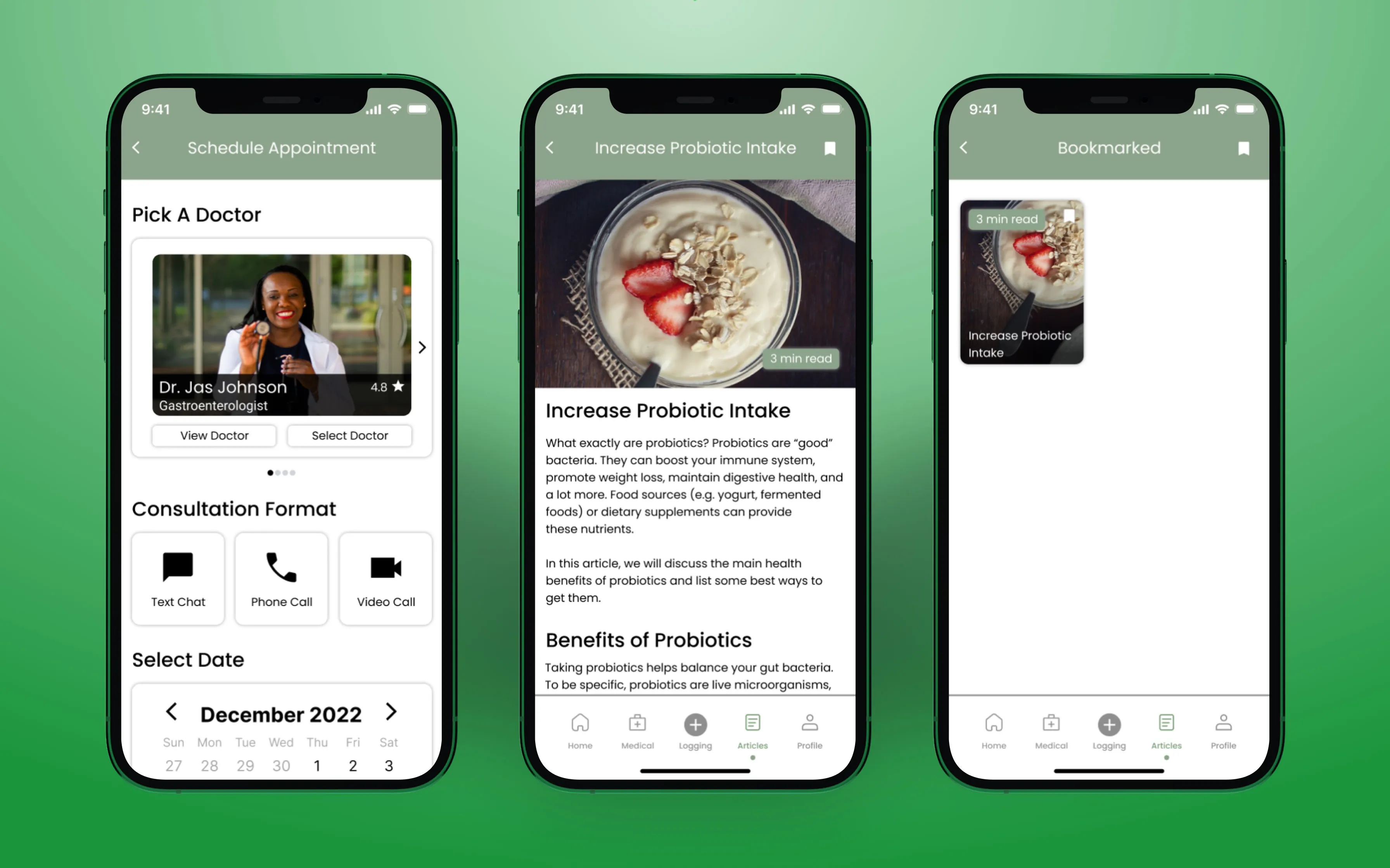
Similarly to Sprint 1's backlog, we delegated each other tasks. I took on the article feature, so our users can have credible sources of information to read/look into.
Sprint 2: Design Week 1 🏃♀️
For this week, we started to work on tasks from our Sprint 2 backlog. Additionally, similar to the previous sprint, we continued our stand-ups and conducted usability tests with three new participants. Following each interview session, we did affinity maps to look for patterns, and we continued to modify our low-fidelities.
Some Valuable Insights
Users want to know how the prescribed medications can help them.
When logging their stool, users want to know why it looks like that.
Users want to be able to describe their stool via the logging feature.
While making doctor appointments, it should be clear and intuitive.
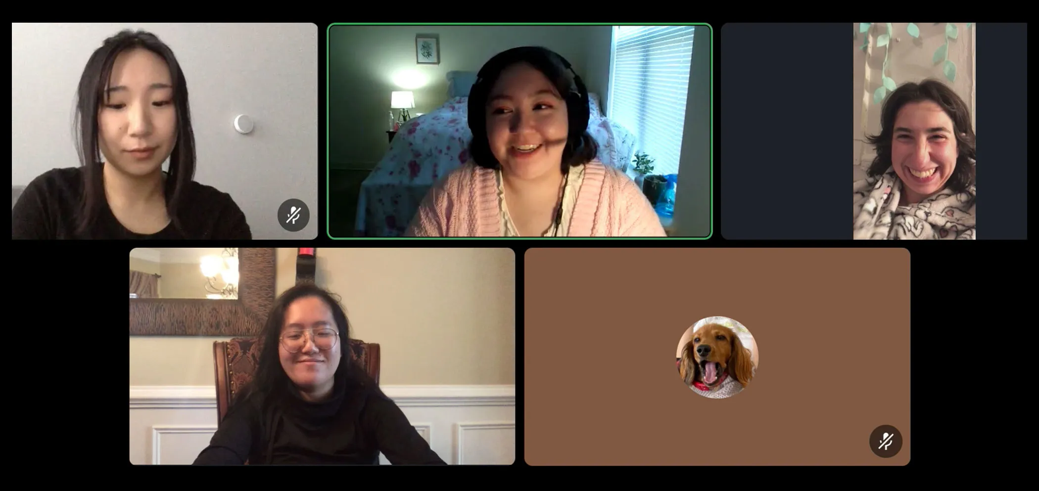
User Interviews via Discord
Sprint 2: Design Week 2 🔎
For the last sprint week, we started to shift from our low-fidelity to high-fidelity prototype. We also finalized a design system to ensure that we had a cohesive design throughout all of our screens. Having established this, we revisited our proto-personas to transform them into our final personas, which was Alexis, and we modified her goals/needs slightly. We chose Alexis as the representation based on our users and what we learned from our sprints.
Our Persona
Our Last Usability Tests
With our last round of usability testing, we tested our high-fidelity prototype and put together affinity maps. In this session, we interviewed two participants that we had in our previous sprint. These individuals gave us the most feedback, so we wanted to see their input with the changes we made for this sprint. We also interviewed one new participant. For improvements, most of our feedback focused on how we can change the UI to make it more intuitive for the user. Lastly, our participants felt that this version of our prototype would help them with logging their gut health and enable them to learn more about it.
Some Valuable Insights
Users want the onboarding (tutorial) to be straight to the point.
When there are numbers, prioritize the numerical value (5) over the word (five).
Ensure that the icons fit the users' mental models.
When users use the search bar, provide search results.
Concluding Our Sprint 2
Following our usability tests, we concluded by refining and making final changes to our high-fidelity. We then had a retrospective meeting on Sprint 2 to reflect on the work that we completed. This meant determining what we felt like could be improved, and how we can take what we have learned from this project to apply it into our own fields/career.
Final Design 🎨
My team and I were able to create Good Sh*t, a gut health tracking app, within 8 weeks. After conducting research and designing this app, we created a project that we are all proud of.
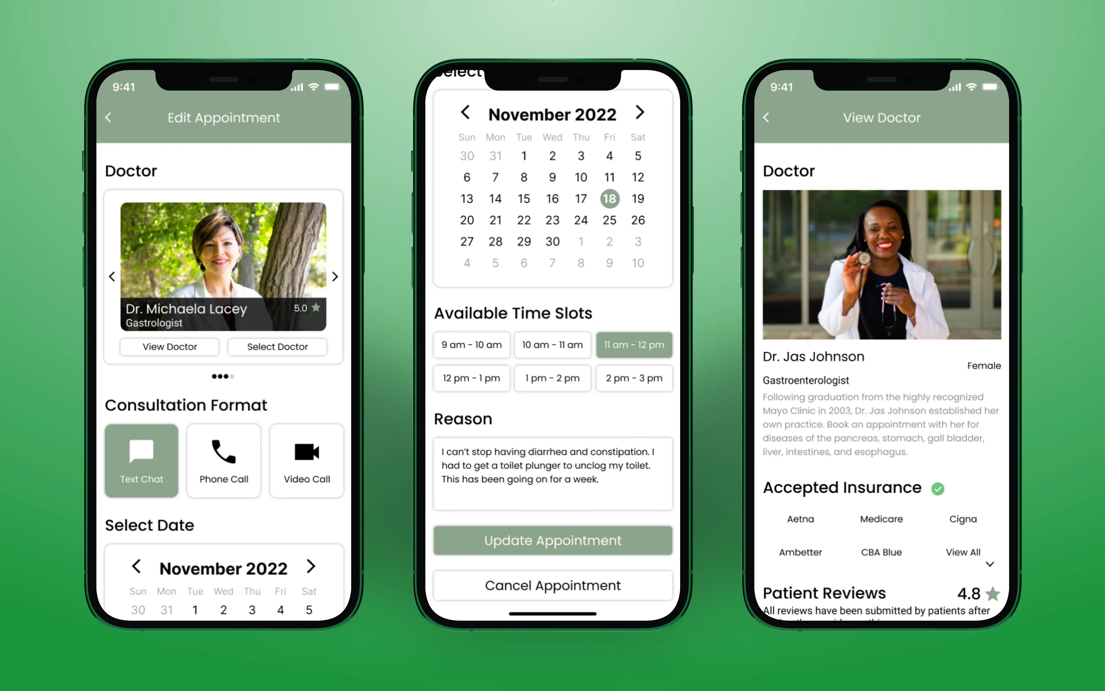
Screens I Designed
The following are the screens and sections that I've designed for the prototype:
Conclusion 🏁
This project gave me the opportunity to learn about Lean UX and how important communication is with a team. Additionally, I do want to acknowledge that this was a modified version of Lean UX—especially since we did not have a cross functional team with developers. In the future though, I hope to have the opportunity to work with them! Furthermore, I learned how valuable research and getting feedback is. It helped pivot the direction of our project and it validated our assumptions along the way.
Key Takeaways 🔑
Furthermore, these are some takeaways that I have learned from this project:
Be comfortable with work that looks and feels unfinished (low-fidelity).
We should determine and establish the sizes of various icons/components, so they look cohesive for all of our screens.
If changes are made to the app, consistently update the team to ensure that we are all on the same page.
Provide task-based scenarios for the user when they are conducting a usability test.
When interviewing, be careful of asking them leading questions, as it may influence their answers.
Due to the nature of sprints, understand what feature(s) should be prioritized and why. This will help guide the direction of the project.
Sketching out low-fidelity prototypes help save time and demonstrate our ideas.
If you are not sure about something that a user said, ask them to elaborate for more information.
Communicate often and effectively during sprints. Changes will be made quickly, so it's extremely important to be aware of any updates regarding the project.