This page showcases my UI design and prototyping skills, presenting all the design work from my 16-week Prototyping II course in college. These class projects encompass a diverse array of user interface designs crafted through prototyping techniques using Figma. Within this page, you'll find detailed explanations of the tools and concepts applied in each design.
Role
User Interface, Visual Design, Prototyping
Tools
Figma, Illustrator, Photoshop
Project Duration
16 Weeks (August - December 2023)
UI Designs 🖼️
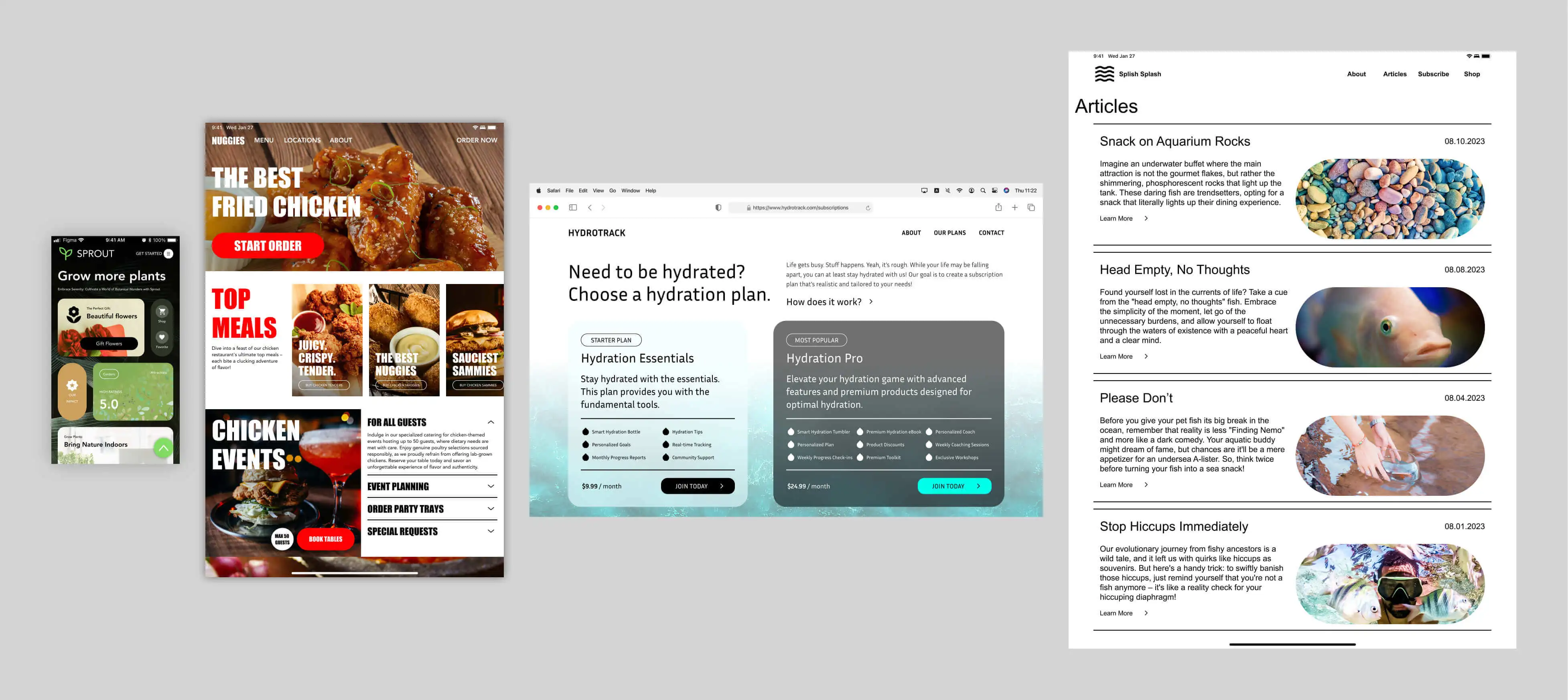
One of the projects that I worked on in class involved designing four unique UI interfaces using Figma, each with distinct text, color, and effect styles. Text styles include varied font weights, and color palettes are customized for each theme (e.g., Sprout with earthy colors). Designs feature effects like drop shadows and background blur. To ensure adaptability, I considered specific UI elements, incorporating necessary status bars and home indicators.
Four UI Designs
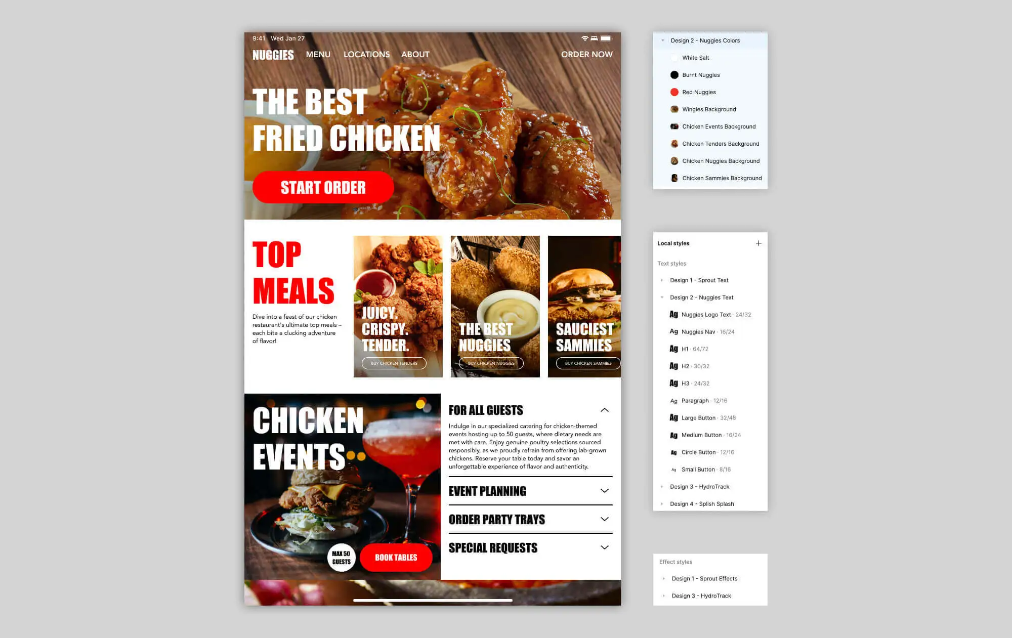
Visuals demonstrating these styles, along with my emphasis on file hygiene and layer organization, are provided below utilizing the second design, Nuggies, as an example.
Styles & Layer/File Hygiene of Nuggies
Autolayout
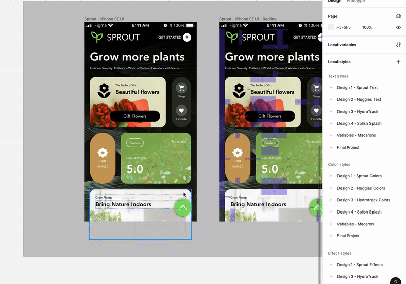
For these designs, I used Figma's “Auto Layout” feature, a powerful tool that ensures responsive design. This functionality played a crucial role in maintaining a consistent design flow throughout my UI designs, allowing content to adapt dynamically. Within this section, I’ll show how I utilized Auto Layout with a section from my first design, Sprout.
Auto Layout Example - Sprout
Redlining
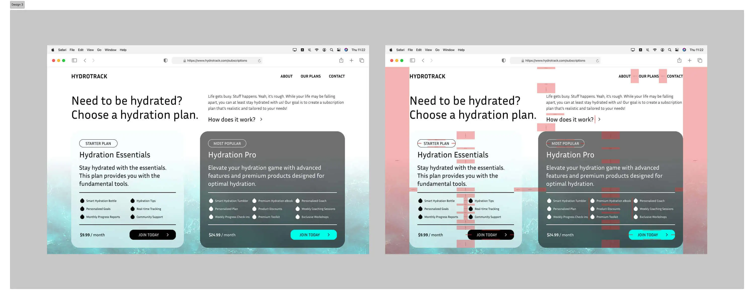
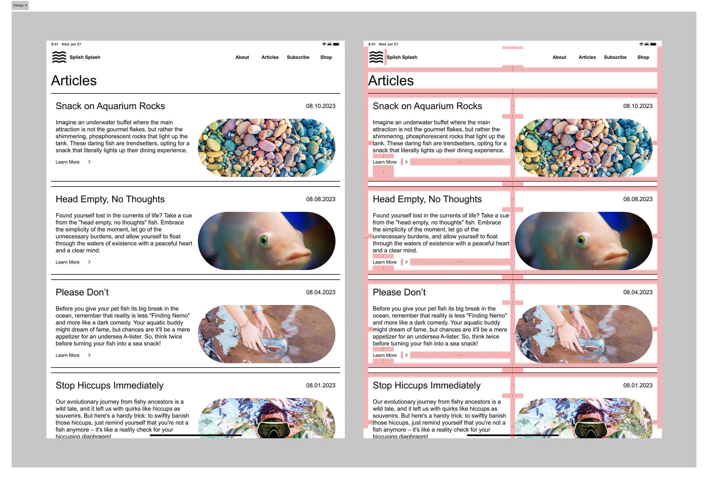
Redlining is a technique that involves adding annotations to a UI design using lines to specify the exact spacing and dimensions of design elements. This thorough approach serves several important functions: it simplifies the process of passing the design to developers, enhances the visual appeal by keeping a consistent rhythm, and contributes to creating a visually unified layout. In the context of these four UI designs, I consistently applied an 8-point grid and incorporated redlining, and I’ve provided some redlining examples below.
Redlining Example - Hydrotrack
Redlining Example - Splish Splash
Figma File
Feel free to explore the details of these UI designs in my Figma file. Observe the text, color, effect styles, status bars, and home indicators, including redlining and autolayout in the "01. UI/Auto Layout Assignment" page.
Use of Variables 👾
Variables are something that can vary in value or take on multiple values. Variables in Figma store reusable values, like color values and numbers, that can be applied to all kinds of design properties and prototypes. A variable’s values can also reference other variables, making updating design systems easy to do.
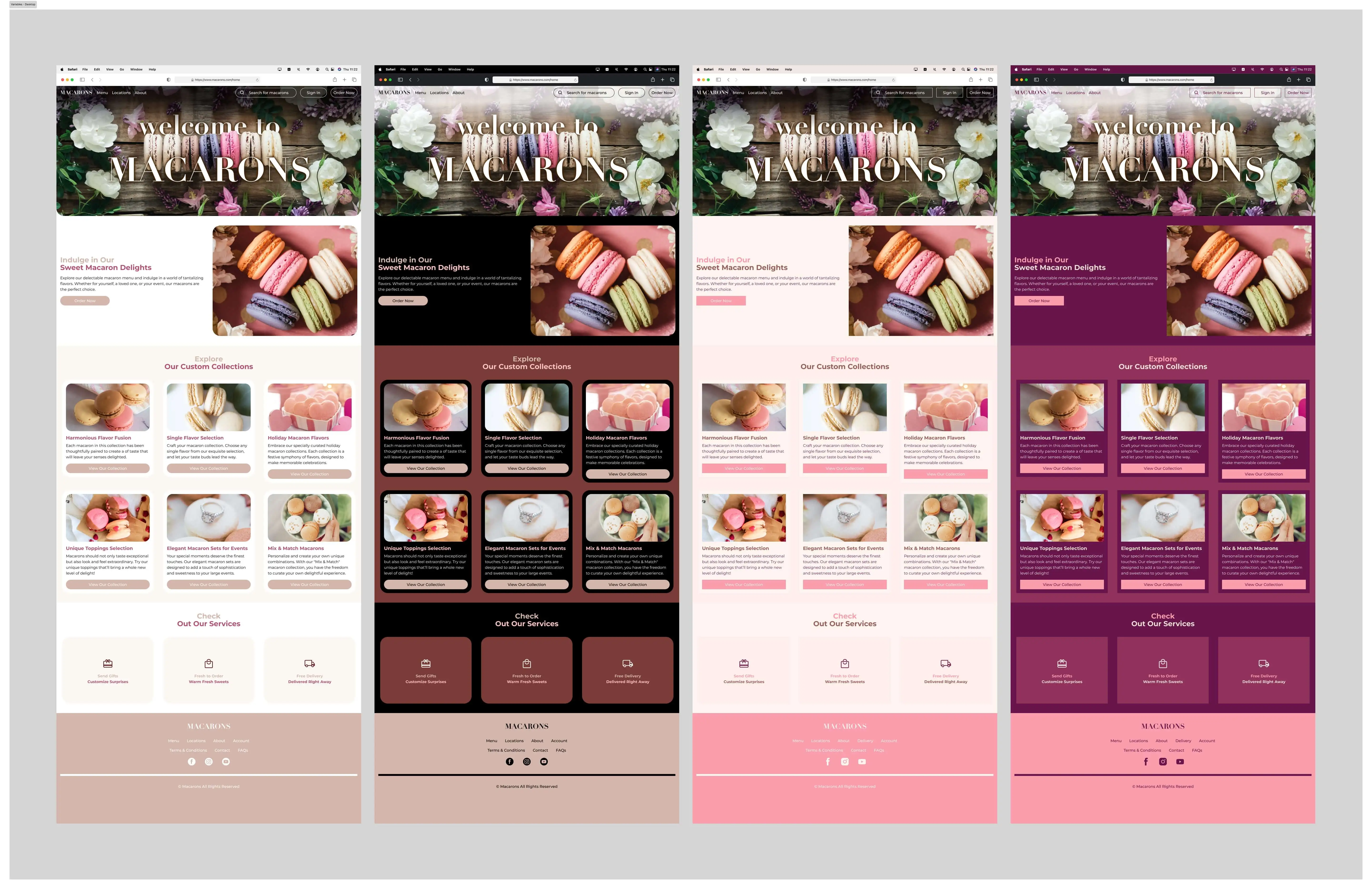
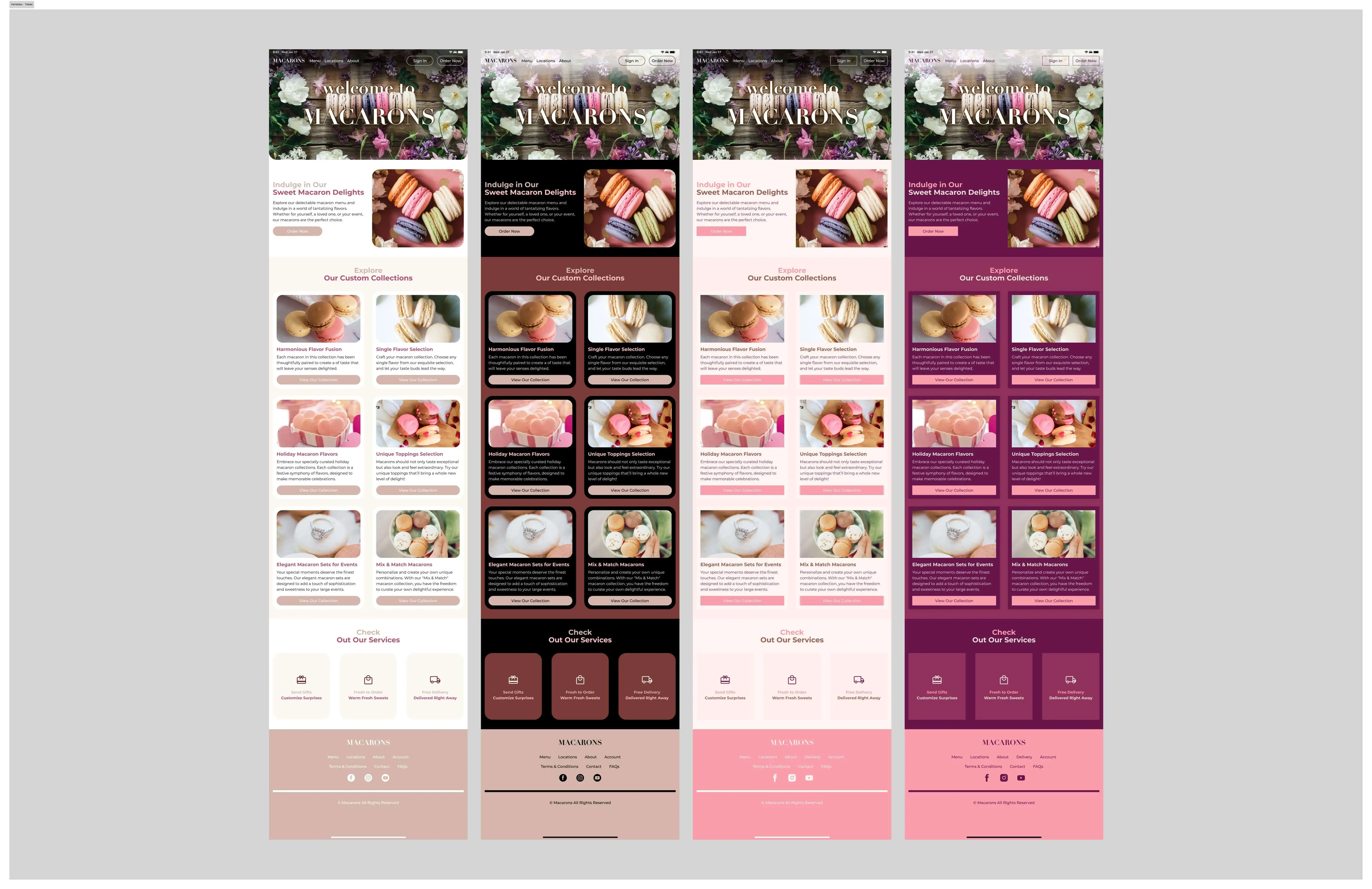
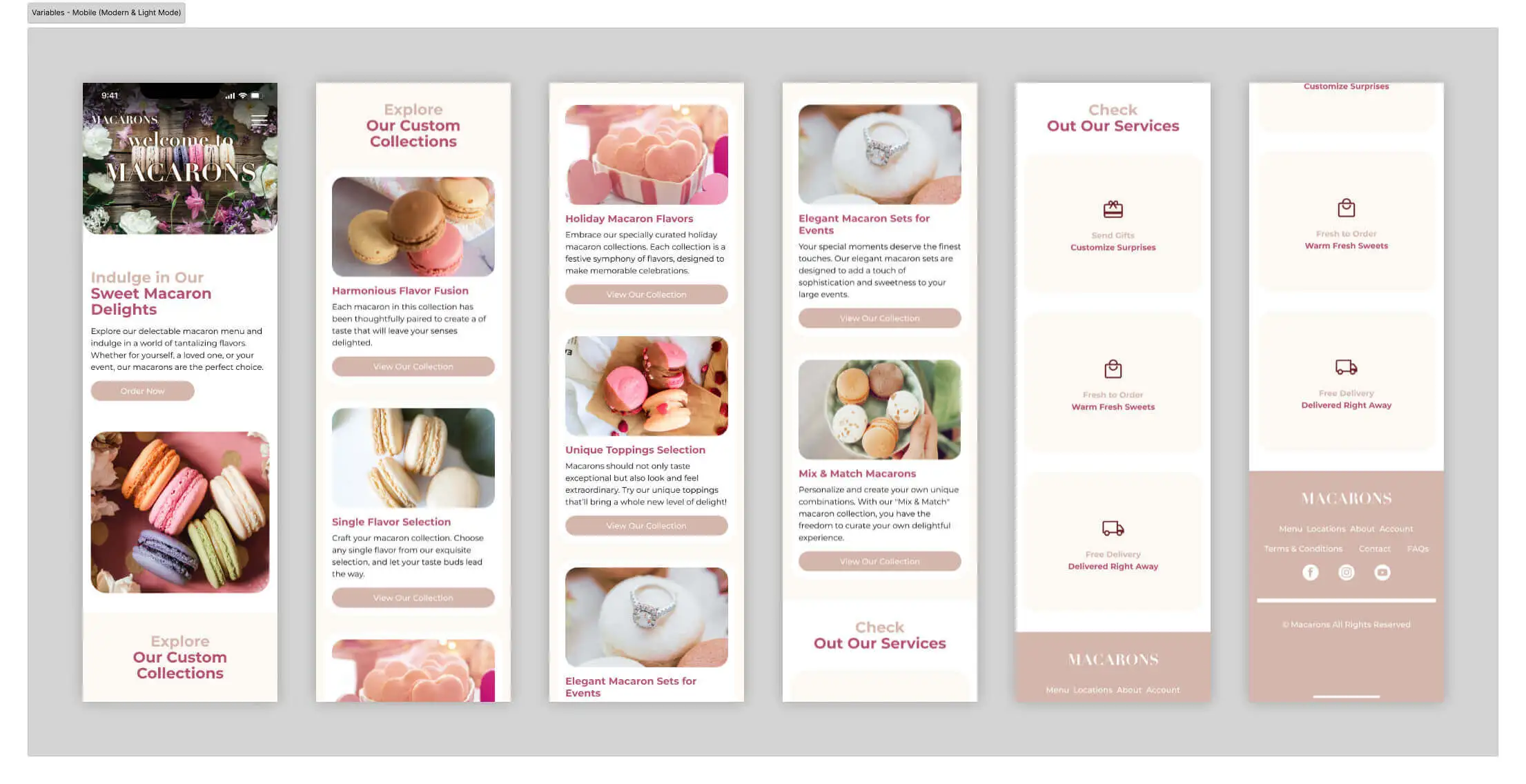
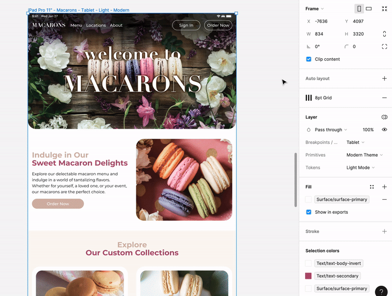
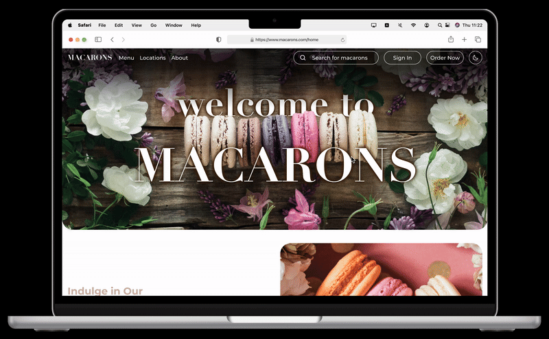
To demonstrate my use of variables in Figma, I created a single UI design that will be implemented in three viewports (desktop, tablet, and mobile) and in four modes (light/dark & modern/brutal). In total, I have created 12 screens across 3 sections, all with auto layout and with the 8-point grid.
Desktop Viewport
Tablet Viewport
Mobile Design of Modern & Light Mode
To accomplish this, I created variables for my design using collections: Primitives, Tokens, Breakpoints/Viewports. I’ll demonstrate my use for each of these collections in detail.
Primitives
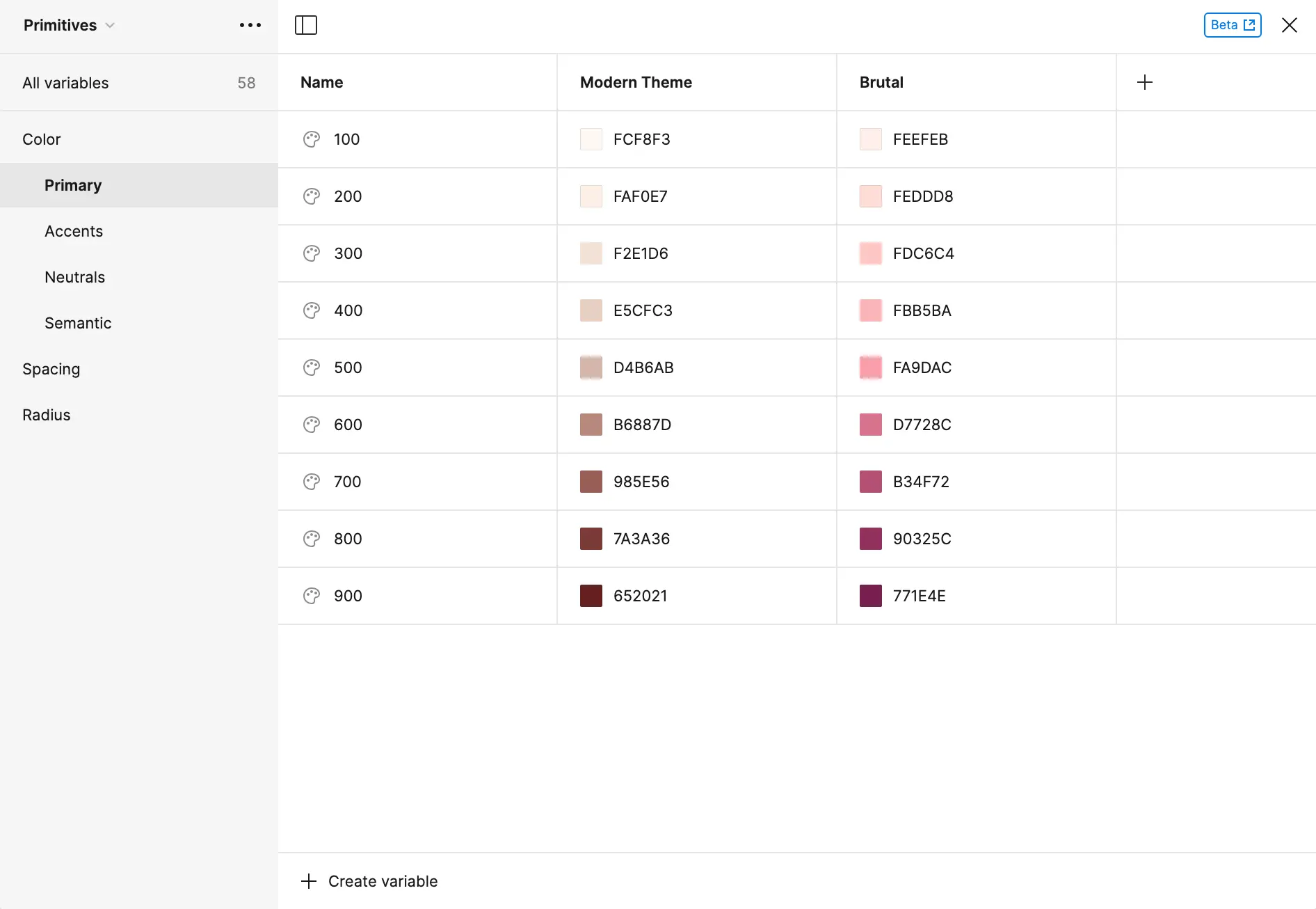
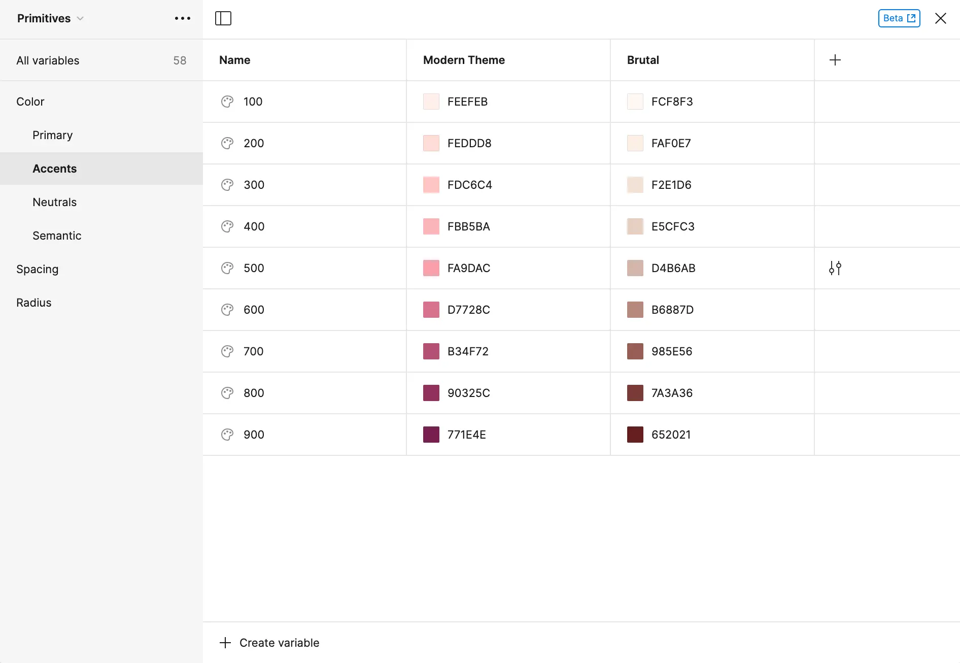
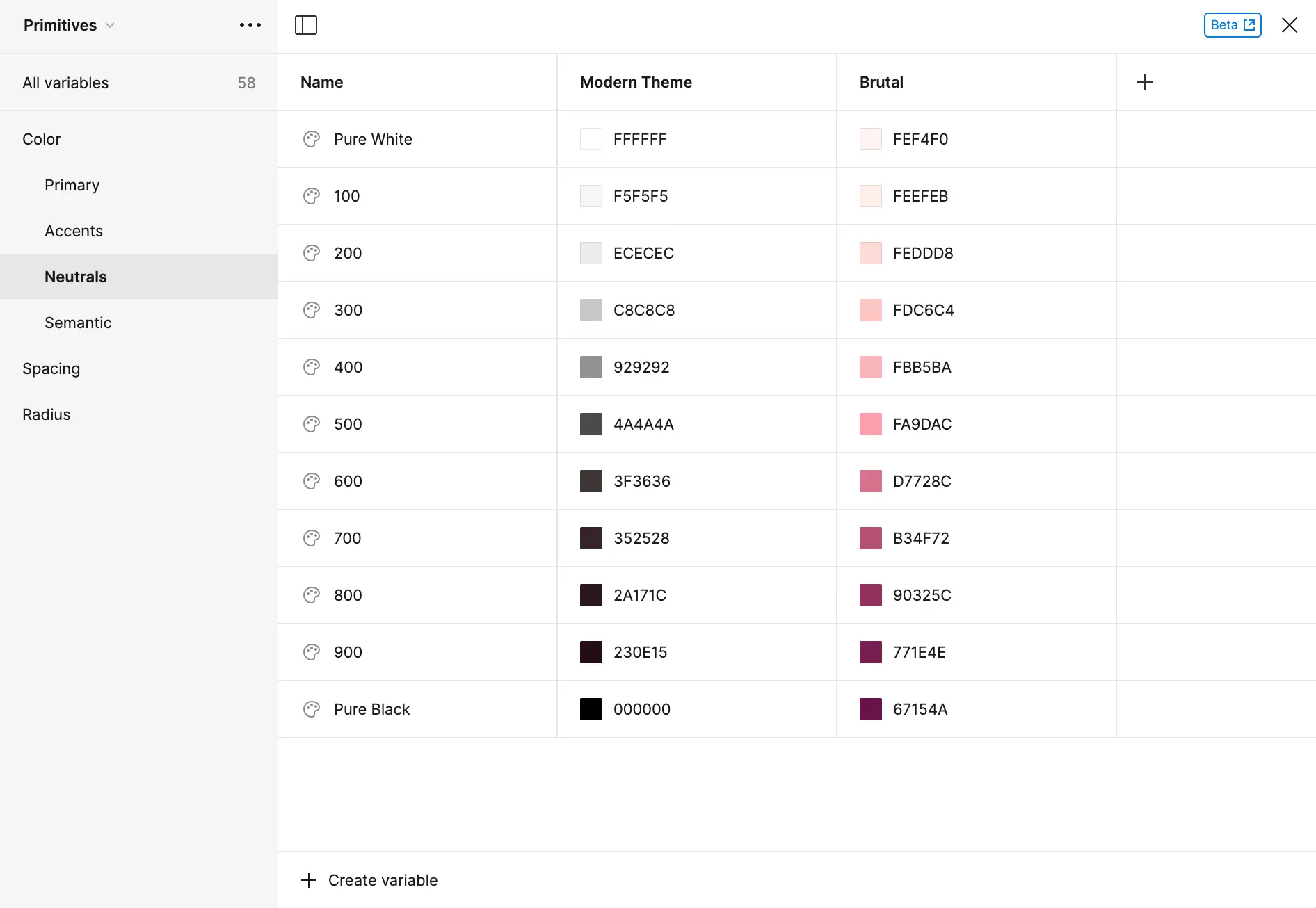
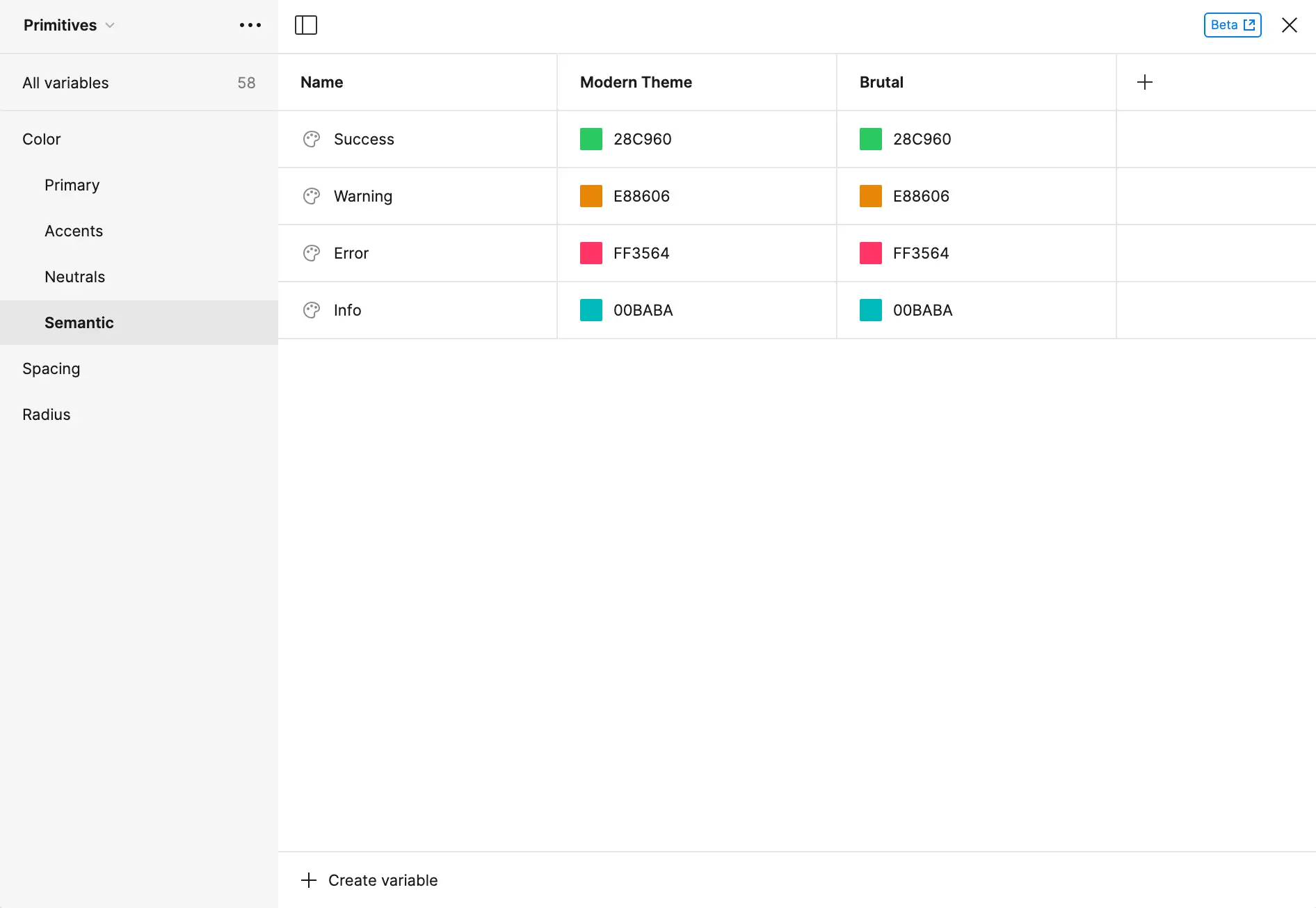
For the Primitives collection, they consist of the basic color, space, and radius values. As for the colors, they’re laid out with a numerical numbering method, and I utilized the color selector, Eva Design System. I’ve also created four color groups: Primary (brand color), Accents (sparingly used to emphasize actions/information), Neutrals, and Semantics (colors associated with success, warning, error, and info).
Primary Colors
Accent Colors
Neutral Colors
Semantic Colors
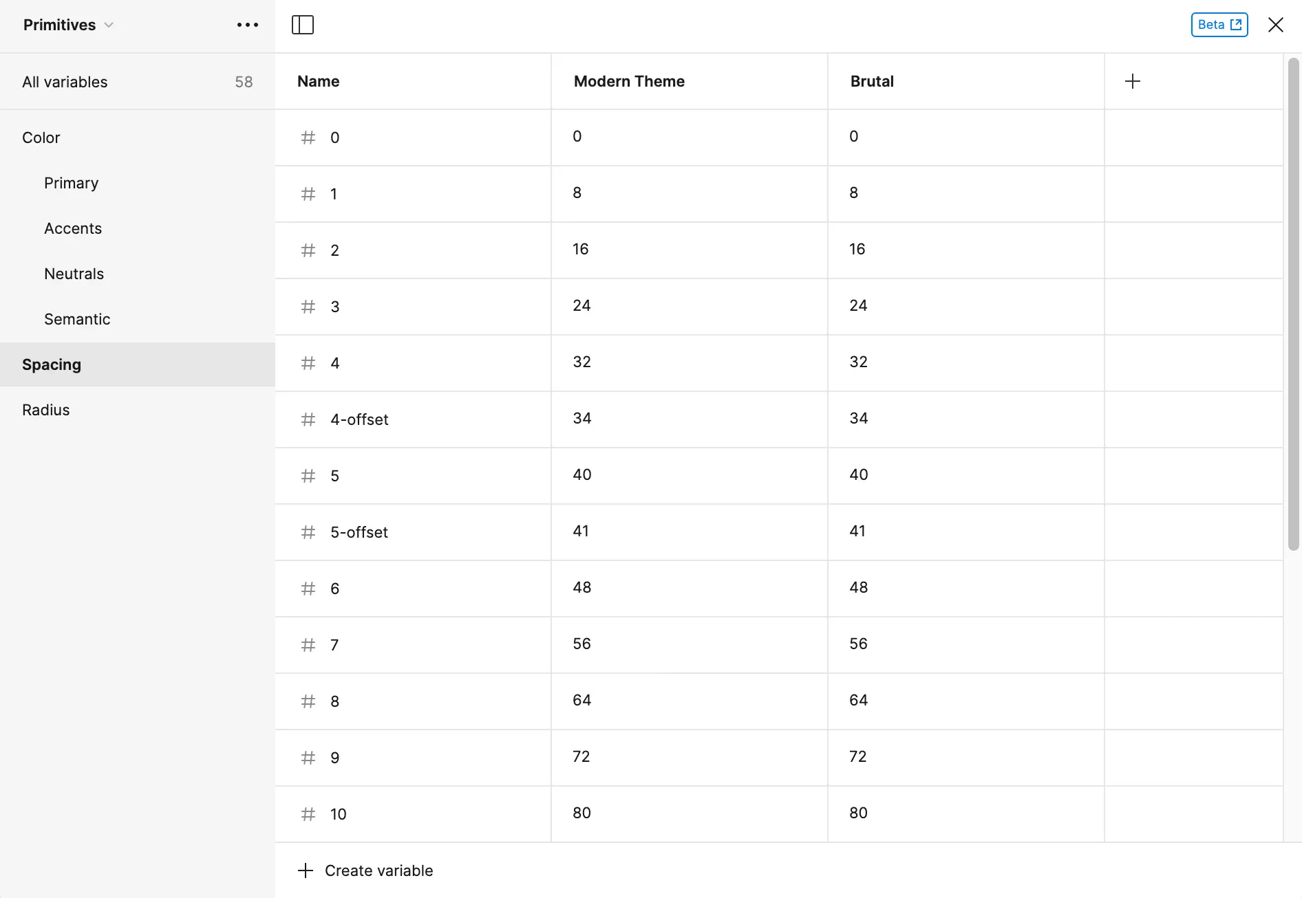
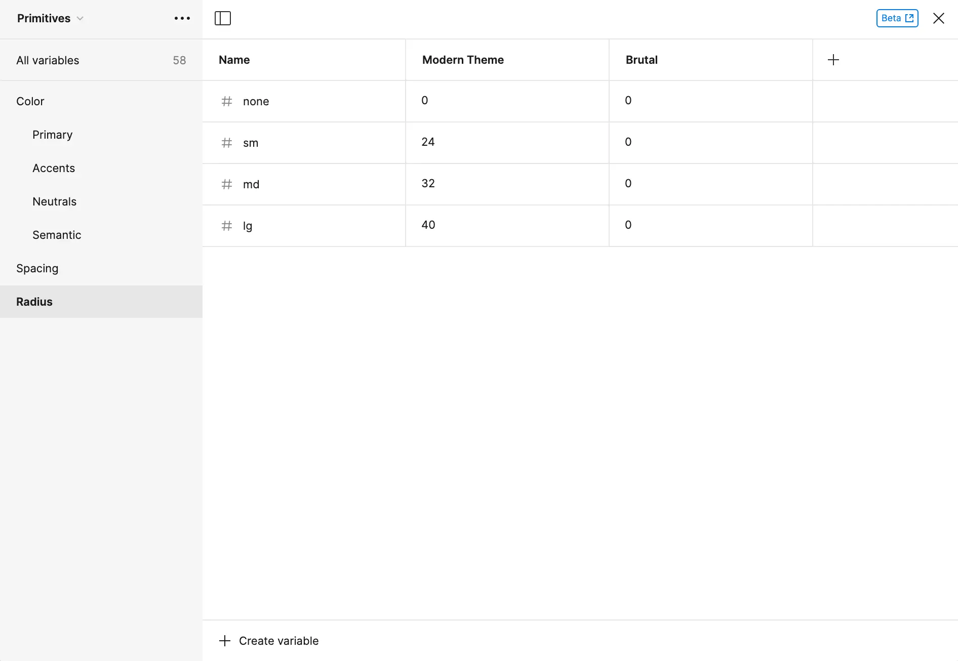
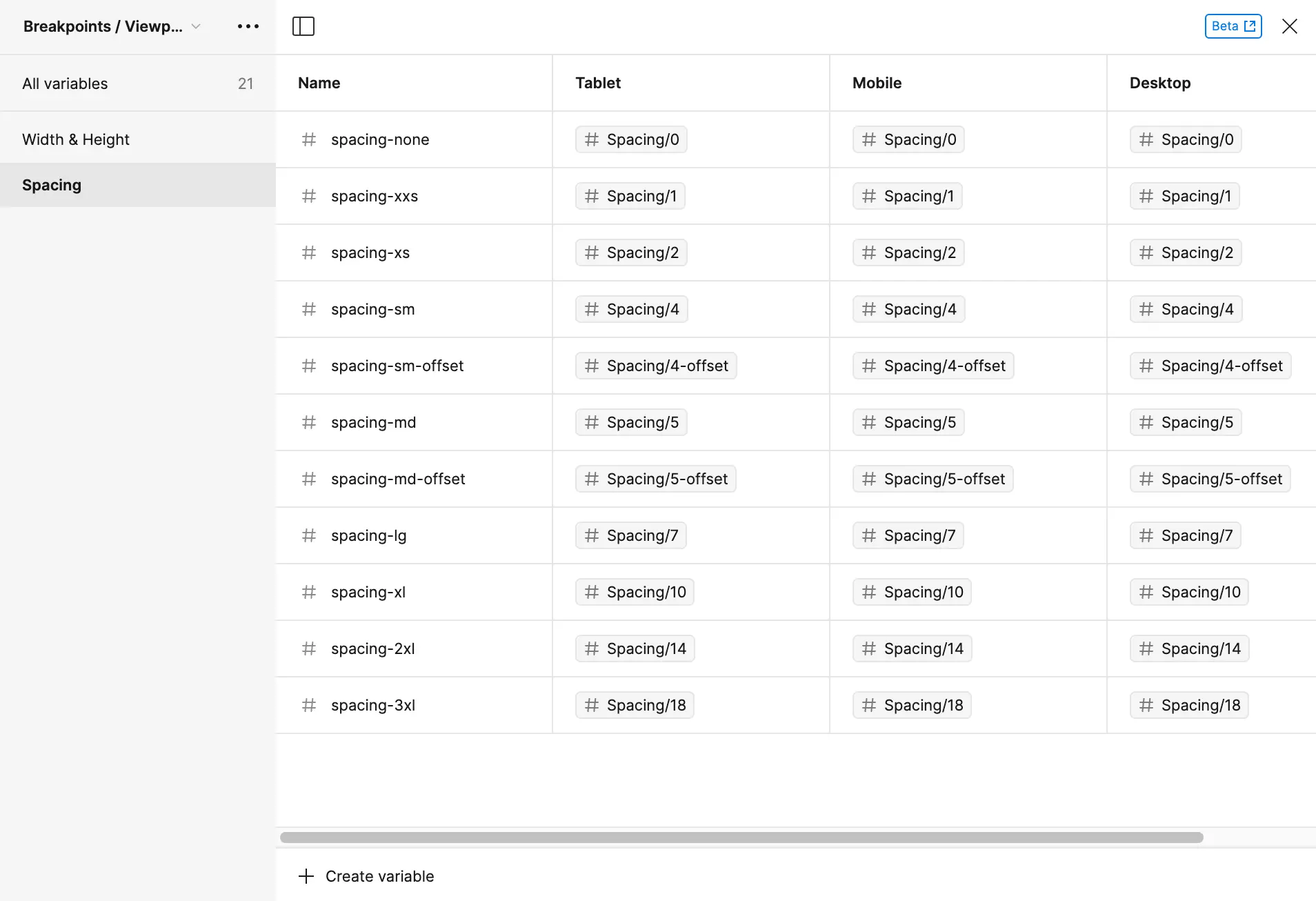
For spacing, I utilized the 8-point grid. The naming system was created to be multiples of 8. For instance, the variable "1" corresponds to 8 points, and the variable "3" corresponds to 24 points. Whereas with radius, it indicates the degree of roundness for the corners of elements. The variable "sm" is assigned a small value of 24.
Primitives - Spacing Variables
Primitives - Radius Variables
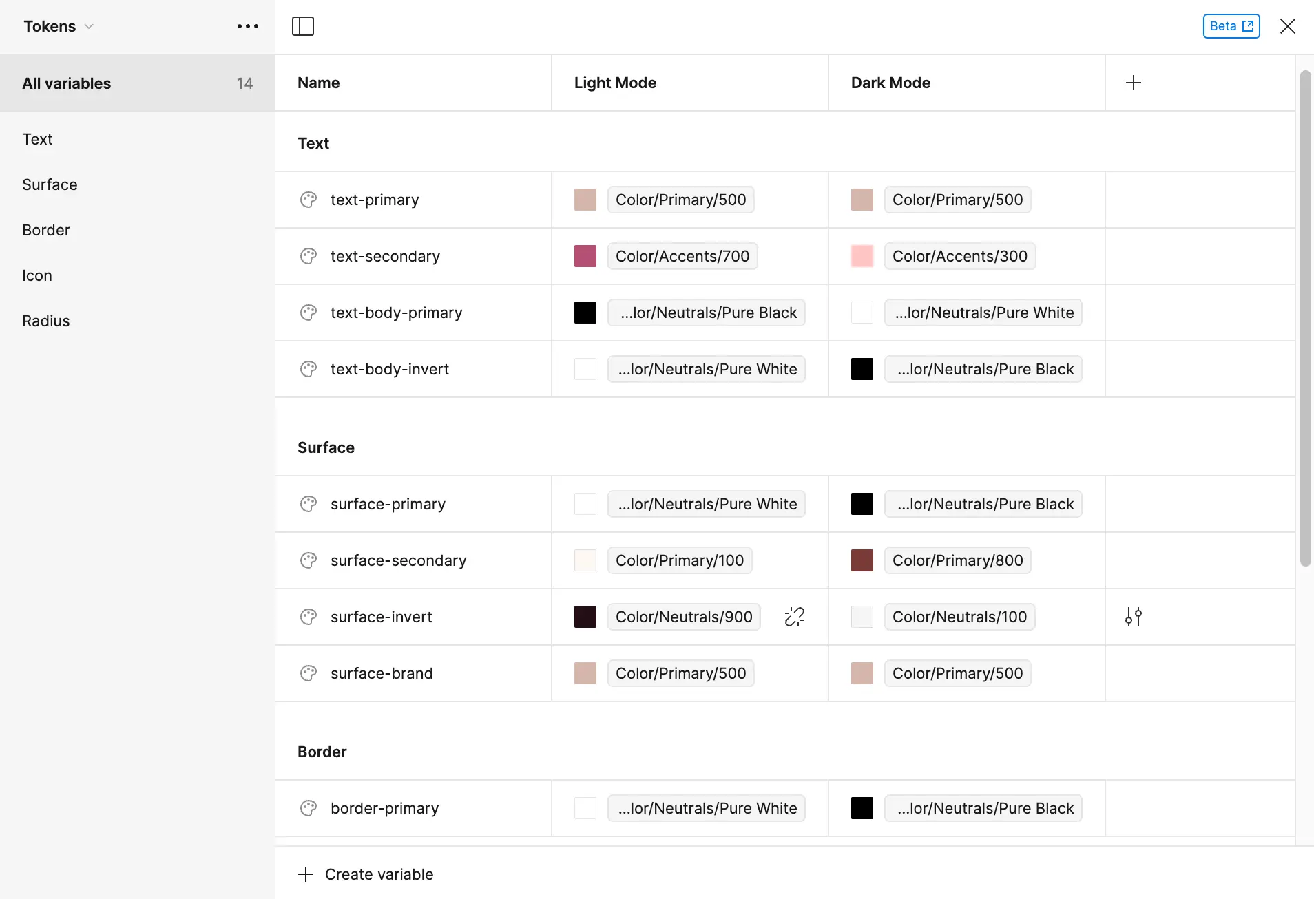
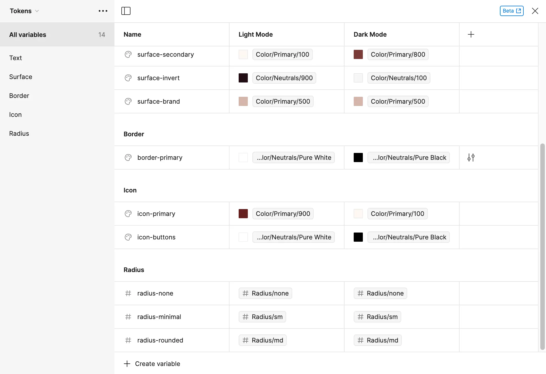
Tokens
With the Tokens collection, it contains semantic values where color and sizing (space and radius) values should be applied. The Tokens inherit their values from the Primitive value, and they have a logical and consistent naming convention.
Tokens Collection Inheriting Values from the Primitives Collection
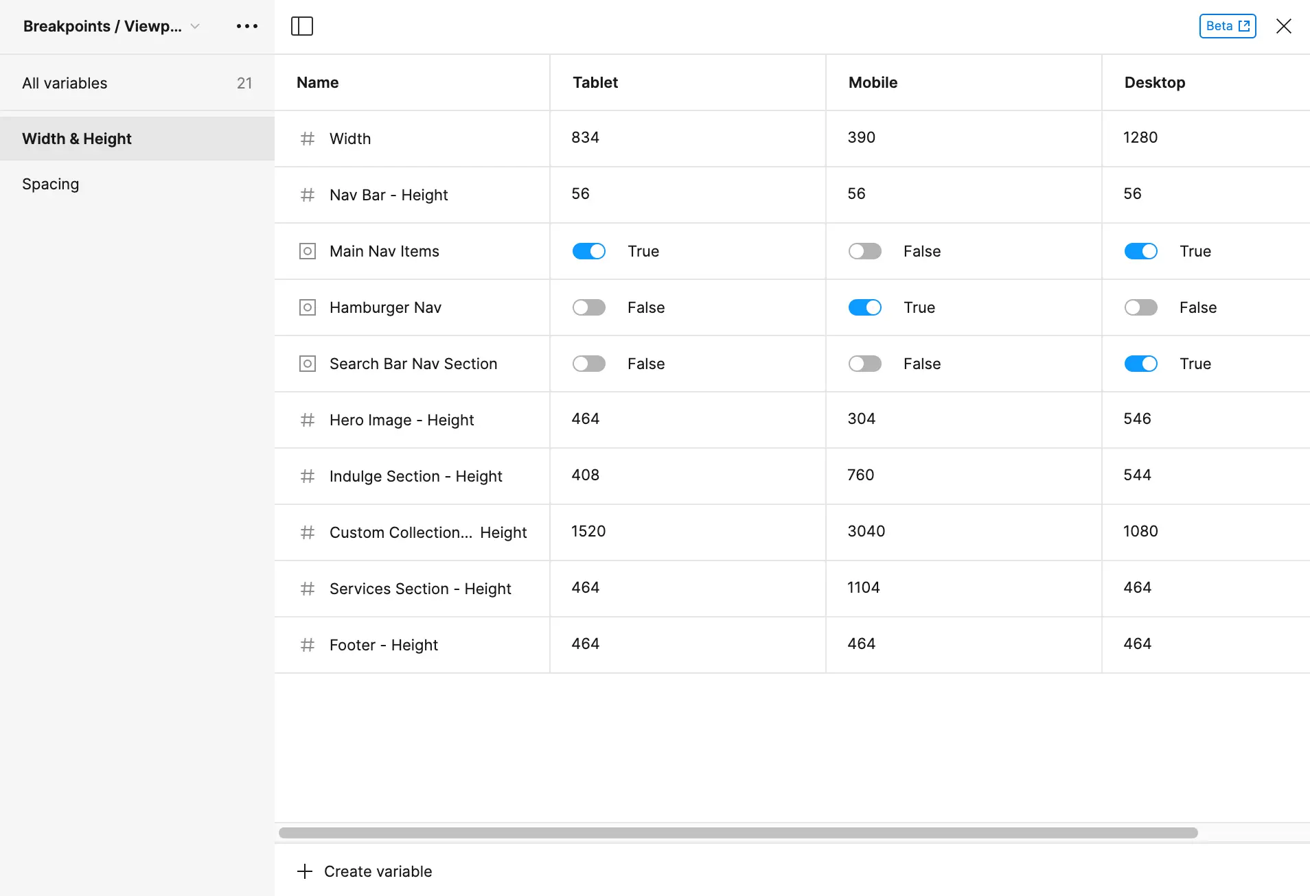
Breakpoints/Viewports
The breakpoints/viewports collection includes instructions on how the design adapts to different viewports. Consequently, certain elements may be visible or hidden based on the viewport (e.g., the search bar is exclusively visible for the desktop viewport), and the sizing of elements may also change. In summary, establishing these variables facilitates seamless adjustments for the design across various viewports.
Breakpoints/Viewports - Width & Height Variables
Breakpoints/Viewports - Spacing Variables
Switching Modes
Variables make it easy for your design to adjust to different viewports and styles/colors. As an example, I can easily change the mode (light/dark & modern/brutal) of the UI design.
Variables - Switching Modes
Prototyping With Variables
Additionally, as an example for prototyping with variables, I created two screens that are light and dark mode. With one button, I can easily allow the screen to change between the two modes.
Variables - Light & Dark Mode
Components
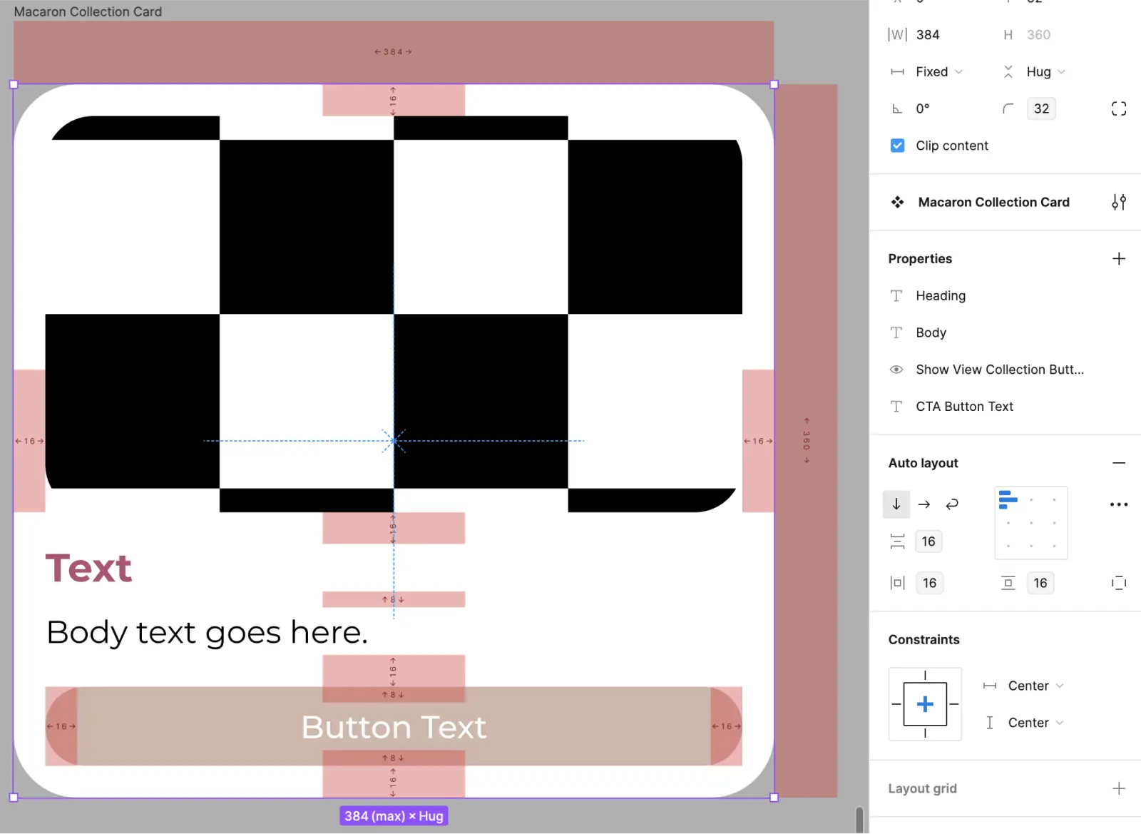
Components were created for elements used repeatedly, ensuring consistency and enabling reuse as needed. Additionally, for elements with various variations, I used component properties—specific, customizable aspects of a component that can be defined. This approach facilitates the creation of multiple variations for elements like the macaron card.
Component Properties
Figma File
Feel free to explore the details of these variables, different modes, and breakpoints/viewports in my Figma file. Observe the colors and spacing variables, autolayout, and more in the "02. Variables Assignment" page.
Final Project 👩🏻💻
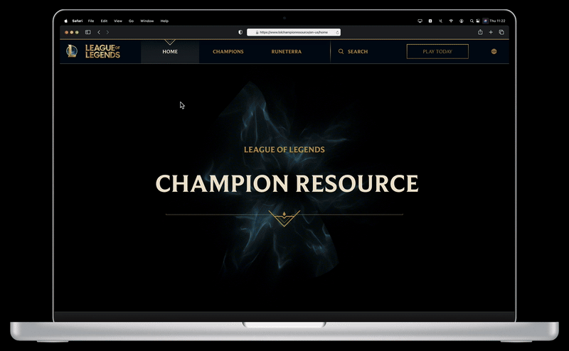
To combine all the techniques that I’ve learned in class, I created a League of Legends Champion Resource guide for desktop. To add, this project shows my ability to interpret and apply an existing brand guideline. Rather than introducing entirely new elements, I focused on extending the existing framework.
Centered around the popular game League of Legends, a competitive online multiplayer game developed by Riot Games, this project specifically targets patch 13.23. The prototype serves as a comprehensive resource guide for champions, consolidating essential details such as name, titles, class, difficulty, abilities, cost (in Riot Points and Blue Essence), skinline, regions, and champion lore. This concise resource streamlines user interaction, providing a seamless experience for accessing key information within the League of Legends universe.
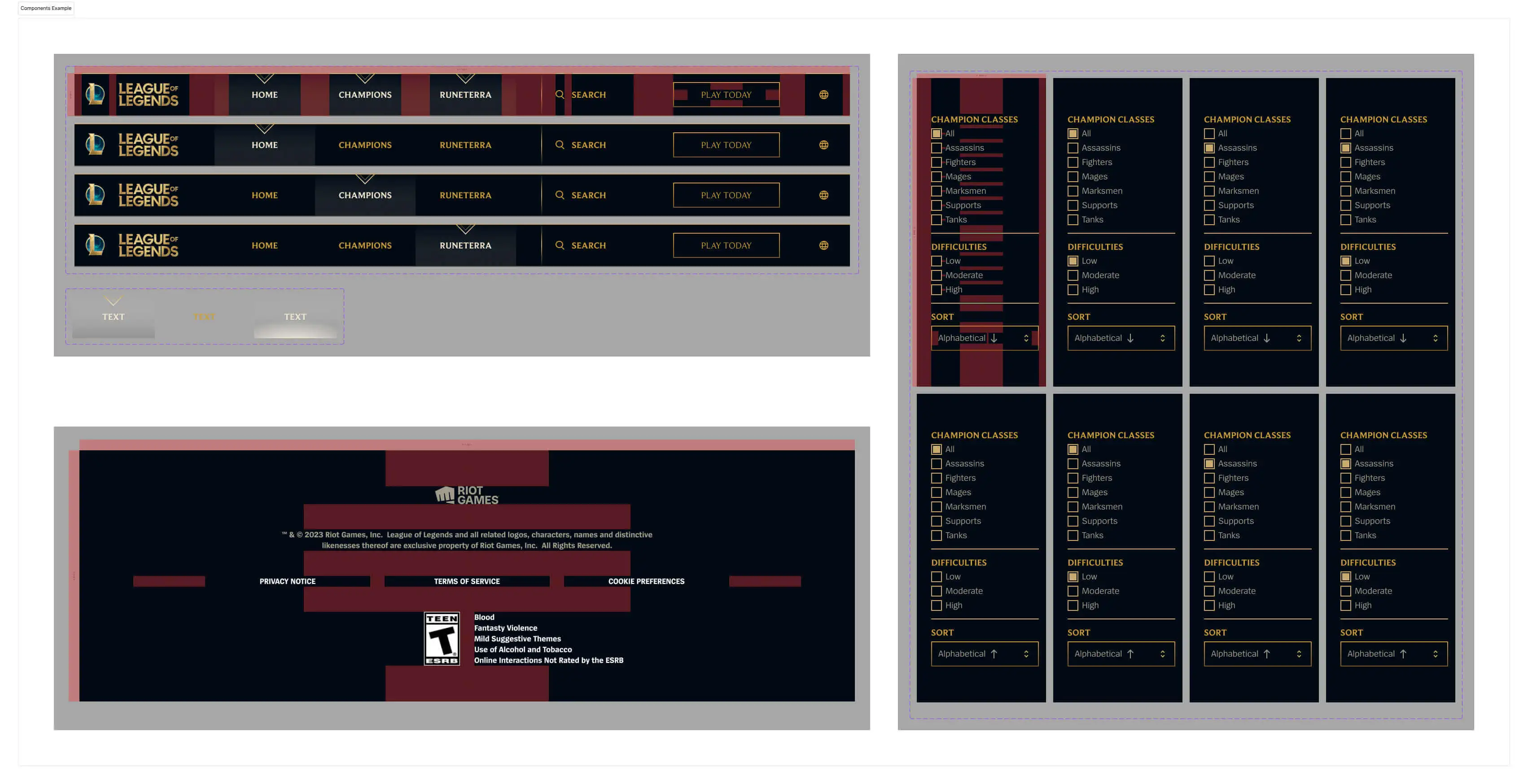
Components
I utilized components since there were multiple reusable elements, and components allowed me to create variations of elements as needed. Below, I’ve included some examples of the components: navigation bar, footer, and a sidebar for the “Champions” page.
Example of Components Used
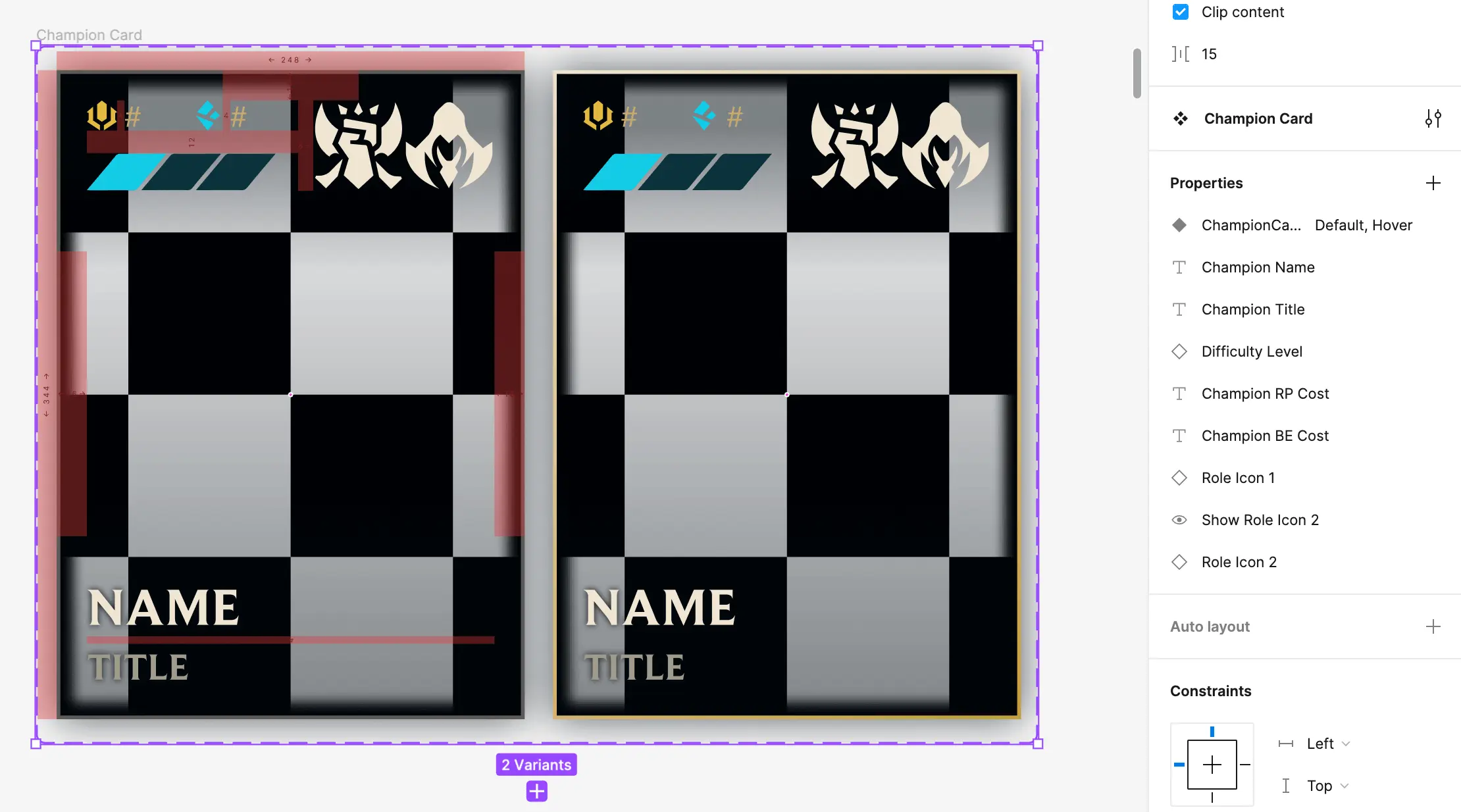
While I created multiple components, I'll spotlight a key component primarily utilized in this prototype—the champion cards. With League of Legends' patch 13.23 featuring 165 different champions, I had to create a corresponding number of champion cards, each possessing distinct properties such as name, cost, role, and more. To streamline this process, I established component properties enabling swift modification of information for each of these cards:
Champion Cards - Component Properties
In addition, leveraging component variants allowed me to incorporate a hover effect into these components. Upon user hover, these elements will change slightly to add a layer of interactivity to the prototype. Below, I've provided some examples of this:
Components - Hover Effect
Champion Page
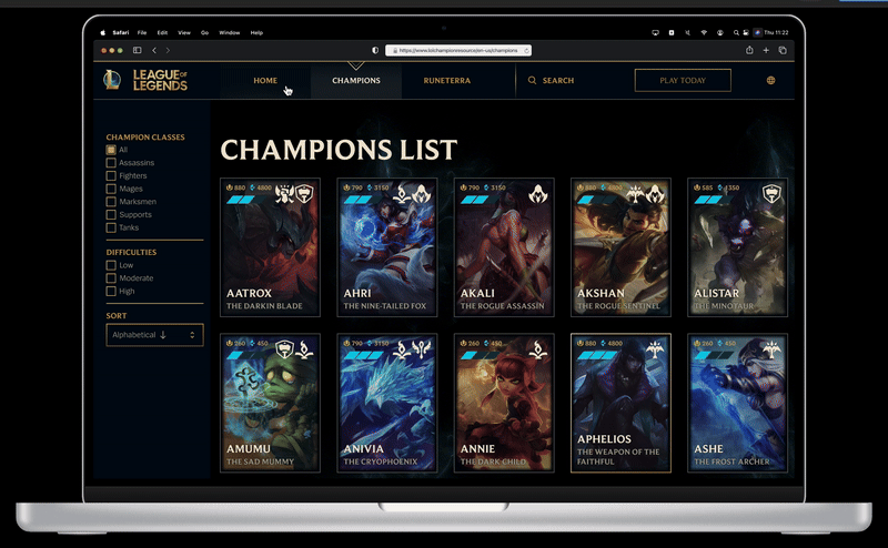
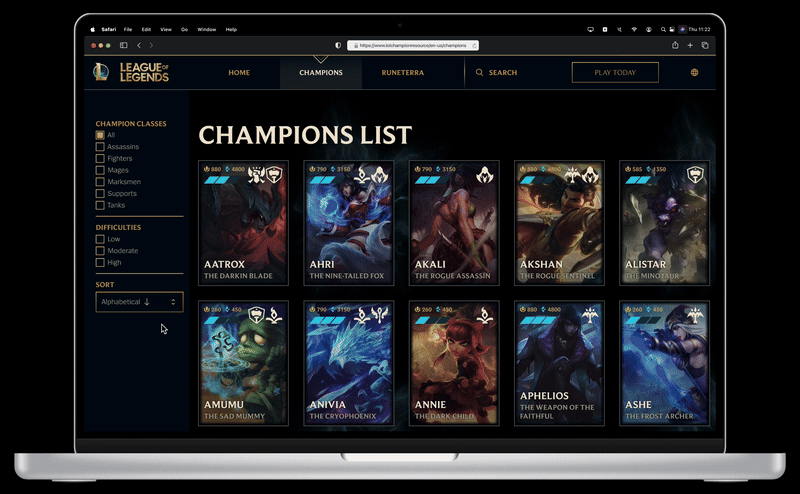
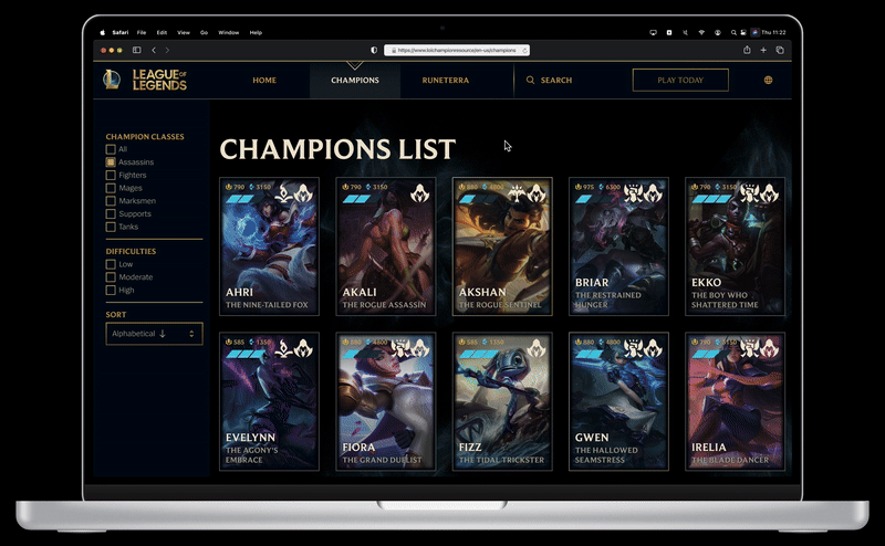
After creating 165 champion cards, I aimed to simplify the user's search for specific champions. I implemented a sidebar to serve as a filter, enabling users to navigate through various categories. As a proof of concept, users can choose the initial options in the sidebar for each category, and subsequently select the first champion card.
Filtering 165 Champion Cards
Selecting Champions
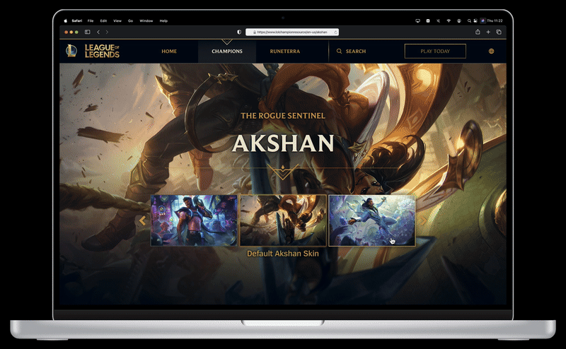
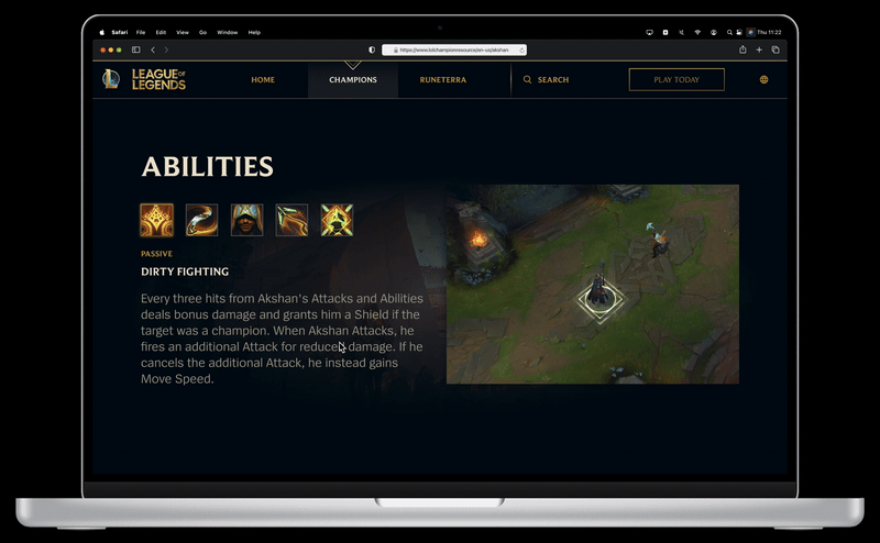
Upon selecting a champion card, the user can access their dedicated page. Each page features a visual representation of the chosen champion integrated into the background. The content includes details such as their skinline, name, lore, cost, and role. As the user scrolls down, the page systematically presents each of the champion's abilities, accompanied by corresponding gifs illustrating the abilities in action. Alongside these gifs, I provide descriptive text outlining the functionality of each ability, allowing users to both visually and textually comprehend their champion's capabilities.
Viewing Champion's Page
At the top of the page, users can utilize a carousel/slider to browse through the skinline of the champion. This functionality was implemented using variables and components. Below is a screenshot illustrating the components in action and the configuration of the variables.
Viewing Champion's Skinline
Then, for the section with abilities, I mainly utilized component variants to show the different abilities for each champion.
Viewing Champion's Abilities
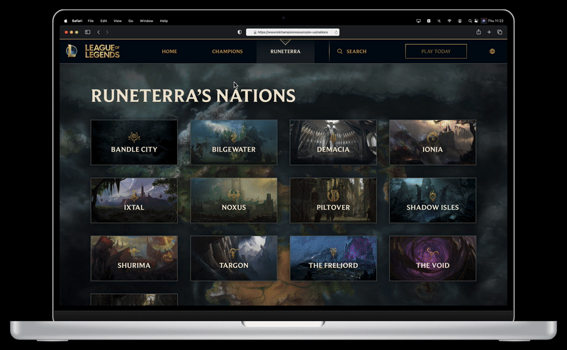
World Map
Lastly, I wanted to create a page that shows the world map of League of Legends, Runeterra, with different nations. When the user first clicks on the page, they would see the map of Runeterra as a background. It would then zoom out to reveal the name of the page and a button. As they click on the button, they’re zoomed into the background where it shows all the nations of Runeterra.
Viewing the World Map, Runeterra
As a proof of concept, they can select the first nation in the list, Bandle City, to view and learn about the nation. Then, when they scroll down, they can view the list of champions that are from Bandle City, and if they select a champion, it shows their champion page.
Selecting Bandle City
Figma File & Prototype
Feel free to explore this project via the file or prototype. Check out the interactions, UI design, colors, text, components, use of variables, autolayout, redlining, and more in the "03. Final Project" page.
Conclusion 🏁
The Prototyping II course has been transformative, delving deep into advanced UI and prototyping techniques using Figma. Through practical projects creating diverse UI interfaces and interactive elements, I've honed my skills with Figma's features like variables, components, redlining, and Auto Layout. This immersive learning journey has focused on applying these techniques, leading to a noticeable improvement in crafting cohesive, user-friendly interfaces and prototypes. The course has helped me grow tremendously as a designer, boosting my confidence in navigating Figma's intricacies and elevating the quality of my design work.
Key Takeaways 🔑
After completing the course, these were some of the key takeaways that I've learned:
Learning how to work with variables in Figma is crucial, providing a dynamic and easily updatable system for handling colors, spacing, radius, and more across designs.
Utilizing components for repeated elements not only ensured consistency but also streamlined the design process, allowing for easy modification and adaptation.
Designing with breakpoints and viewports showcased the importance of thoughtful responsiveness, tailoring elements for different screen sizes and ensuring a seamless user experience.
Implementing hover effects on champion cards adds a layer of interactivity, enhancing the user experience and providing a visually engaging element to the interface.
Auto Layout helps streamline the management of design elements and contributing to an efficient and organized layout. This feature also allows for responsive designs, ensuring a seamless and adaptable user interface across various devices.
In the future, I would like to practice more, and strive to create more designs with complex interactions!