Experience Design Internship
Elevance Health
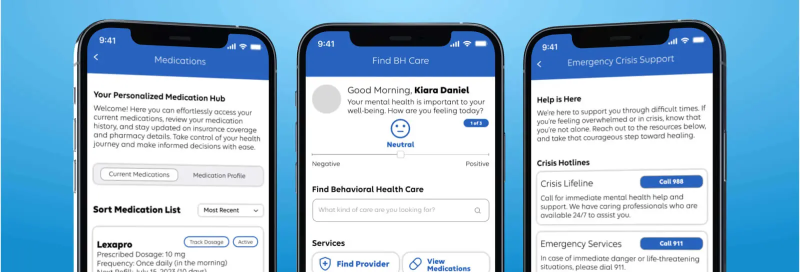
Created new design concepts for a member-facing behavioral health experience, validating two concrete changes, a gallery-based services layout and an expanded mental-state check-in, through research and dscout testing.
Overview 📝
Elevance Health, Inc. is an American health insurance provider, formerly known as Anthem, Inc. In the summer of 2023, I worked as an Experience Design Intern in the Chief Experience Office at Elevance Health.
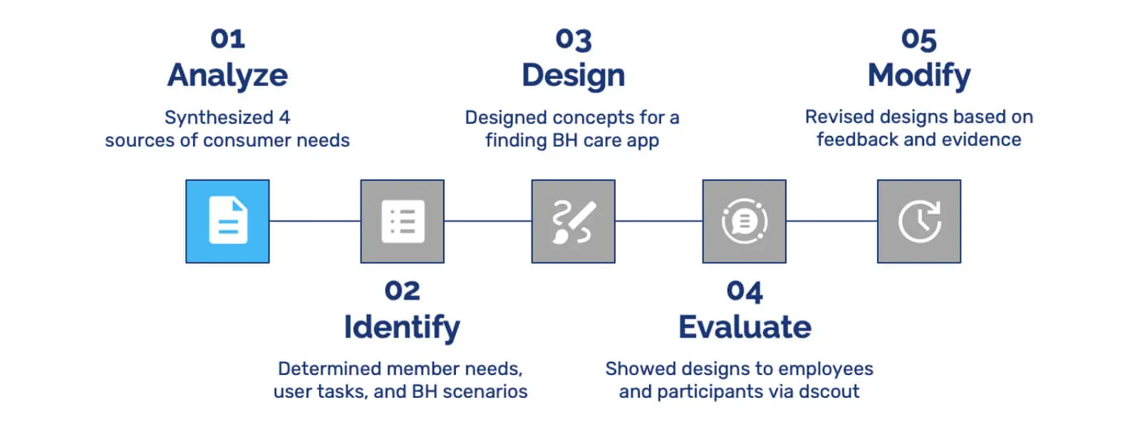
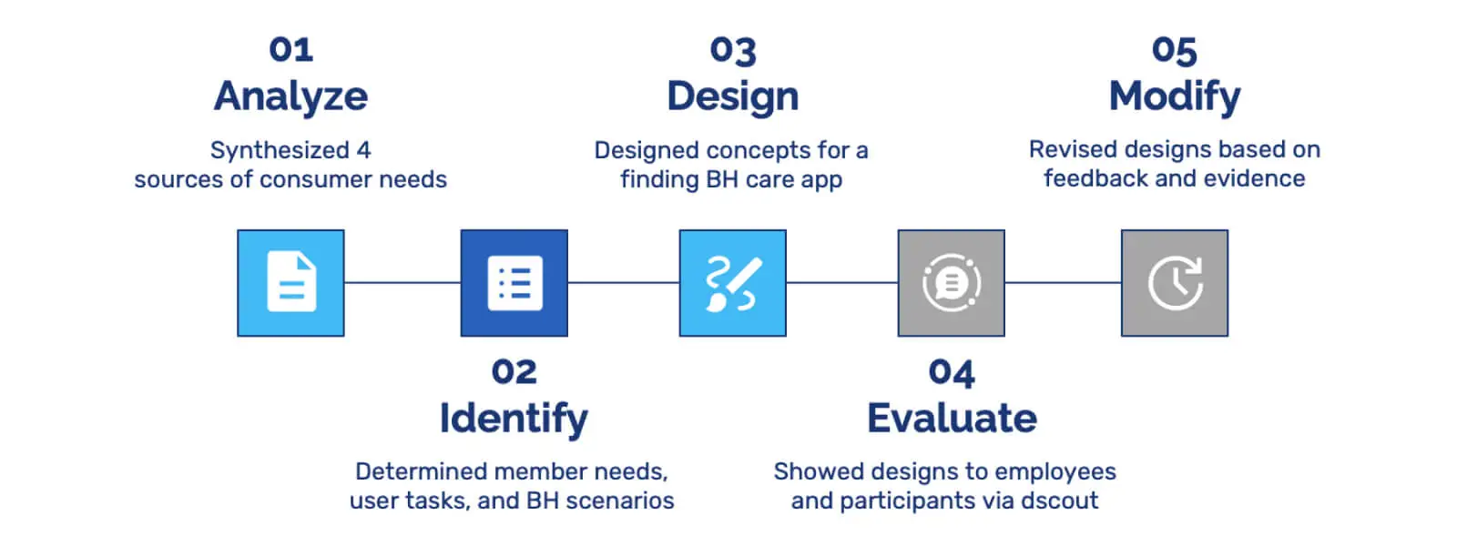
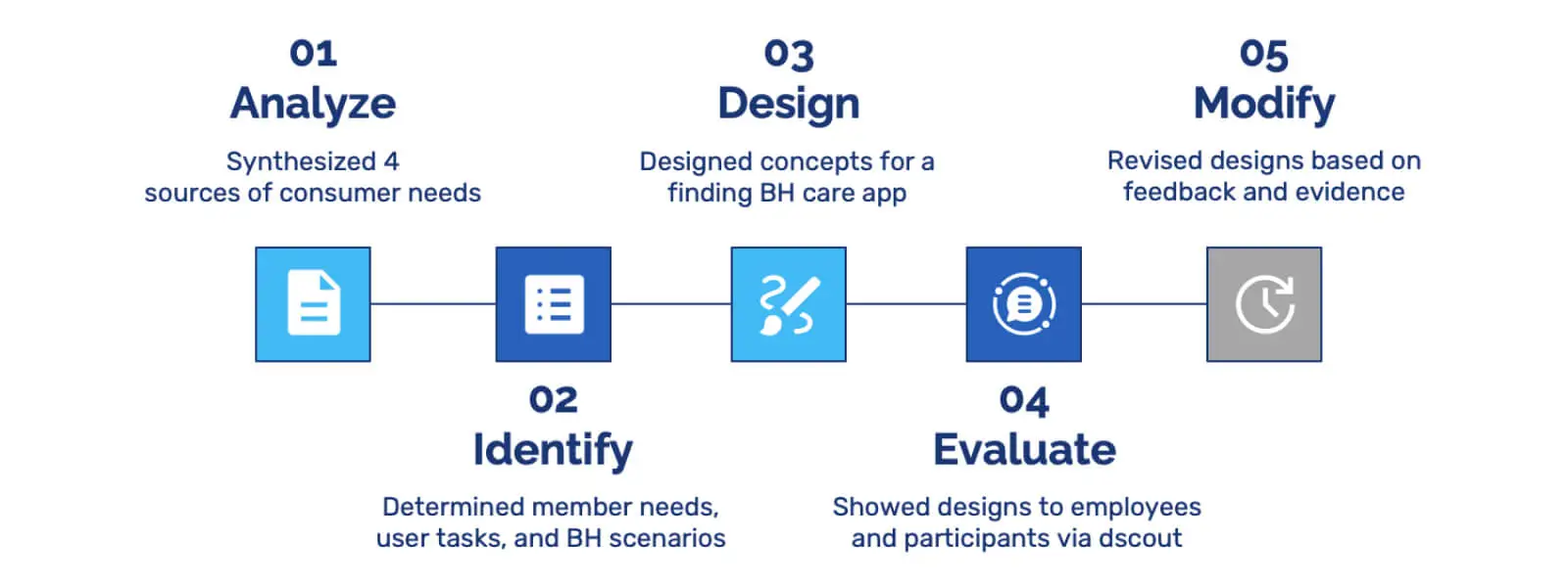
Under Suzanne Currie, Experience Strategist, I was part of the Behavioral Health Consumer Experience (BH CX) initiative. I developed new design concepts for a member-facing behavioral health experience. This involved synthesizing input from four sources, including a consumer-research report, to create lists of member needs, user tasks, and BH situations. These lists informed the design of a future Find BH Care member experience, including a landing page and interaction flows. The design process involved walkthroughs with 10 internal employees and 5 participants from a dscout study, incorporating their feedback and evidence-based findings to refine the designs.
This case study adheres to confidentiality agreements at Elevance Health. While specific details are omitted, the focus remains on methodology, process, and outcomes.
Elevance Health members face barriers in accessing digital resources for behavioral health care. This includes understanding care options, identifying providers, and managing ongoing care, especially for complex cases. To address this, we propose a comprehensive digital app experience to meet the diverse needs of members seeking BH care.
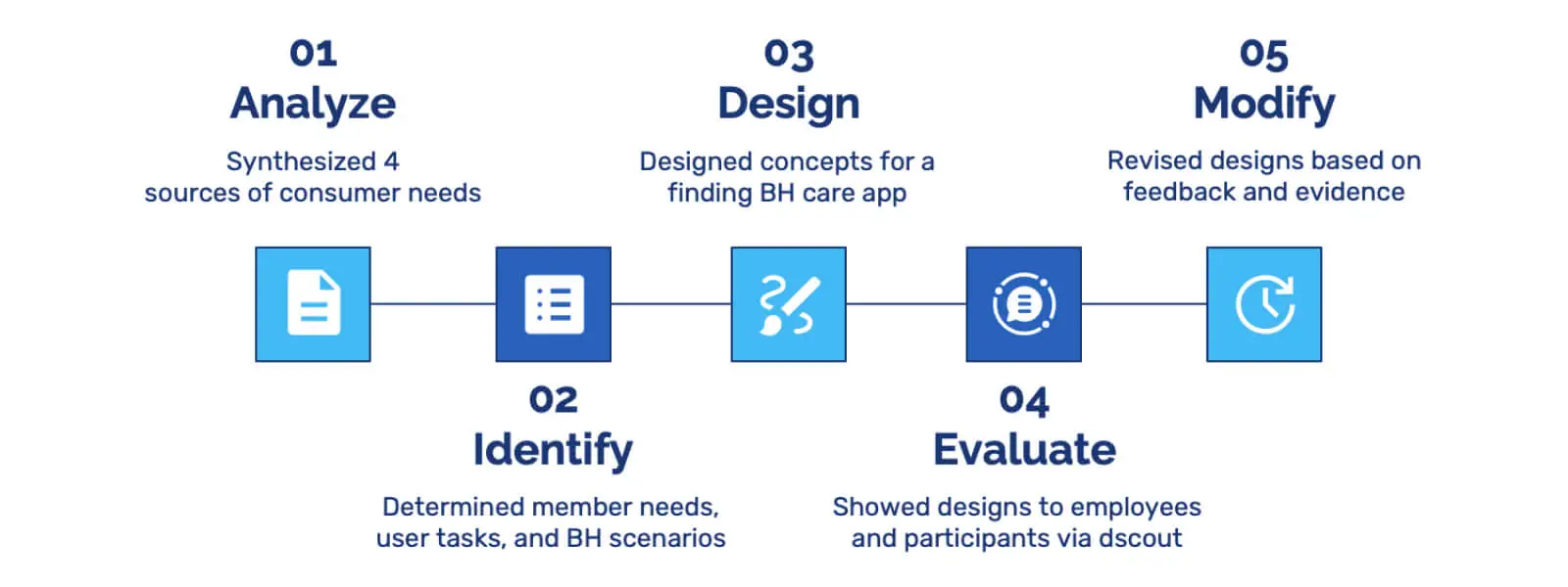
Analyze 🤔
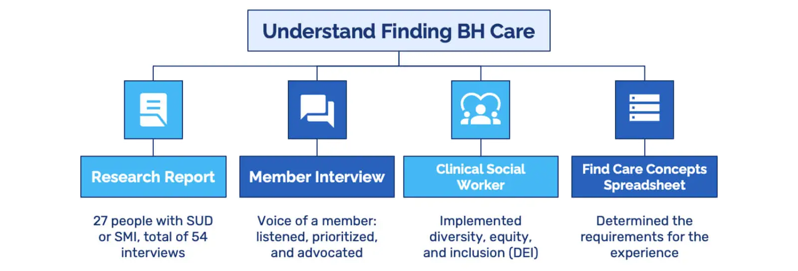
My goal in the Analyze stage was to gain insight into how members find and access BH care. I drew from four key sources: a research report, member interviews, a clinical social worker interview, and a Find Care concepts and use cases spreadsheet.
Research report
I reviewed an in-depth research report that included interviews with 27 individuals living with severe mental illness, substance use disorder, or both. This report revealed valuable BH insights, consumer pain points, and pivotal moments that deepened my understanding of their experiences.
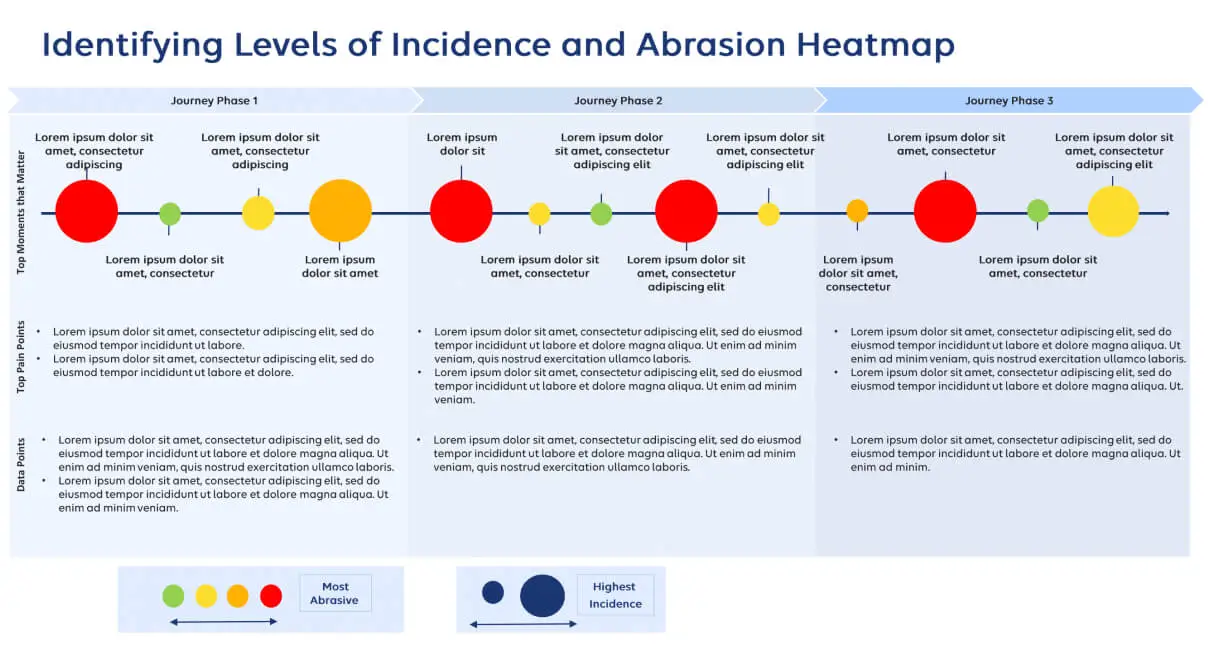
Within this research report, the BH CX team also created a range of artifacts, including a heatmap that played a pivotal role during the Analyze phase. This heatmap outlined varying degrees of incidence and pinpointed where members encounter the most friction. The underlying data remains confidential, but I can offer a visual representation of its structure and how it helped highlight pain points in a member's journey.
Member interviews
Through confidential discussions with a member, whose identity I can't disclose for privacy reasons, I saw firsthand the challenges families face when health insurance falls short of providing necessary support. This included three cross-functional informational interviews that underscored priorities and informed my advocacy efforts.
Clinical social worker interview
An informational interview with a clinical social worker at Elevance Health emphasized the significance of diversity, equity, and inclusion in the search for a suitable provider, highlighting the pivotal role these factors play in the BH consumer experience.
Find Care concepts and use cases spreadsheet
I leveraged a spreadsheet of Find Care concepts and use cases to help discern requirements, explore concepts and solutions, and assess the value they could bring to the consumer journey.
Identify 🔎
In the Identify stage, I focused on generating three pivotal categories of information: member needs, user tasks, and BH scenarios.

For member needs, I aimed to understand the current requirements of those seeking and utilizing BH care. For user tasks, I outlined what individuals do when engaging with BH care via the Sydney app and anthem.com, capturing the experience start to finish. I also detailed diverse scenarios where individuals find and access BH care, identifying where our design solutions would be most impactful. Synthesizing these lists and insights revealed opportunities that formed a solid foundation for the design concepts.

Design 🎨
During the Design stage, I synthesized the research and information from the preceding stages to craft the design concepts.
Core experience principle
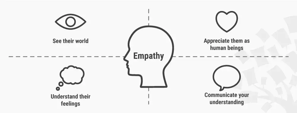
The design concepts were centered around a core experience principle: "Meeting the Member Where They're At." Its specific meaning is confidential, but it guided the translation of consumer needs into every experience concept that followed.
Translating consumer needs into experience concepts
My earlier work involved pinpointing needs, tasks, situations, and opportunities within the project's scope. Building on that groundwork, I dug into the underlying motivations that drive people to engage with the app, such as seeking BH care for the first time, needing prescription refills, or seeking care for a loved one.
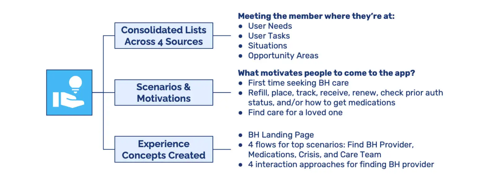
By establishing this foundation, the experience design concepts were tailored to diverse situations and motivations. The result was a pathway that resonated with each user's current needs, supporting an authentic and intuitive experience.
Low-fidelity design concepts
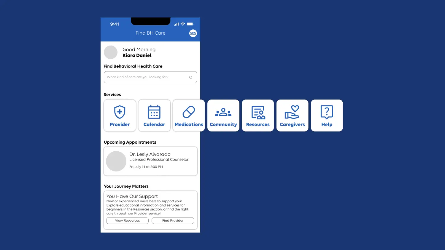
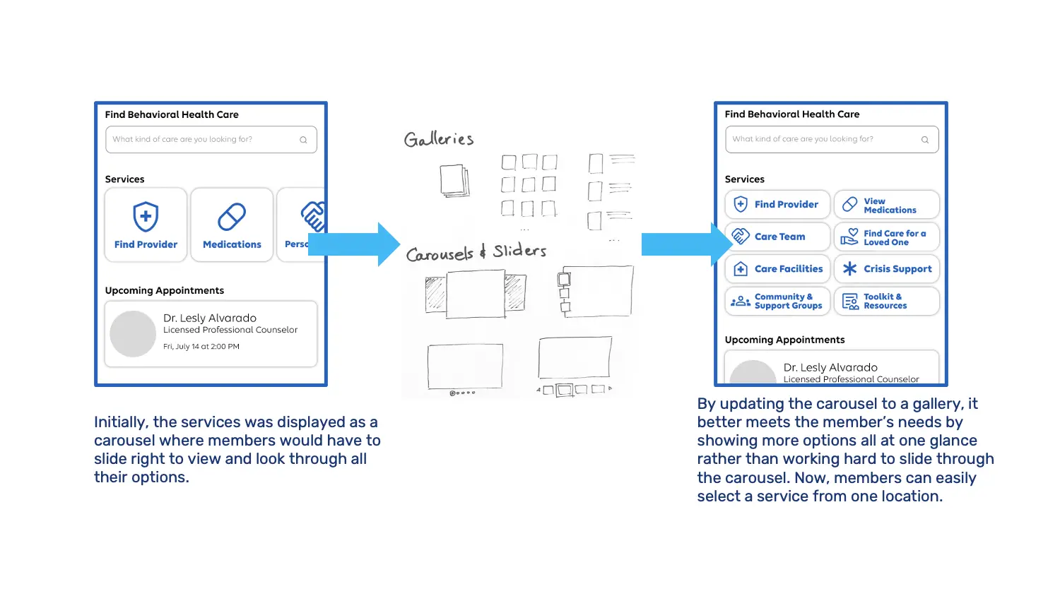
The first iteration of the BH landing page concept used a carousel or slider format to present the available services.
Connected to the landing page, I designed four distinct user flows: finding a BH provider, managing medications, connecting with a care team, and addressing crises, the top scenarios we identified to focus on.
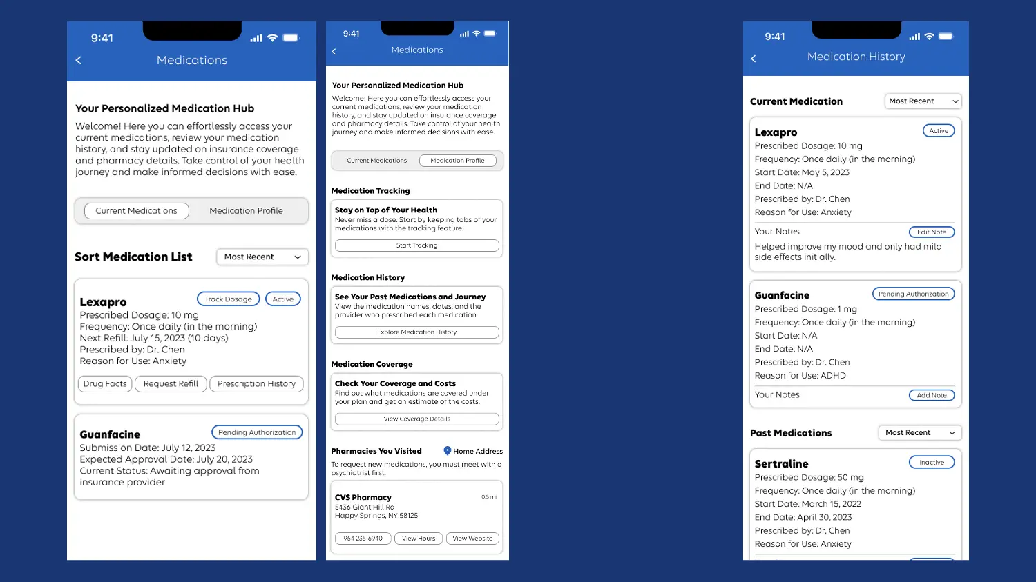
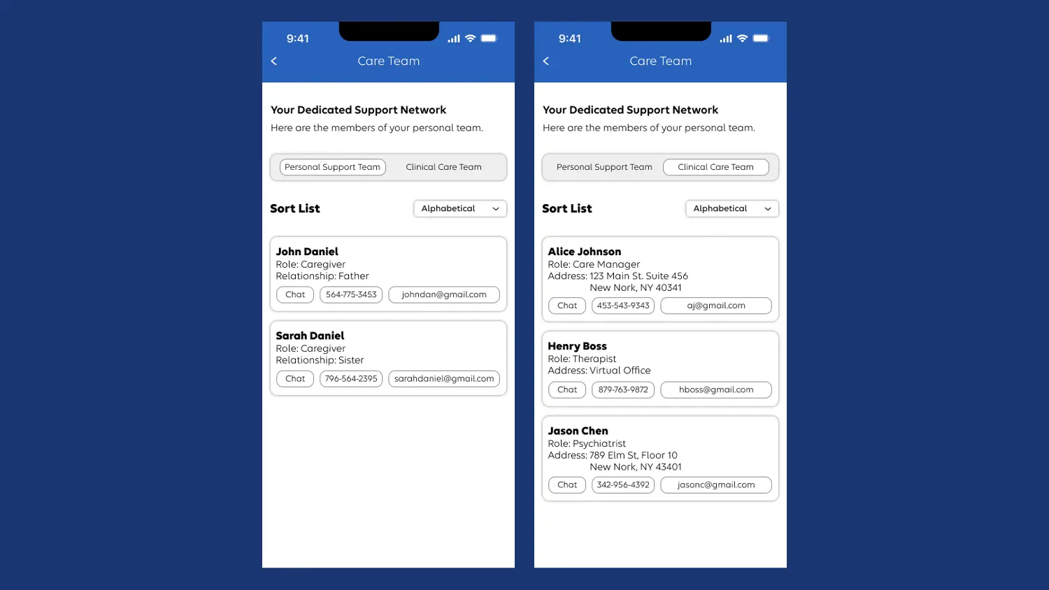
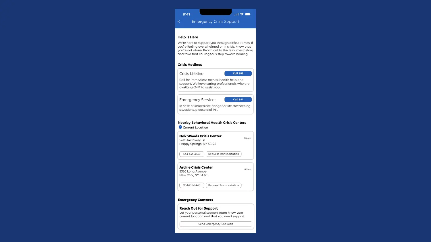
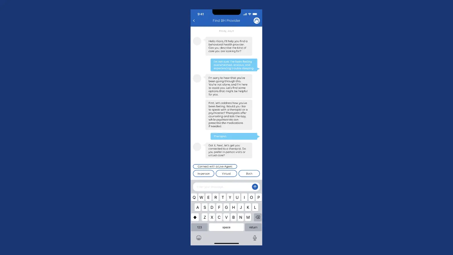
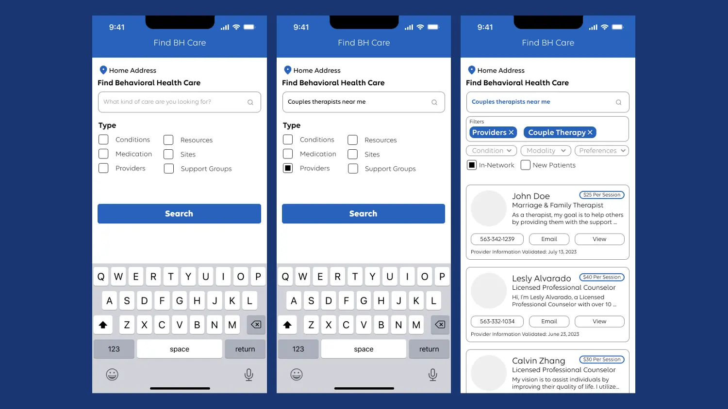
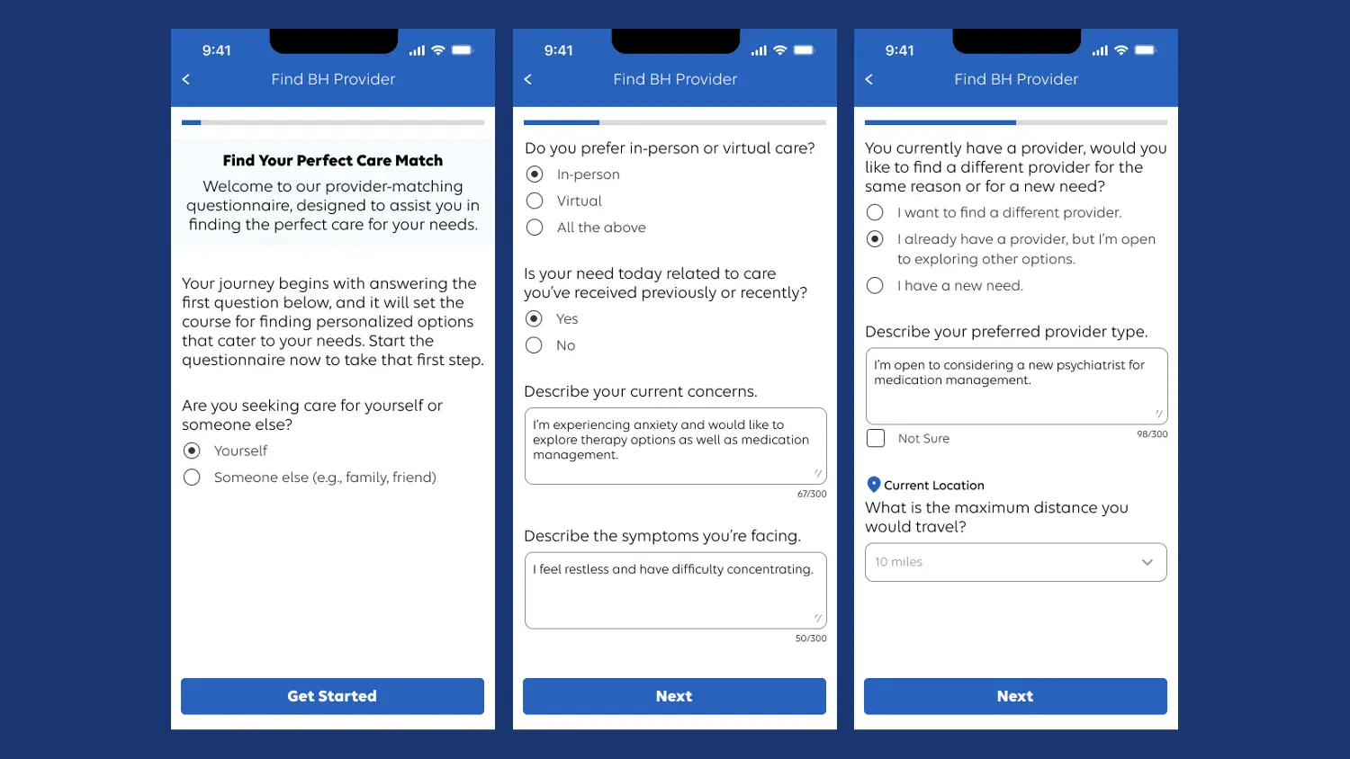
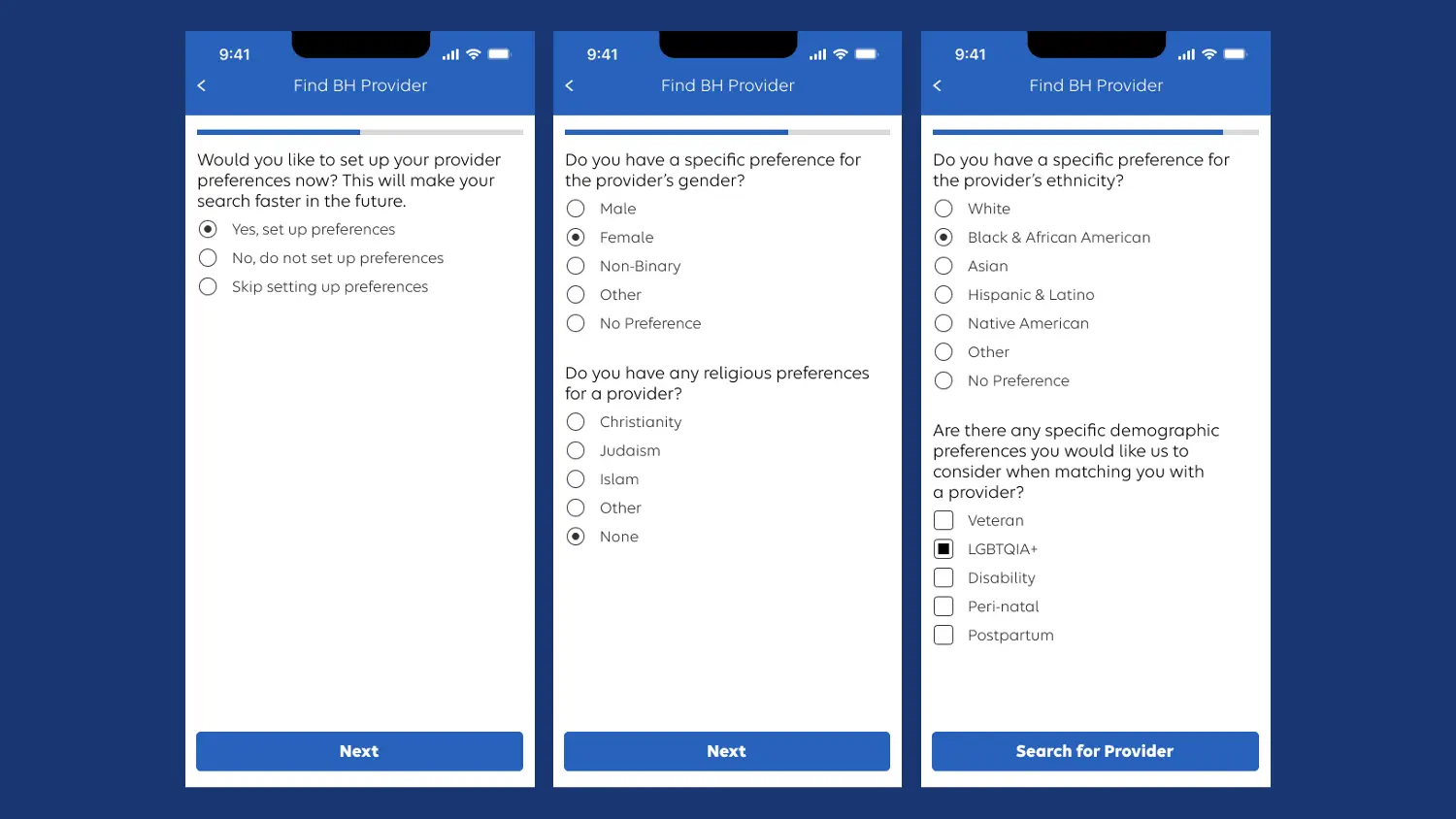
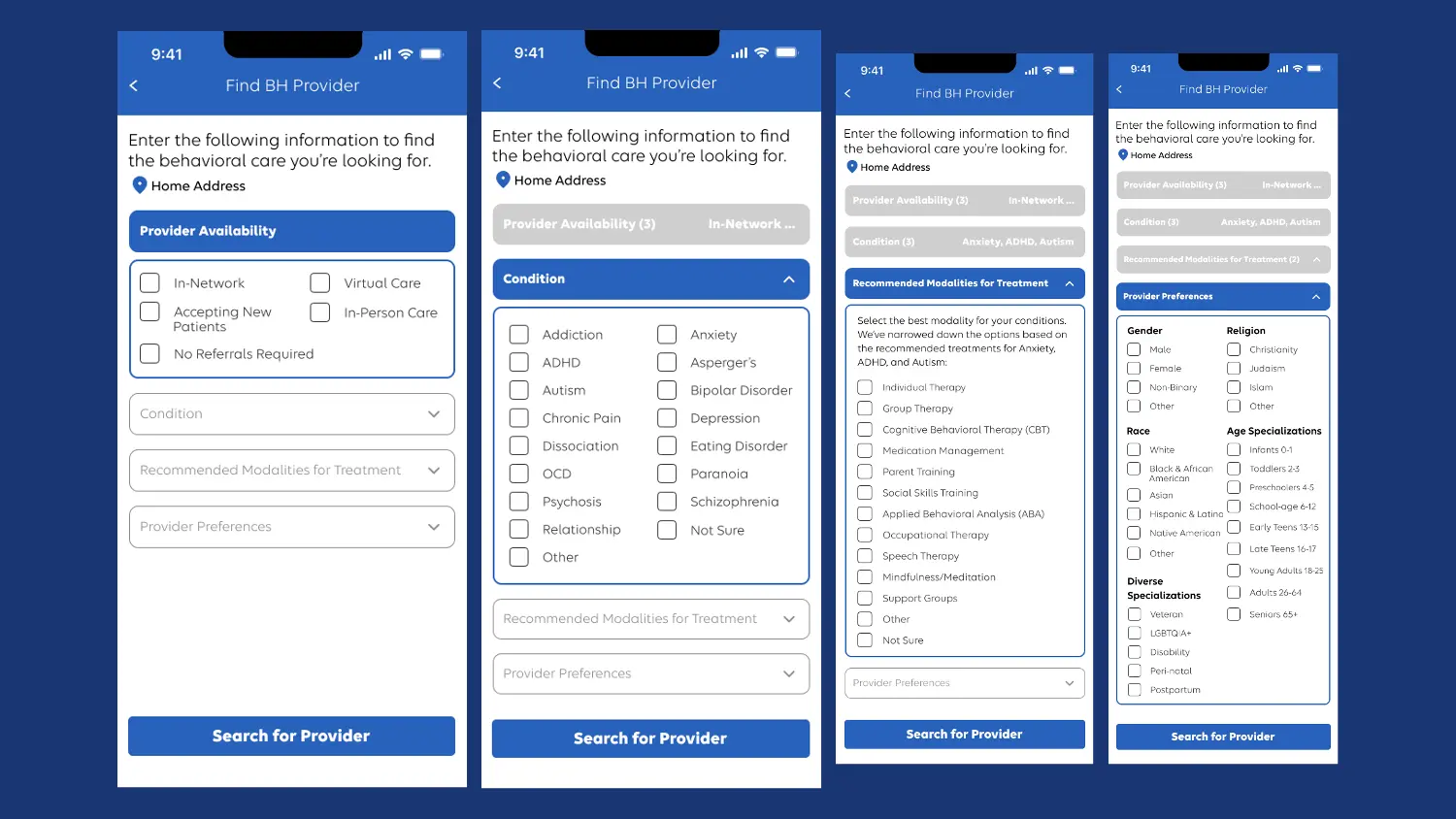
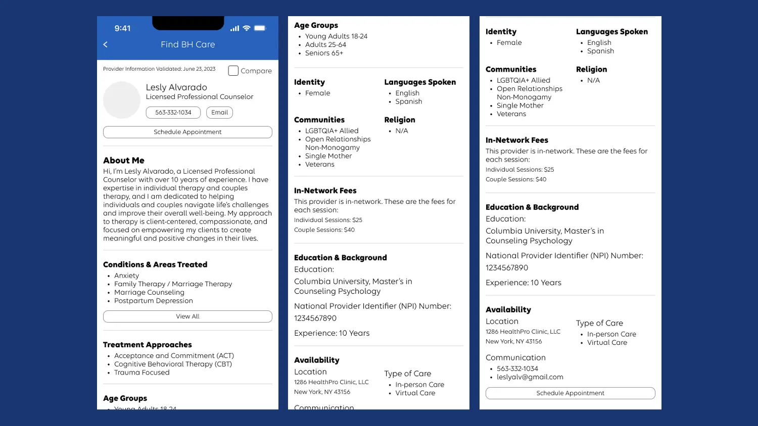
I also designed four interaction approaches for locating a BH provider: a chatbot, an open search, a questionnaire, and a dropdown-and-search feature, plus a supplementary provider bio screen.
Evaluate 💬
With the BH landing page, user flows, and provider-finding approaches complete, the focus shifted to gathering feedback that would help refine the designs.
This phase drew on insights from stakeholders, experienced employees, and participants with BH needs, supporting an iterative process of improvement. Incorporating this feedback let me make informed revisions that elevated the overall experience.
Four sessions of internal design walkthroughs
To begin collecting feedback, I conducted four rounds of design walkthroughs involving 10 company employees. Names aren't disclosed for privacy, but I can outline their roles.
The first session engaged the CXO behavioral health team for a comprehensive review. The second brought together people who could offer personal behavioral health insight, including a member whose family was facing a BH situation, their case manager, a peer support administrator, and a clinical social worker. The third engaged two subject matter experts in substance use disorder and severe mental illness. The fourth connected with someone experienced in the pharmacy sector.
Together, these four sessions yielded feedback that enhanced the designs in line with the principle of meeting the member where they are.
After the internal design walkthroughs
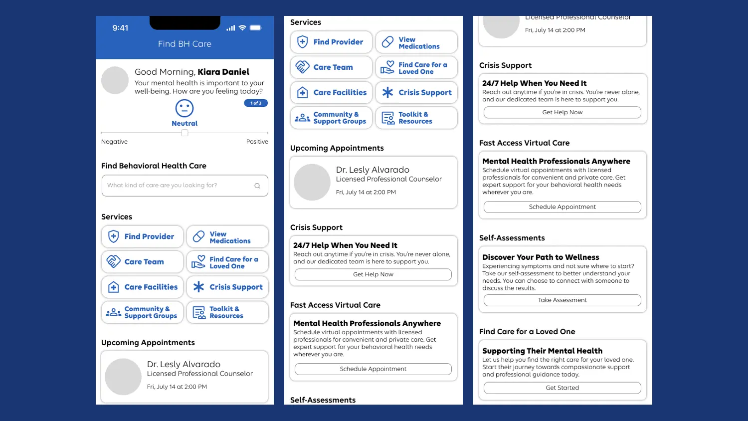
Comparing the landing page before and after these walkthroughs highlights the changes that resulted.
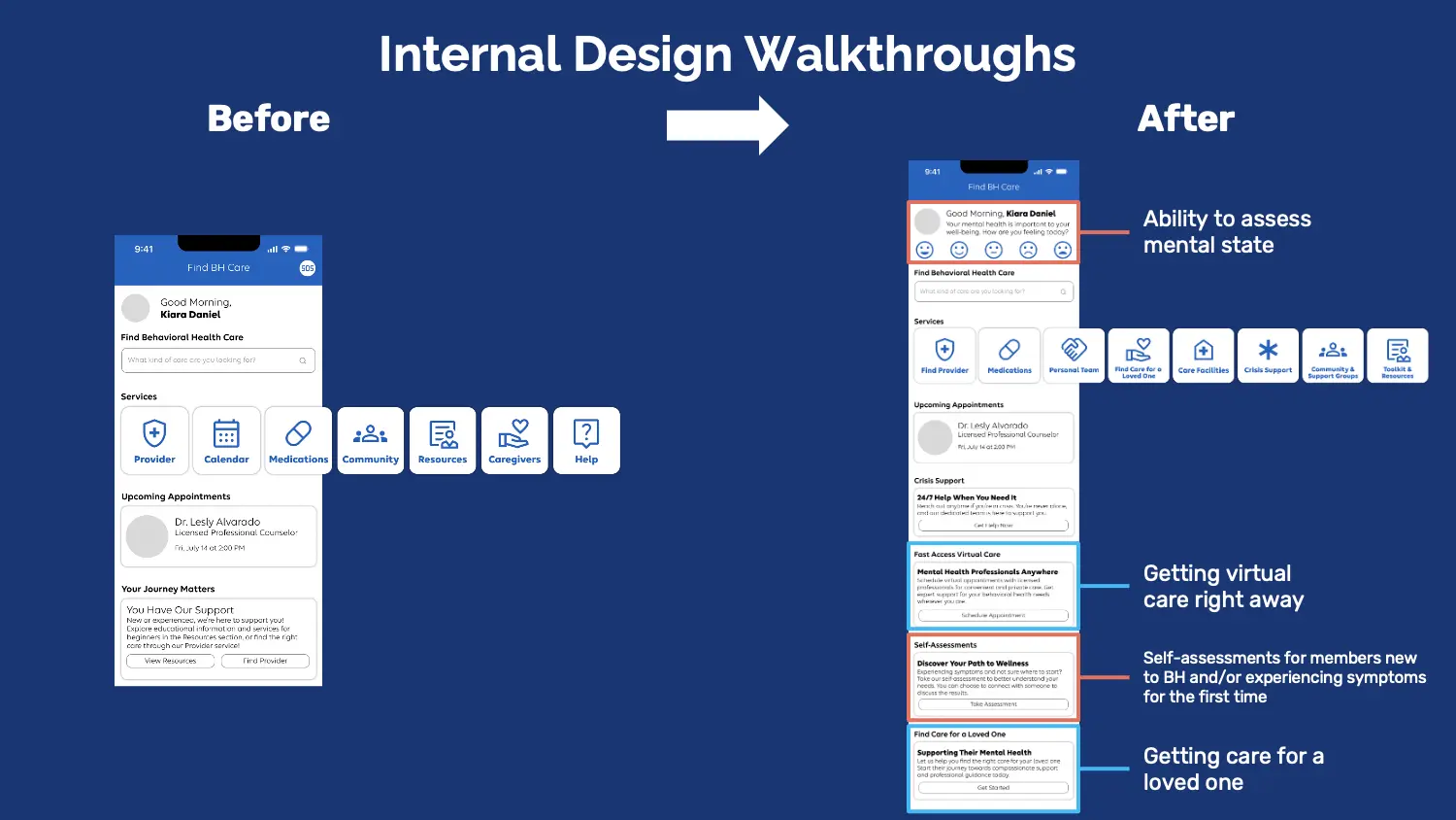
On the right screen, we added a feature for members to evaluate their mental state, promoting self-reflection and mental health awareness. We also integrated direct access to Live Health Online, enabling quick engagement with care services. The self-assessments guide those new to behavioral health or experiencing symptoms for the first time. The page also supports those seeking care for a loved one.
Dscout study
Building on the internal walkthroughs, I partnered with my project manager, Suzanne Currie, to run the Find and Access BH Care study, covering study planning, plan review, a recruiting screener, and launching and conducting the study.
Dscout screener
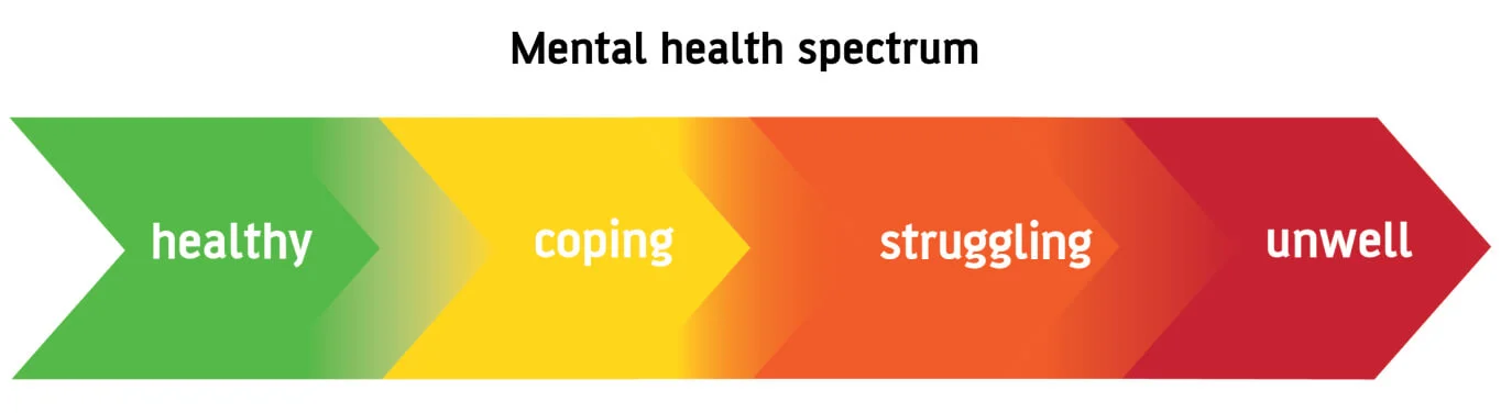
For the participant screener, we wrote twenty-three questions to determine study fit. Participants also contributed a short video describing their experience accessing BH care. Recruitment targeted five participants spanning diverse acuity levels within the mental health spectrum.
Running the study
I moderated four of the five one-hour sessions with participants via dscout. Across these sessions, participants shared feedback on the BH landing page, the user flows across various scenarios, and the four provider-finding approaches. They also shared their own BH journeys and mental models of what a behavioral health app should include.
I used the insights from these sessions to build affinity maps, grouping similar information to distill common themes. These maps directly guided the design revisions and clarified participant preferences going into the next stage.
The sessions also revealed participants' preferred interaction approach for locating a BH provider, helping refine the concepts going forward.
Preferred concept for finding a BH provider
Among the four approaches, the dropdown and search method was preferred by four out of five participants. Its comprehensive, personalized nature, adaptability to individual needs, and intuitive checklist-like functionality contributed to its perceived ease of use.
The other approaches were less preferred, largely because they suited individuals new to BH care less well and posed challenges when someone needed swift assistance during a crisis.
To visualize the comparative effectiveness of these approaches, I built a 2x2 matrix mapping participants' experiences across "novice to expert" and "novel to familiar interaction."

"Novice to expert" reflects the level of BH familiarity a participant needs to effectively use an approach. "Novel to familiar interaction" gauges how much a user's past experience with a similar approach affects its ease of use.
Modify 🔨
In the Modify stage, I used feedback and insights from Evaluate to refine and enhance the design concepts for optimal member experience.
Comparing the landing page before and after the dscout study and design walkthroughs highlights the enhancements that followed.

The screen on the right represents the finalized iteration of the BH landing page. Two significant changes came out of the dscout walkthroughs: a spectrum featuring a broader range of mental health states, replacing the previous limited scale, and a services layout transformed into a gallery format, moving away from the swipe-based design.
Finding: services
Services were originally presented in a carousel or slider format, requiring members to slide right to explore all options. Conversations with participants showed this sliding action demanded extra effort and time. I updated the carousel to a gallery layout that displays a wider array of options in a single location, letting members select services without extensive sliding.
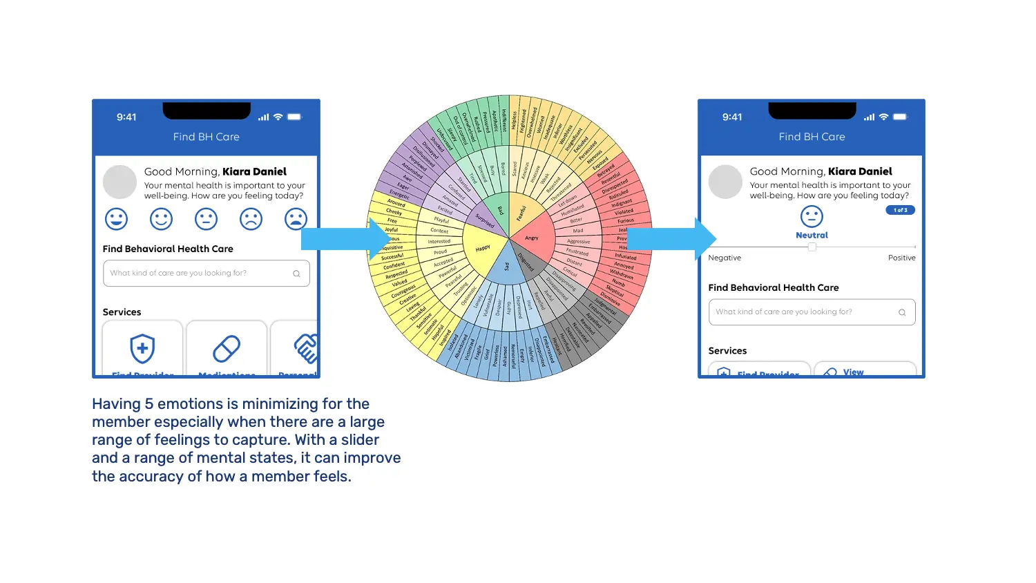
Finding: mental states
Originally, members could only choose from five emotions when checking in, which proved limiting. I found a comprehensive wheel encompassing many more words to accurately capture the diverse range of emotions people experience.
Acknowledging this intricate spectrum of feelings, the design transitioned to a slider format. Compared to the initial five options, this better aligns with the emotional landscape and lets members indicate a wider span of mental states with more precision.
Finding: personalization
As the design concepts reached their culmination, I created a context scenario featuring Mary, a fictional character, to offer a clear illustration of how someone like her would navigate the app. This narrative was one of my final contributions during the internship, and its focus on Mary's journey underscores the need for the BH app to feel personalized.
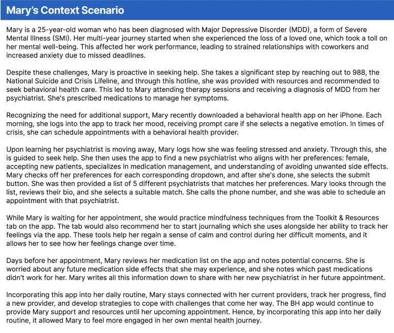
The dscout study emphasized a key finding: personalization is paramount. The scenario highlights how the app can be tailored to Mary's unique needs, and the broader importance of personalization to the overall member experience.
Conclusion 🏁
This internship shipped two validated design changes, the services gallery and the expanded mental-state check-in, into Elevance Health's BH care roadmap, and shaped how I approach research-informed design ever since.
Key takeaways 🔑
- Research and design are interdependent: a strong design relies on thorough research, and designs themselves can serve as research tools to validate further.
- Low-fidelity work is valuable precisely because it's imperfect, sharing work in progress made it possible to catch and fix issues fast, before they were costly to change.