Initial Planning & Assessment 💭
Thorough planning and assessment set the project's direction and objectives. This phase reviews the original website to identify strengths and weaknesses, gathers stakeholder requirements, and evaluates existing content. Site mapping and information architecture create a structured blueprint for the redesign. These steps ensure a well-informed, strategic approach to the website redesign.
Website Analysis
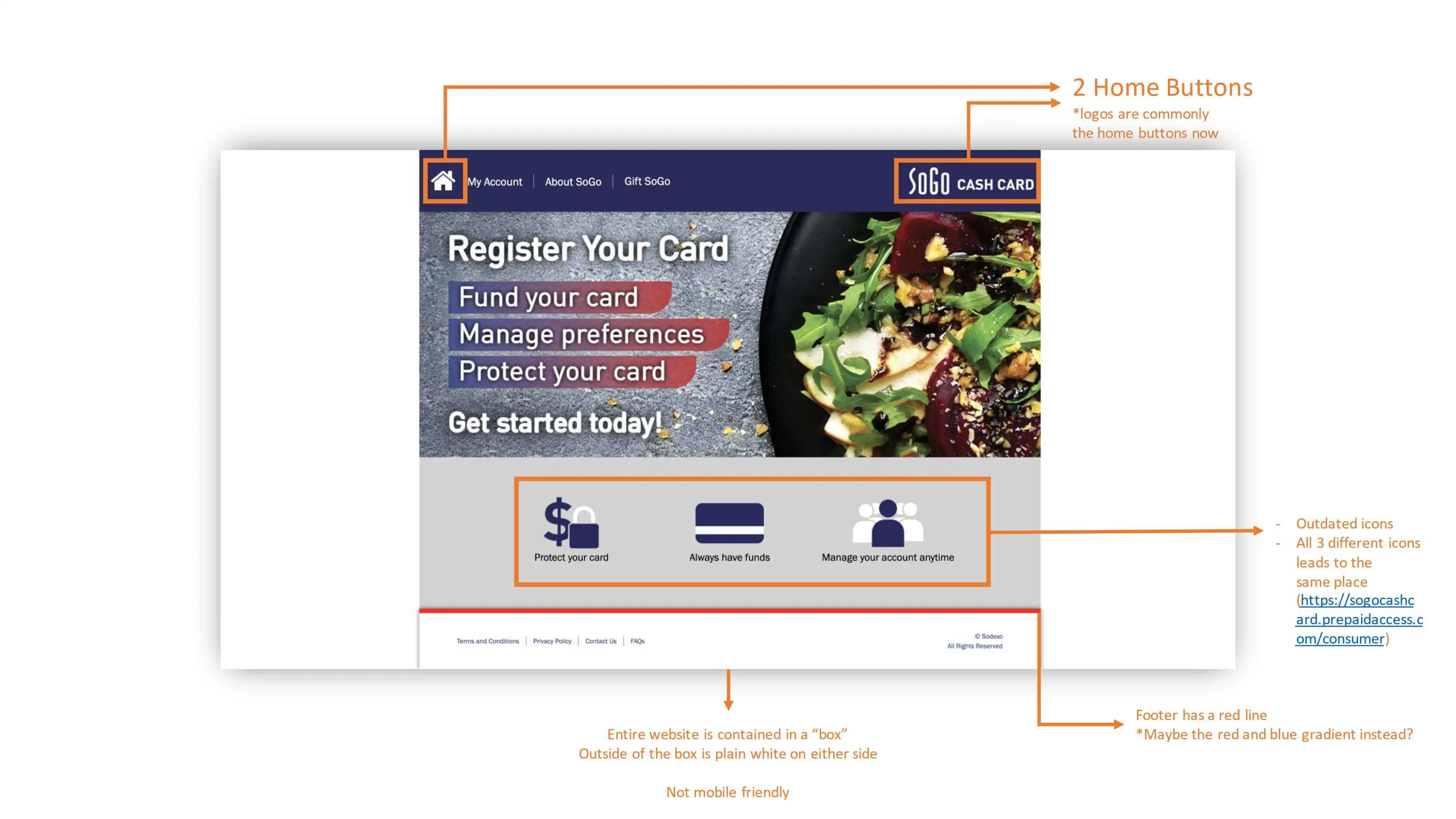
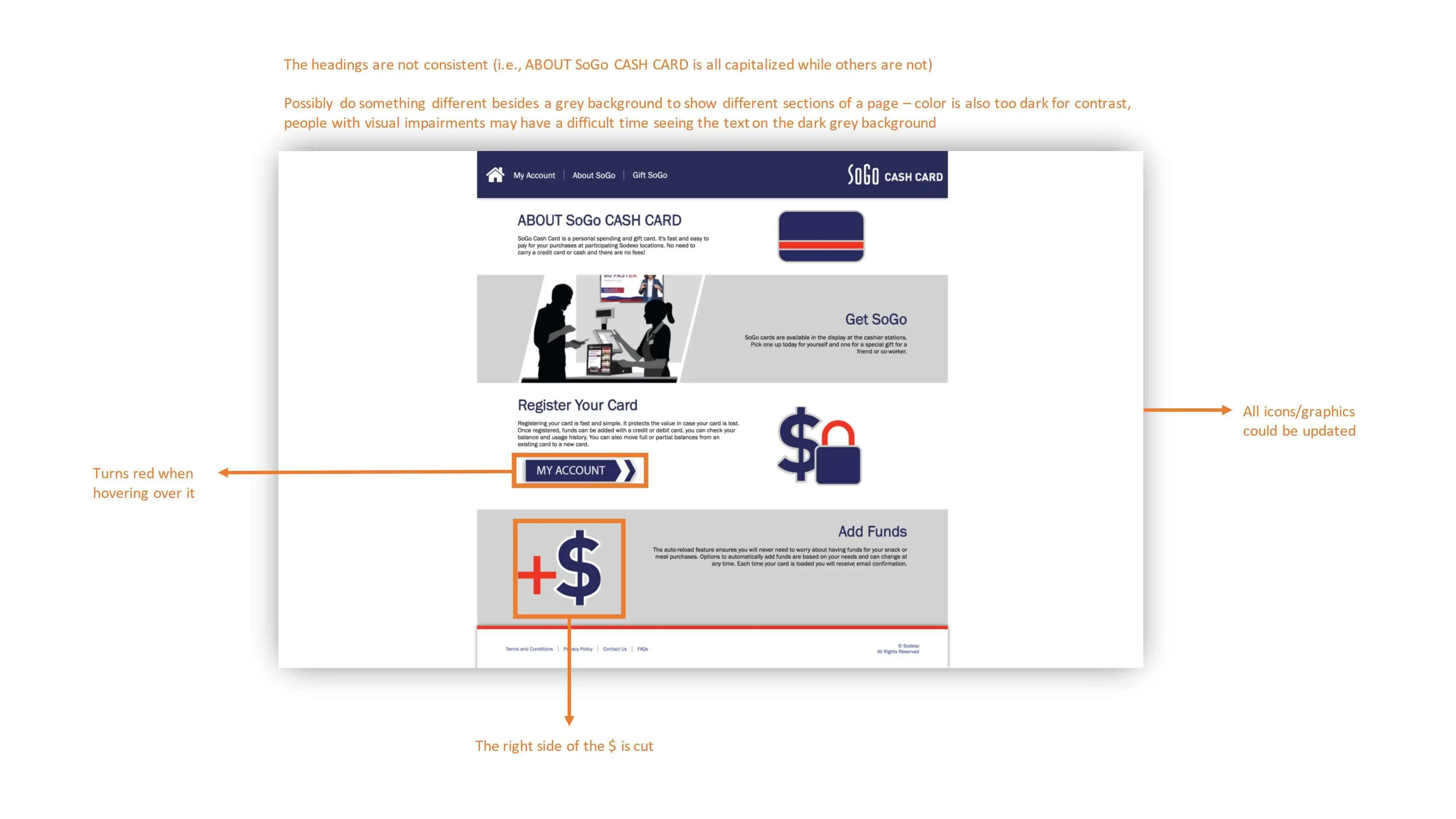
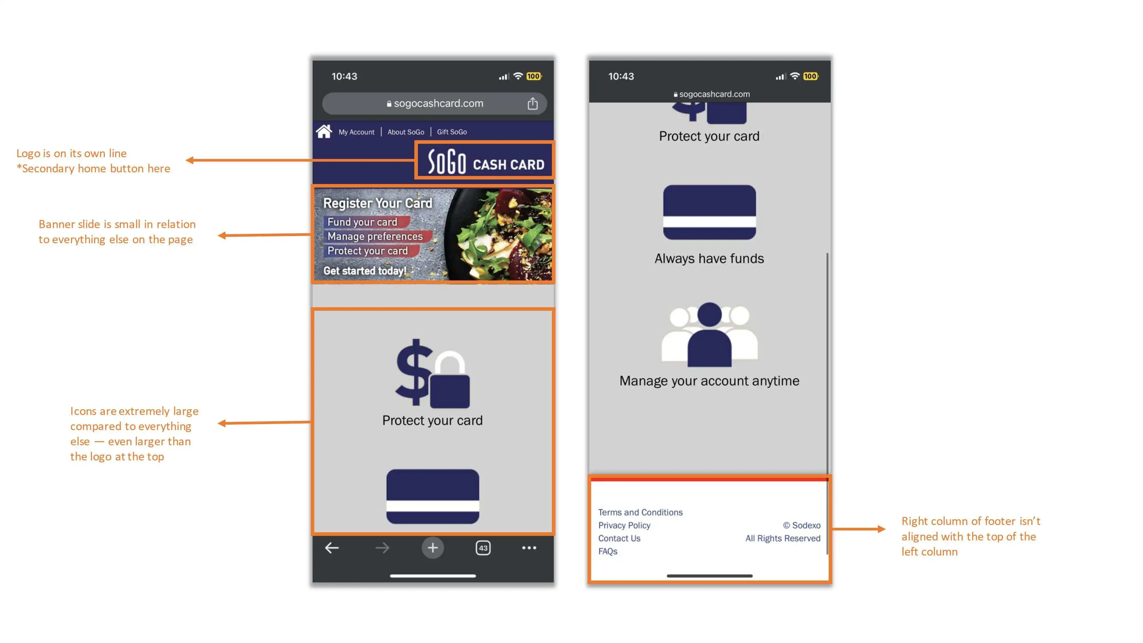
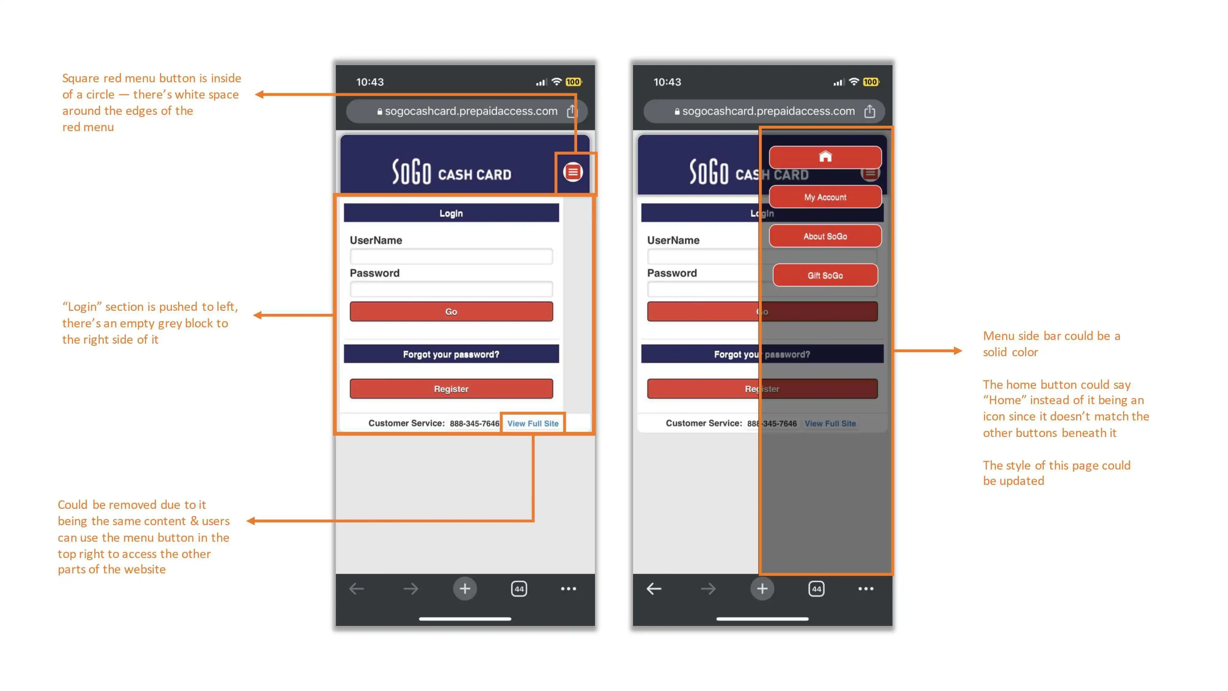
The process began with a comprehensive review of the original SoGo Cash Card website. This involved a thorough analysis of its design, functionality, and user experience. By examining each element closely, I gained valuable insights into its strengths, weaknesses, and areas for improvement. The following below are a few examples of how I analyzed the website:
Competitive Analysis
In conducting a competitive analysis, I evaluated several key competitors in the industry to gain insights into current trends, best practices, and areas for differentiation. Due to non-disclosure agreements (NDAs) with the companies I reviewed, I am unable to disclose specific competitor names. However, I can share some of the findings to inform our website redesign strategy.
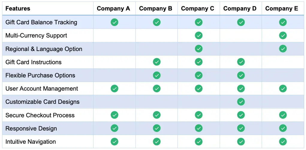
The following are the key findings from our competitive analysis:
- Design and User Experience: Competitors' websites often feature sleek designs, user-friendly interfaces, and intuitive navigation. Many excel in visual storytelling with captivating imagery and interactive elements.
- Gift Card Functionality and Features: Competitors streamline gift card redemption, allowing users to easily check balances, reload funds, and track transactions online or via mobile apps, enhancing usability.
- Regional Customization: Competitors tailor content and promotions to specific regions, addressing cultural preferences and events for a personalized user experience.
- Content and Messaging: Competitors communicate value propositions through compelling copywriting and persuasive messaging, offering educational resources and tutorials to build credibility and trust.
Stakeholder Requirements Gathering
I engaged with stakeholders to understand their goals, priorities, and vision for the website redesign. Their input helped shape the project's objectives and informed key decisions throughout the process. The following are some of those objectives:
- Enhanced User Experience: Prioritize a seamless, intuitive user experience for USA and Canada users. Implement a user-friendly interface for easy country and language selection (French or English), ensuring accessibility for all.
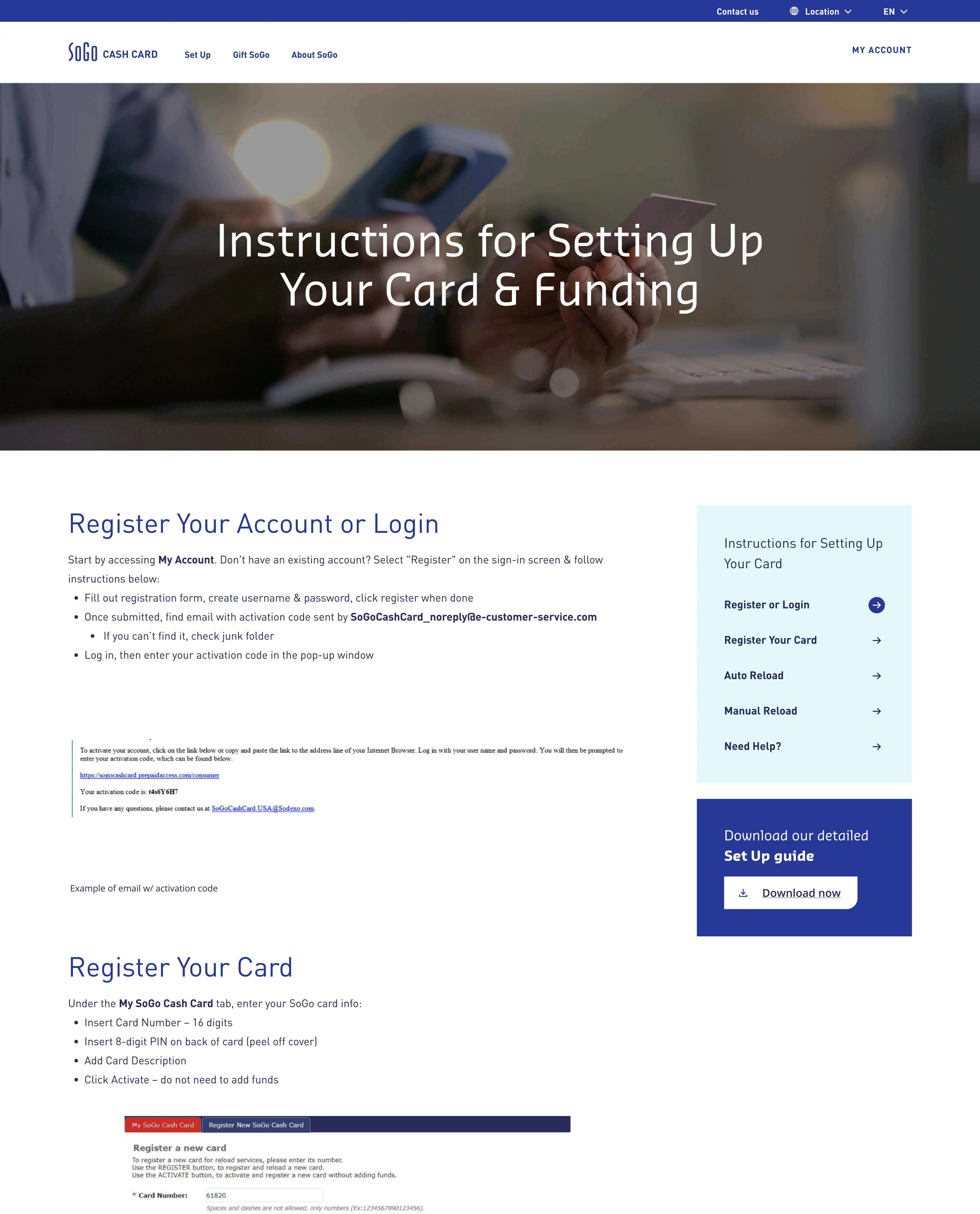
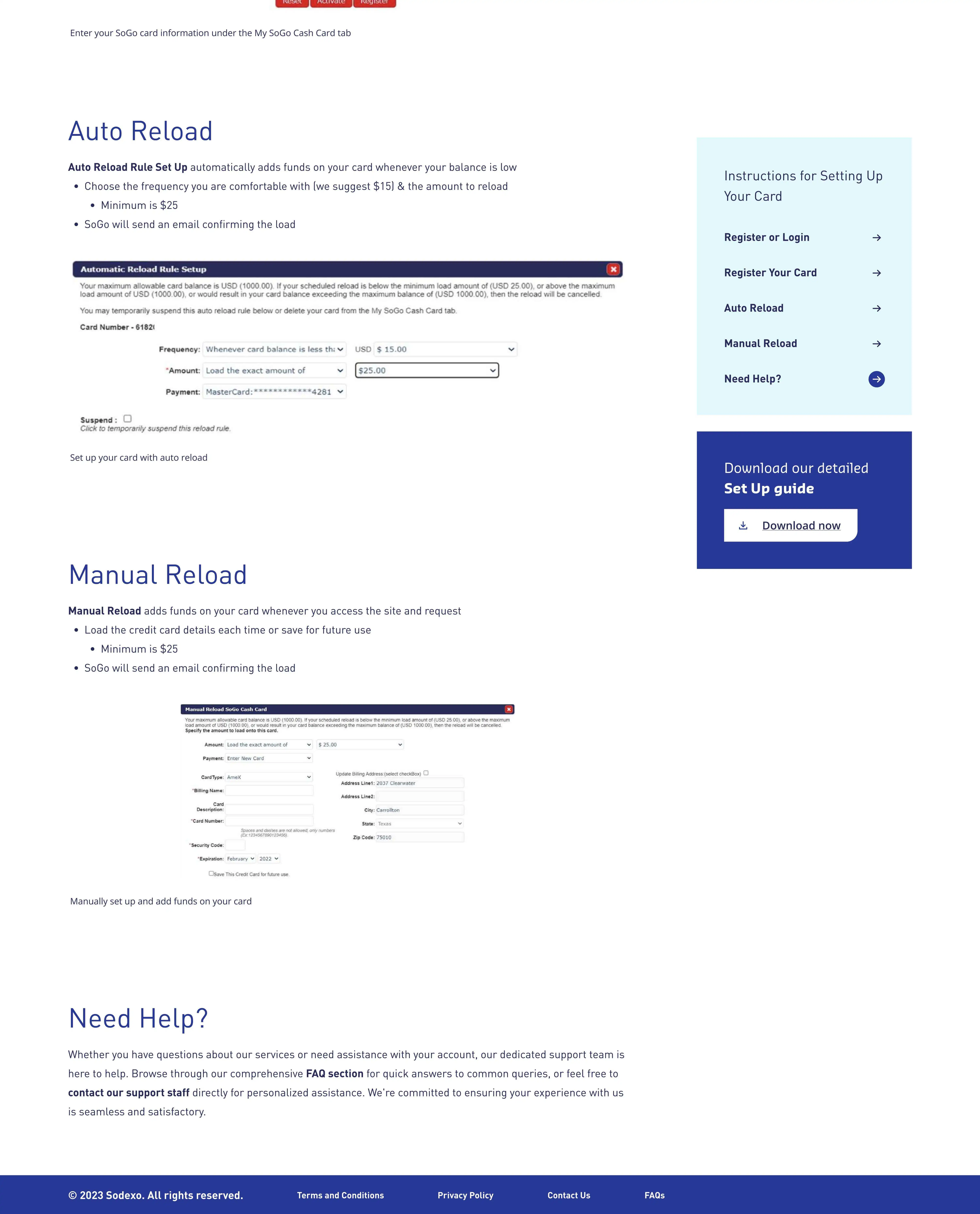
- Streamlined Onboarding: Simplify the onboarding process with a dedicated page for setting up SoGo Cash Card. Provide clear steps for activating the card, registering an account, and accessing features to reduce friction and increase engagement.
- Increased Conversion Rates: Improve conversion rates by allowing users to view their gift card balance directly on the website. Make this feature prominent and easily accessible to encourage transactions and reloads.
- Modern UI Design: Enhance the website's UI design to align with the SoGo Cash Card brand. Update visual elements, typography, and color schemes for a contemporary look that reinforces brand identity.
- Content Expansion: Add content about SoGo Cash Card's gift cards, including history, features, and benefits. Include an "About" page detailing the company's background, mission, values, and customer commitment to build trust and credibility.
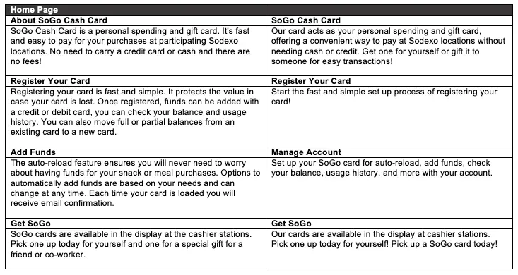
Copy Review and Content Assessment
Evaluating the existing copy and content on the website was crucial in determining its effectiveness and relevance. I carefully reviewed each piece of content to ensure alignment with the brand's messaging and tone while identifying opportunities for enhancement. The following is an example of how the copy was adjusted and reviewed:
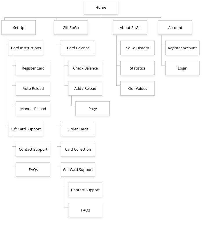
Site Mapping and Information Architecture
With a clear understanding of the website's current state and stakeholder requirements, I proceeded to create a comprehensive site map. This visual representation outlined the website's structure, hierarchy, and navigation flow, serving as a blueprint for the redesign process.
Site Map
Our sitemap emphasizes four key pages: Set Up, Gift SoGo, About, and Account, all stemming from the homepage. Each page serves a distinct purpose, catering to user needs.
"Set Up" guides new users through setting up their gift card, "Gift" offers a variety of gift cards and gift card functionalities, "About" provides company insights, and "Account" offers personalized access. Together, they ensure a seamless and user-centric browsing experience.
By following these initial steps, I established a solid foundation for the subsequent phases of the UI redesign process, ensuring alignment with stakeholder expectations and a user-centric approach to enhancing the SoGo Cash Card website's overall experience.
Wireframing & Design System Integration 🏗️
With a foundation established, I focused on the website's design and structure. I started by creating wireframes to outline the layout and organization of web pages for a clear, intuitive user experience. I integrated design systems to maintain consistency and efficiency across all elements. Using predefined styles, components, and patterns, I streamlined the design process, reduced redundancy, and ensured a cohesive visual identity. This approach enhanced aesthetics, usability, and scalability, delivering a polished and professional user experience.
Wireframes
I created wireframes of the website's layout and functionality, ensuring every element is strategically placed for optimal user interaction. Through iterative refinement, I shape the wireframes to effectively convey the website's structure and flow before proceeding to the design phase. The following are some examples of the wireframes:
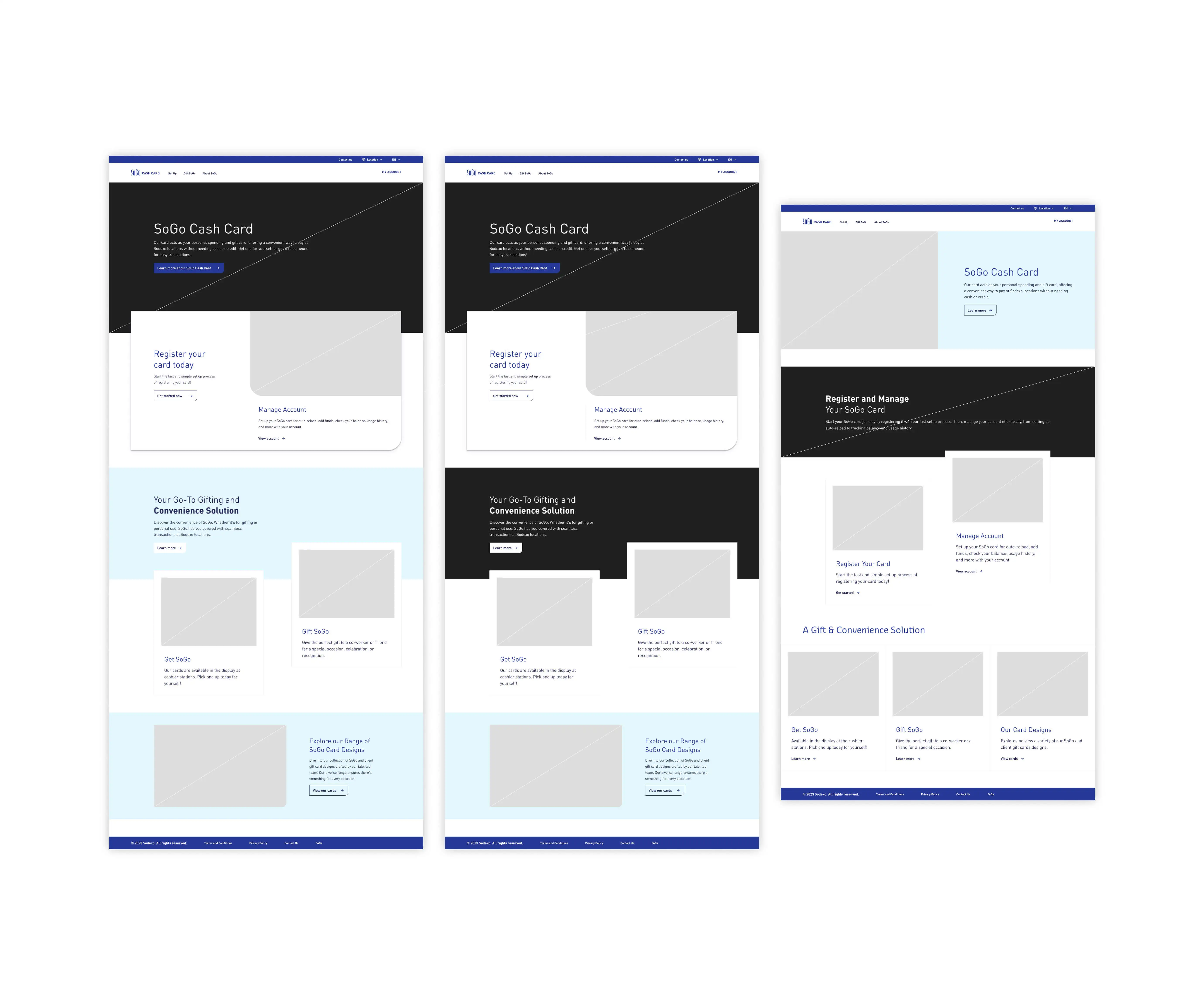
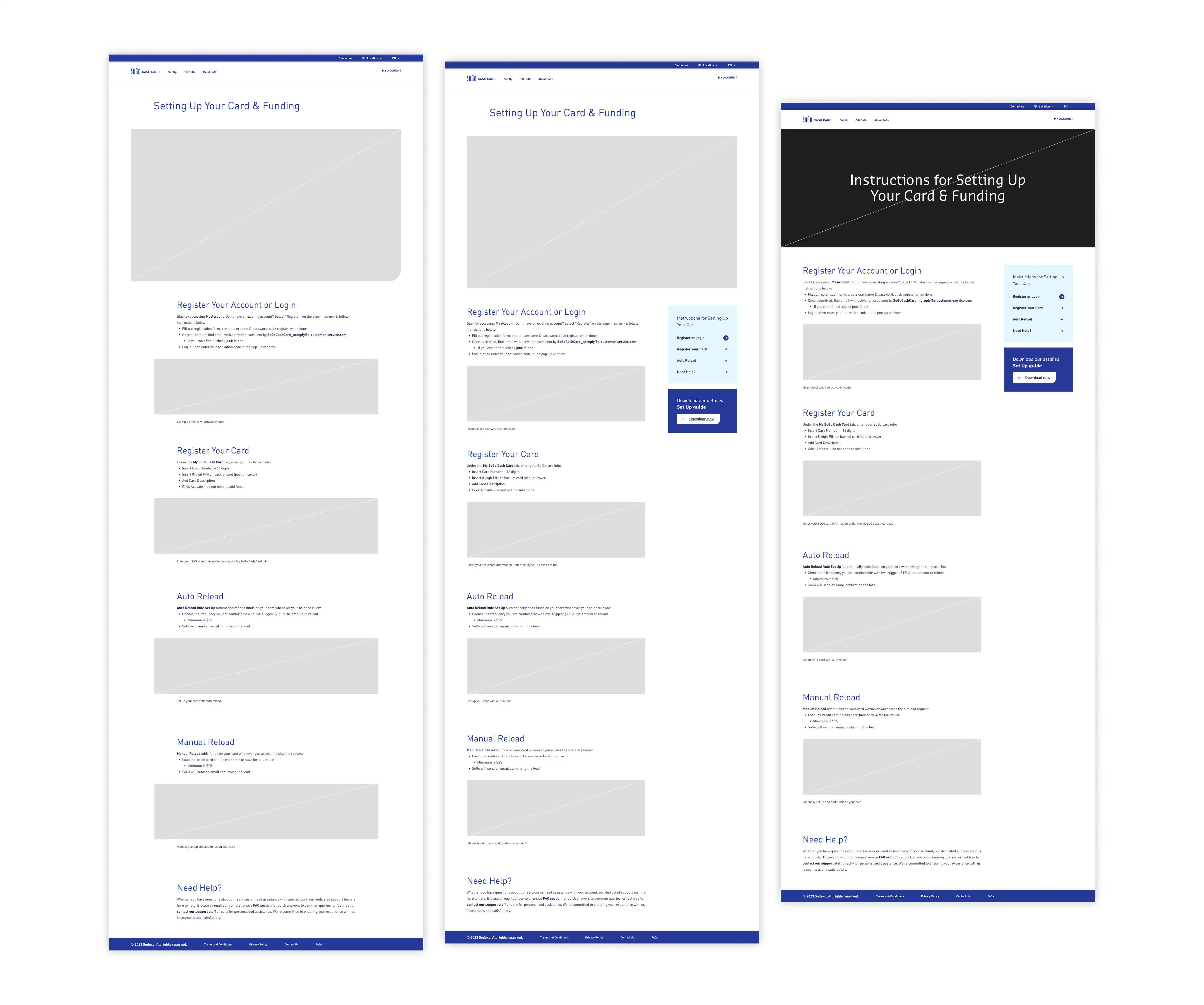
Wireframe Examples
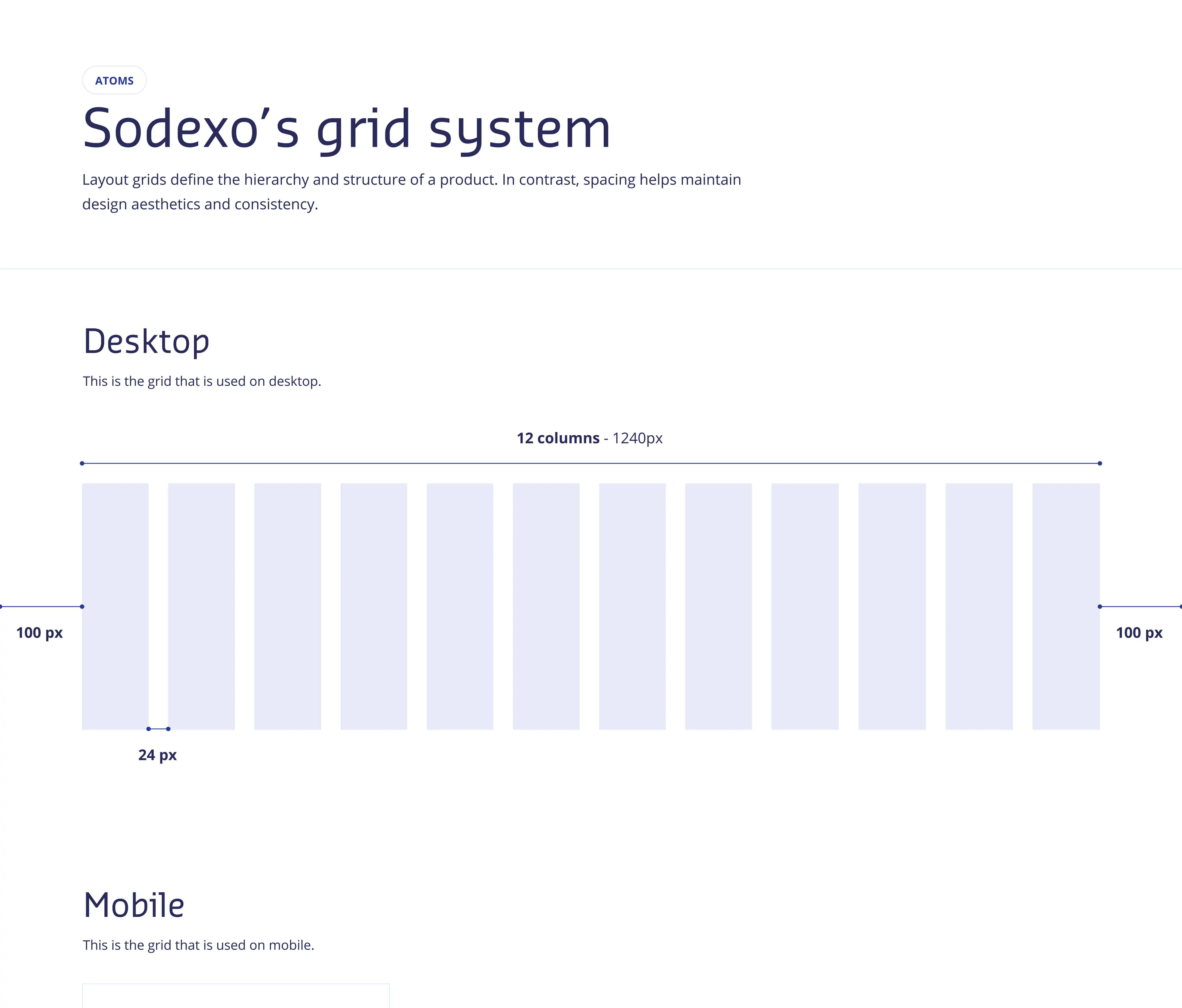
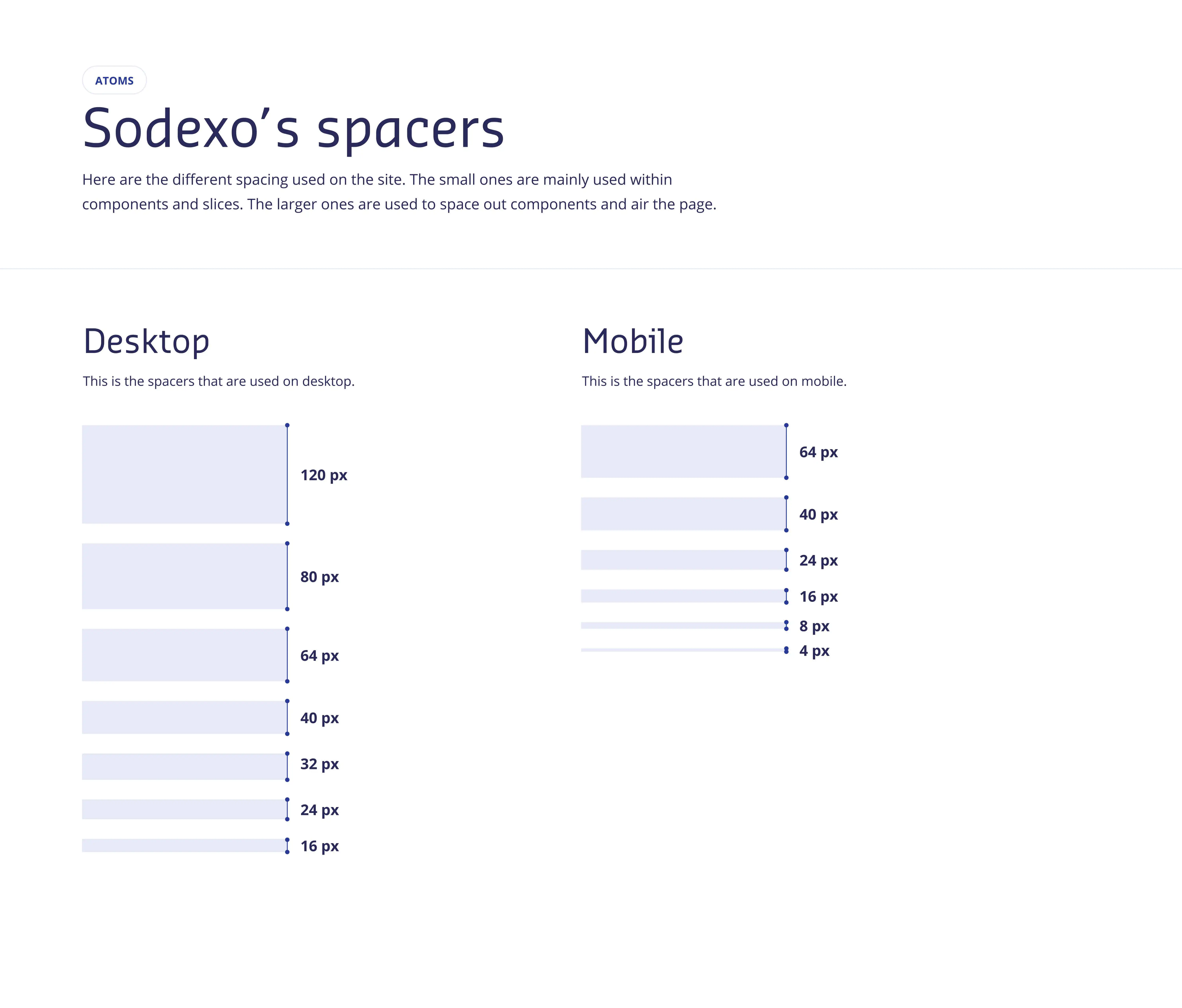
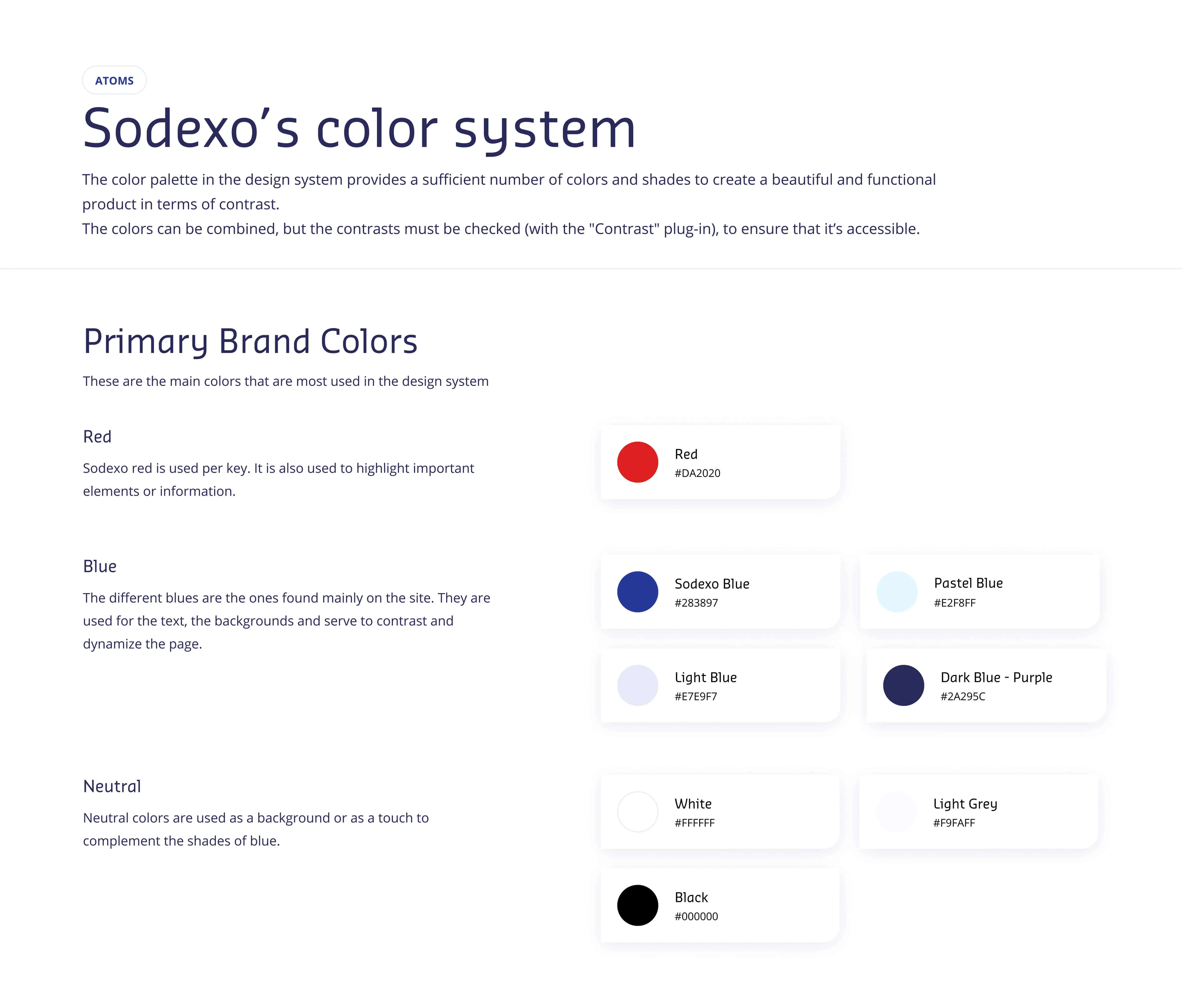
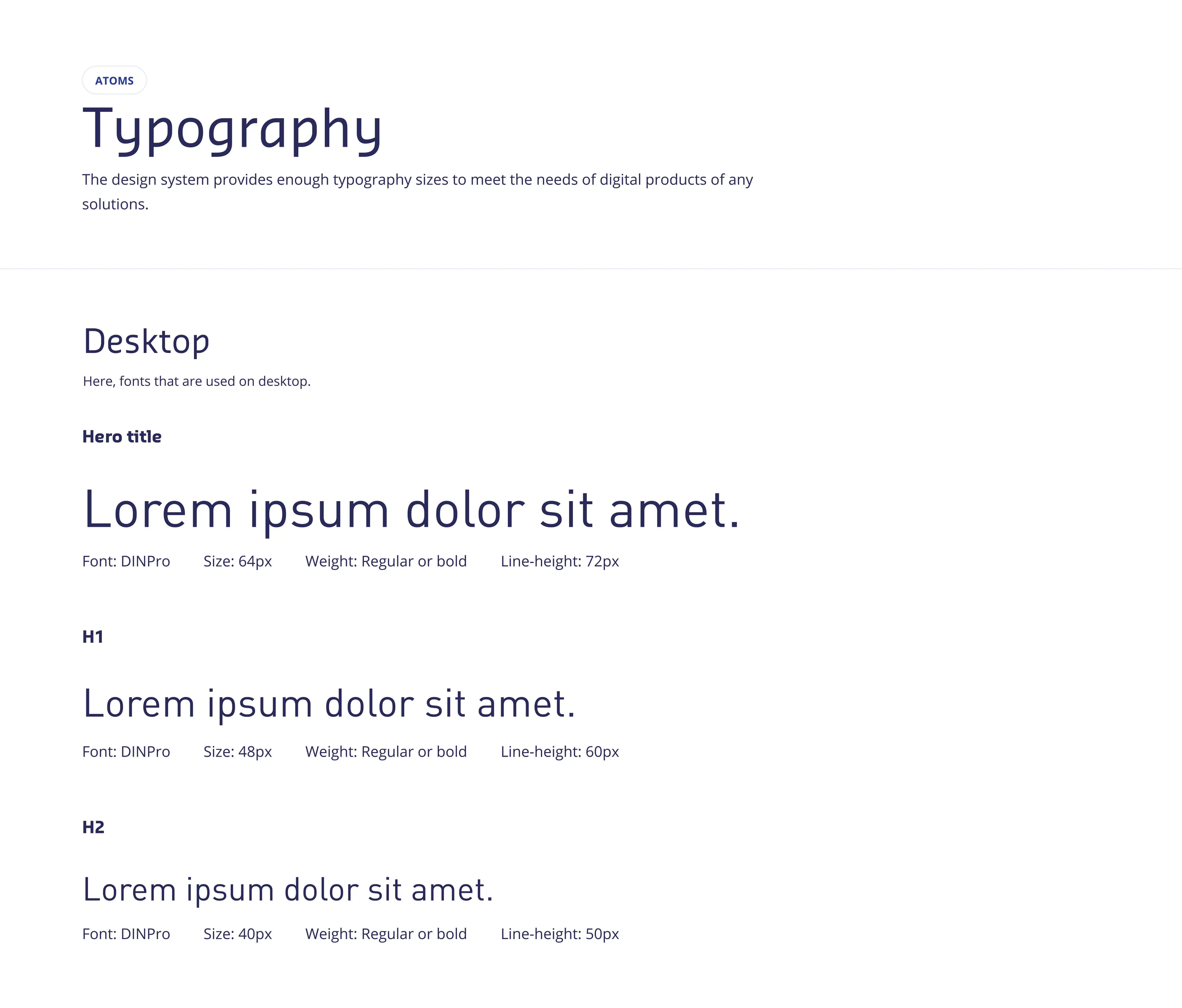
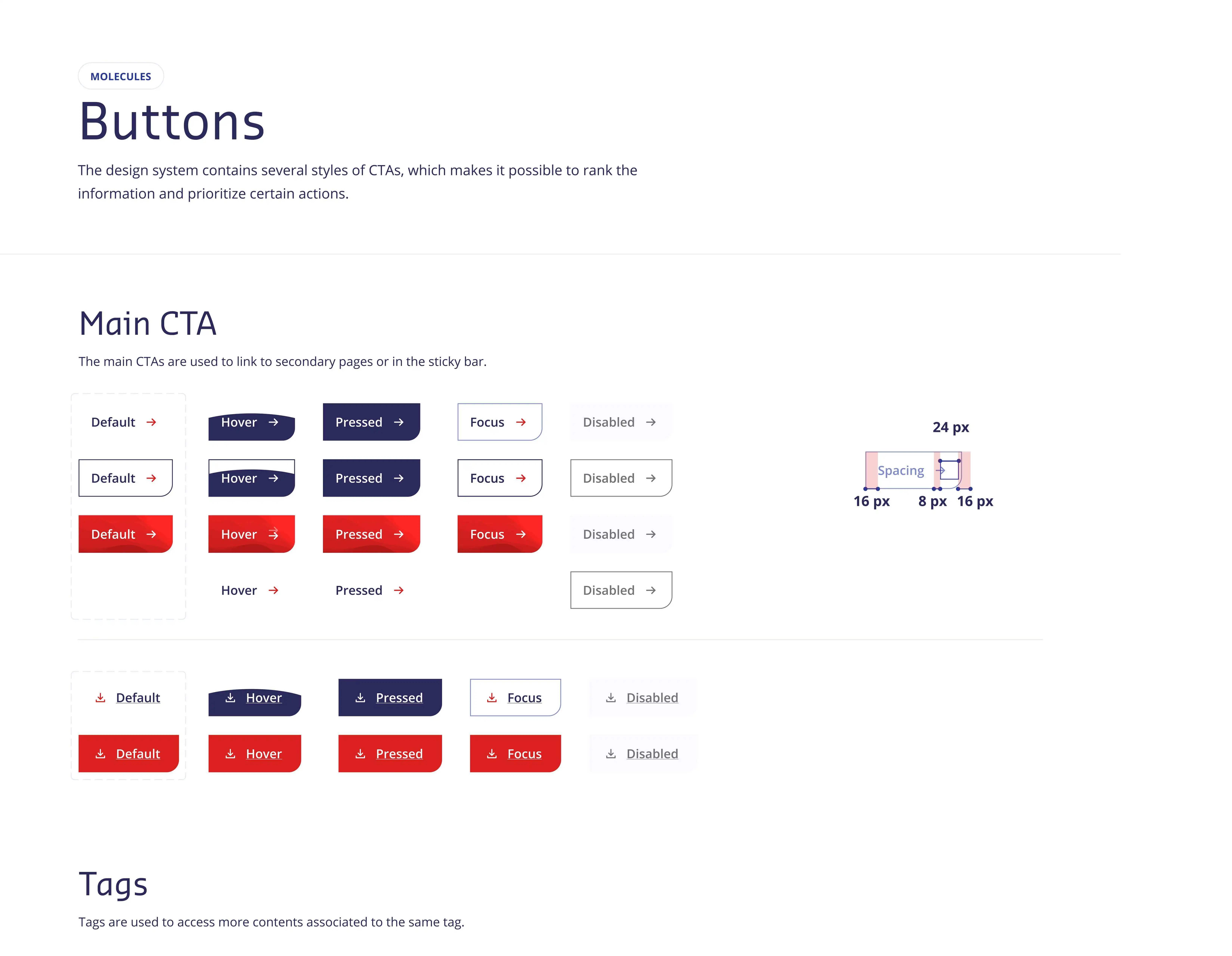
Design System Integration
Integrating the design system, I used Sodexo's color palette, components, grid, spacers, typography, icons, and more for consistency and cohesion in the website's visual design. These predefined elements streamline the design process and ensure a harmonious aesthetic across all pages. This enhances brand recognition and facilitates efficient collaboration and scalability. Below are examples of the elements used:
Prototyping & Iterative Design 🖼️
I transformed wireframes into interactive prototypes to simulate user interactions and validate design concepts. Through iterative testing and refinement, I gathered feedback from stakeholders and users to enhance usability and address issues. This approach ensures continuous improvement, meeting user needs and project goals.
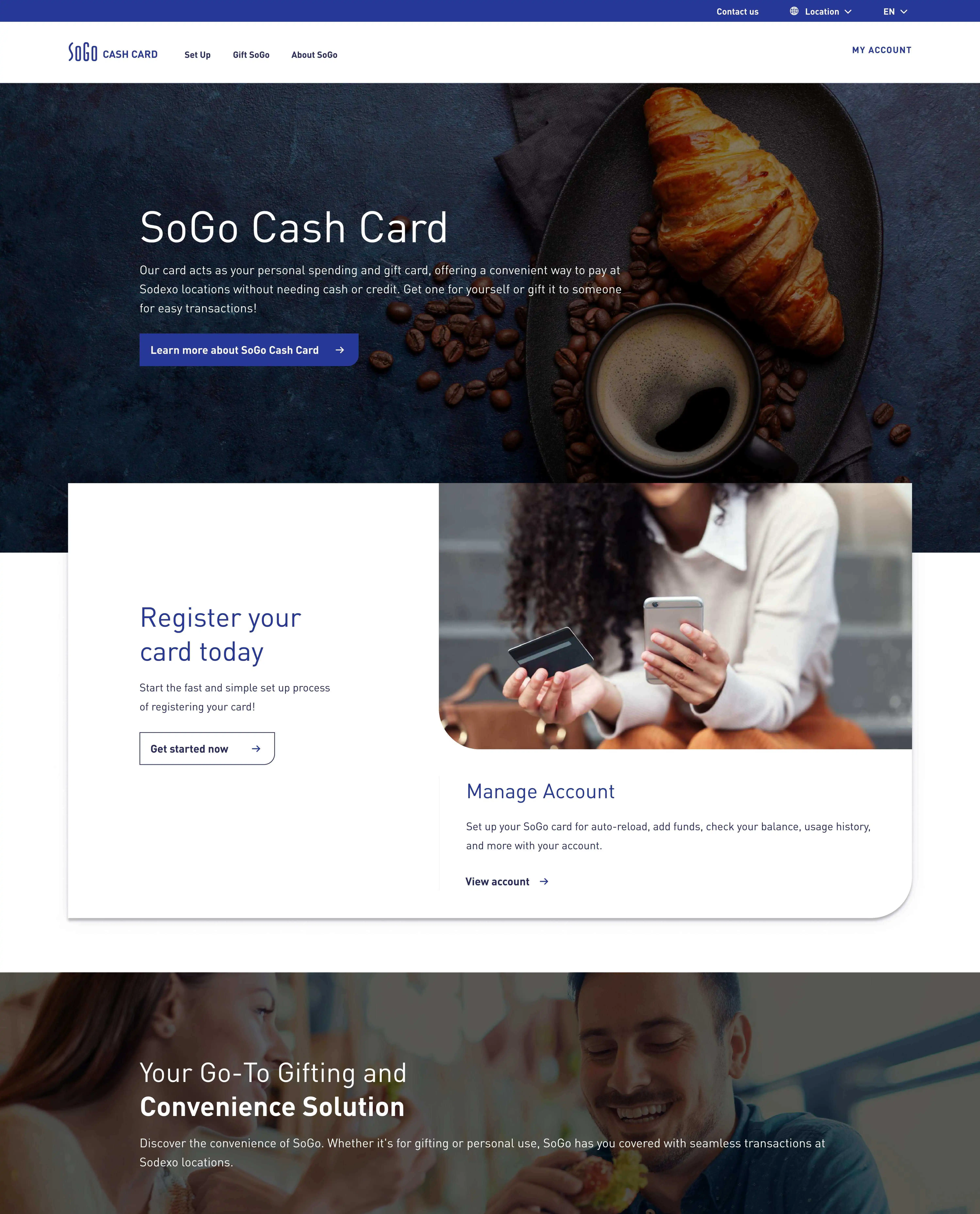
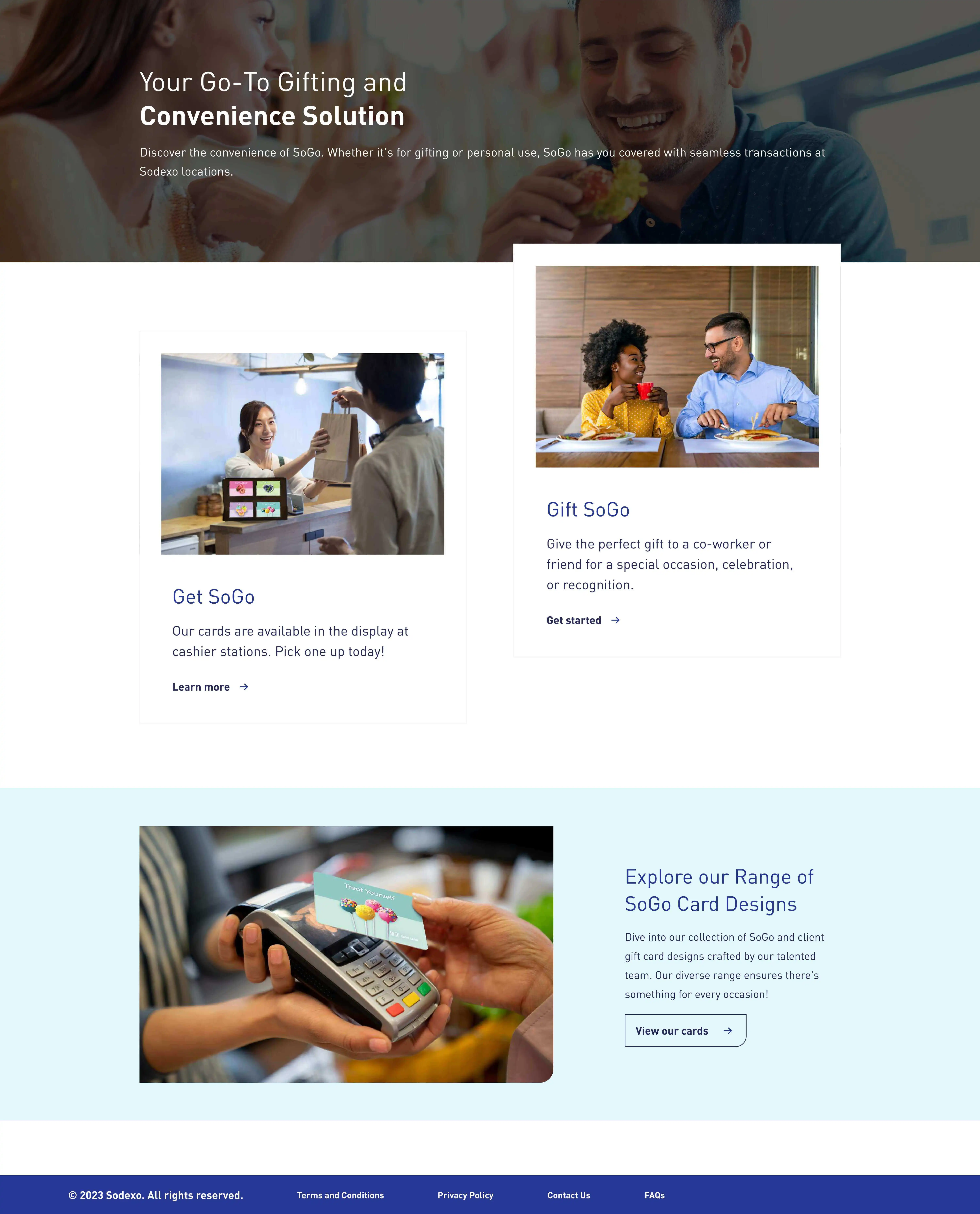
Prototyping the Website
Prototyping is a crucial phase where I transform conceptual ideas and wireframes into interactive prototypes. These prototypes allow stakeholders and users to experience the website's layout, features, and functionality. Prototyping enables testing different design approaches, gathering feedback, and iterating on the design to refine the user experience.
These prototypes are invaluable for visualizing and refining the website's design, allowing stakeholders to provide targeted feedback and insights. Interactive prototypes facilitate meaningful discussions and collaborations, driving the project towards a user-centric and engaging website. Below are a few examples of the prototype:
Responsiveness & Autolayout
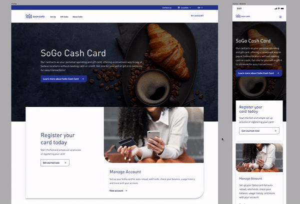
I also prioritized creating designs that adapt seamlessly to various screen sizes and devices using techniques like auto layout. This ensures that website elements adjust dynamically, maintaining consistency and usability across desktops and smartphones. By implementing responsive design principles, I optimize the user experience, allowing effortless navigation regardless of the device. Meticulous testing and iteration ensure pixel-perfect responsiveness, delivering a consistent and intuitive browsing experience.
Conclusion 🏁
During my time here, I have gained valuable insights into effective communication, learning to interact seamlessly with both designers and non-designers. I've come to appreciate the significance of clear communication not only within the design team but also in conveying design concepts to stakeholders and ensuring that the final product effectively communicates with the target audience. I am grateful for the enriching opportunity at Sodexo, where I honed my skills and gained valuable experience in UI design.
Key Takeaways 🔑
I've had a remarkable learning journey so far, providing me with invaluable insights. Here are some key takeaways:
- Interacting with both designers and non-designers during my internship at Sodexo enhanced my ability to communicate clearly, emphasizing the importance of precise communication in collaborative work.
- Engaging in iterative design processes allowed me to be more flexible, adapt, and learn how to improve the design for the next iteration.
- Designing bilingual materials for English and French audiences demonstrated my ability to consider linguistic and cultural nuances, showcasing a thoughtful and inclusive design approach.
- The redesign of SoGo's website showcased my proficiency in strategic design thinking, involving stakeholder discussions, thorough analysis, and a focus on enhancing user experience.
- Close collaboration with clients in creating diverse design materials highlighted my commitment to meeting their needs, with positive feedback on the redesign mockup underscoring the paramount importance of client satisfaction in the design process.
- Understanding the design system is crucial for maintaining consistency, efficiency, and a cohesive visual identity across the website.